A Guide to CSS Flexbox
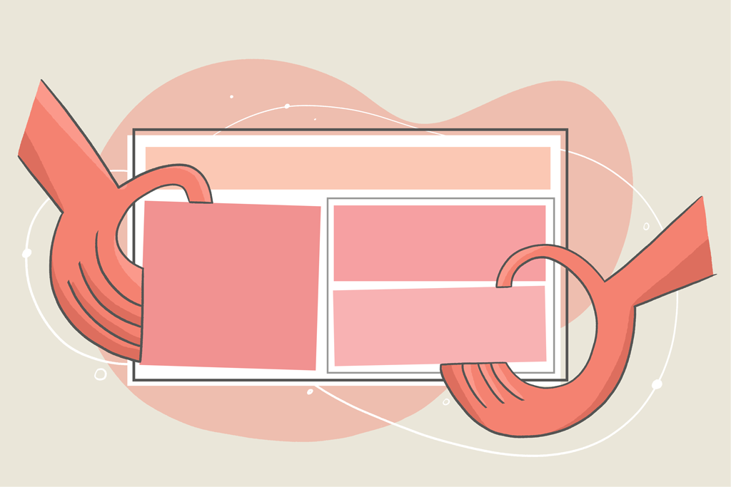
When you add HTML content to your web page, it stacks on top of itself, leaving a lot of space on the edges or making your content look odd. The float CSS property, along with position , was then used to define layouts and position elements, but it was complicated to use, especially when dealing with responsiveness. You no longer need to use the float and position properties to organize your page’s layout and style containers or content side by side. With the advancement of the web and technology, you now have two CSS layout systems: flexbox and CSS grid. This guide focuses on CSS flexbox, but you can bookmark our detailed guide on CSS grid .