A Guide to CSS Flexbox
When you add HTML content to your web page, it stacks on top of itself, leaving a lot of space on the edges or making your content look odd. The float CSS property, along with position, was then used to define layouts and position elements, but it was complicated to use, especially when dealing with responsiveness.
You no longer need to use the float and position properties to organize your page’s layout and style containers or content side by side. With the advancement of the web and technology, you now have two CSS layout systems: flexbox and CSS grid. This guide focuses on CSS flexbox, but you can bookmark our detailed guide on CSS grid.
This guide will teach you everything you need to know about the CSS flexbox layout system, including the flexbox layout axis and its properties, justifying and aligning flex items, adding gaps and ordering these elements, and much more. You’ll also learn when to use flexbox and when to use CSS grid by the end of this guide.
What is Flexbox?
CSS flexbox is a one-dimensional layout system that you can use to create a row or column axis layout. It is a module rather than a single property because it includes several properties, some of which are for the flex container (parent element) and others for the flex items (children elements). This layout module allows the container to change its items’ width/height (and order) to fit the available space best and support all display devices and screen sizes.
CSS flexbox was introduced in 2009 as a new layout system to make it easier to build responsive web pages and organize your elements, and it has grown in popularity since then. Flex is designed to provide a more efficient way of laying out all items, aligning, and distributing space among each item in a container, even when each flex item’s sizes are unknown and/or dynamic.
It simplifies designing and building responsive web pages by eliminating the need for tricky hacks and a plethora of float and position properties in your CSS code. Flexbox allows you to automatically scale elements (change their height or width) to fill the available space, shrink or grow elements to fit into the container, and prevent overflow. It can change the order of the items, create columns of the same height, design navigation panels, and much more.
Understand the Flexbox Layout Axis
The way items are laid out when you use flexbox is based on the flex directions. If the flex-direction is row which is the default value, your main axis is along the row, and your cross-axis is along the column. If the flex-direction is column, your main axis is along the column while your cross-axis is along the row.
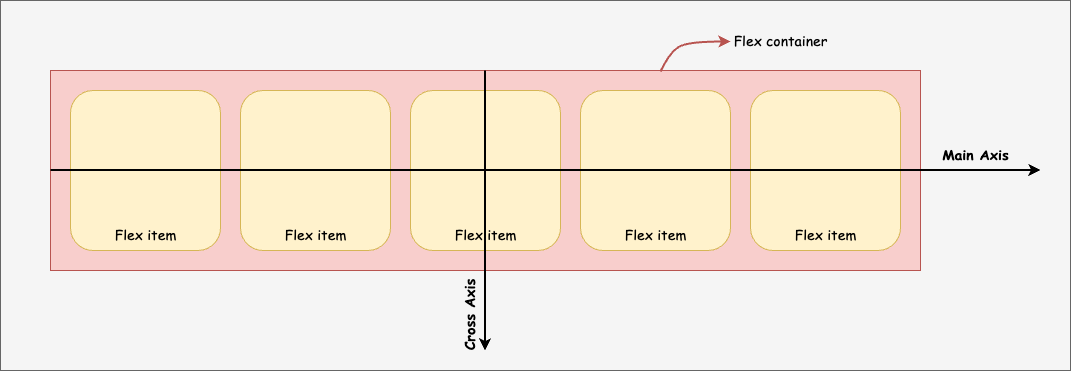
The primary axis in which flex items are laid out in a flex container is usually referred to as the main axis. It is not necessarily horizontal because it depends on the flex-direction property. The cross-axis is perpendicular to the main axis. Its direction depends on the main-axis direction.
Flexbox properties
Flexbox is a module, meaning it comprises many properties that are either applied to the flexbox container or the flex items. Here is a table to show the list of elements that you can apply to either the flex container or items:
| Flex container | Flex Items |
| display | order |
| flex-direction | flex-grow |
| flex-wrap | flex-shrink |
| flex-flow | flex-basis |
| justify-content | flex |
| align-items | align-self |
| align-content | |
| gap, row-gap, column-gap |
How to make a flex container
The flex container is a container that holds all the flex items. For example, if you have a div that holds three other divs:
<div class="flex-container">
    <div class="flex-item">
        <p>Item One</p>
    </div>
    <div class="flex-item">
        <p>Item Two</p>
    </div>
    <div class="flex-item">
        <p>Item Three</p>
    </div>
</div>Code language: HTML, XML (xml)
To make the parent div a flex container, you would apply the display property and give it a value flex. This turns the container into a block element, allowing a flex layout for all of its direct children.
.flex-container {
    display: flex;
}Code language: CSS (css)
You can also set the value to inline-flex, which works similarly. The only difference is that it creates a container as an inline element.
.flex-container {
    display: inline-flex;
}Code language: CSS (css)
💡 An absolutely-positioned flex item does not participate in flex layout.
How to set flex-direction
You can set the direction of your flex items using the flex-direction property. You can set the items to flex vertically (column), horizontally (row), or even reverse the items in the specified direction using values like row-reverse and column-reverse.
.flex-container {
    display: flex;
    flex-direction: row | row-reverse | column | column-reverse;
}Code language: CSS (css)
The flex-direction property will only work on a flex container, meaning you must have used the display property and set the value to flex or inline-flex.
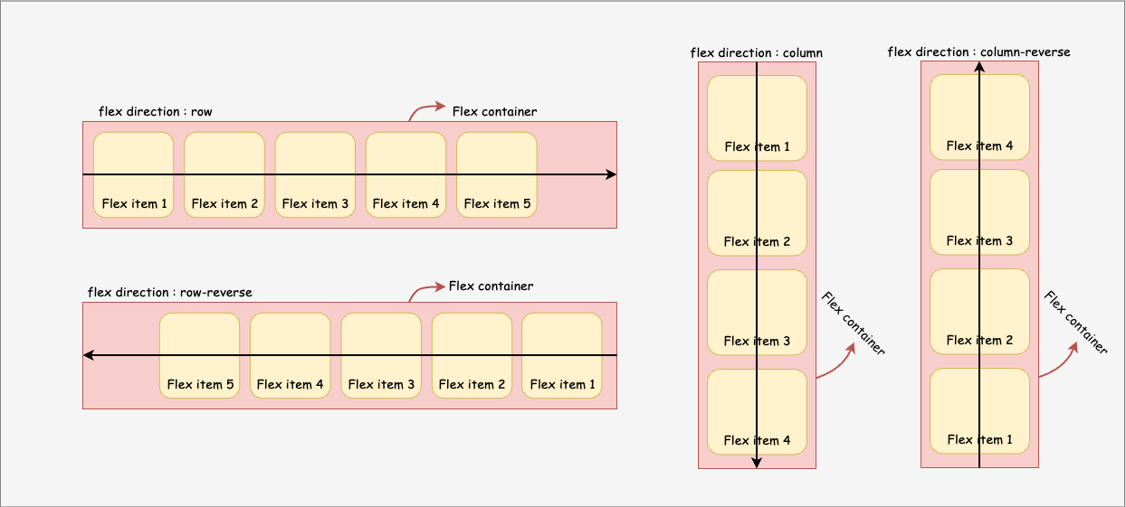
The default value of flex-direction is row which sets the flex items from left to right. In contrast, row-reverse does the opposite and sets flex items right to left. column will set flex items from top to bottom with items order similar to row, while column-reverse will reverse the flex items from bottom to top.
Wrapping flex Items
When you create a flex container, all its items (flex items) will try to fit onto one line by default. When these items reach the max-width, they shrink to fit onto that single line.
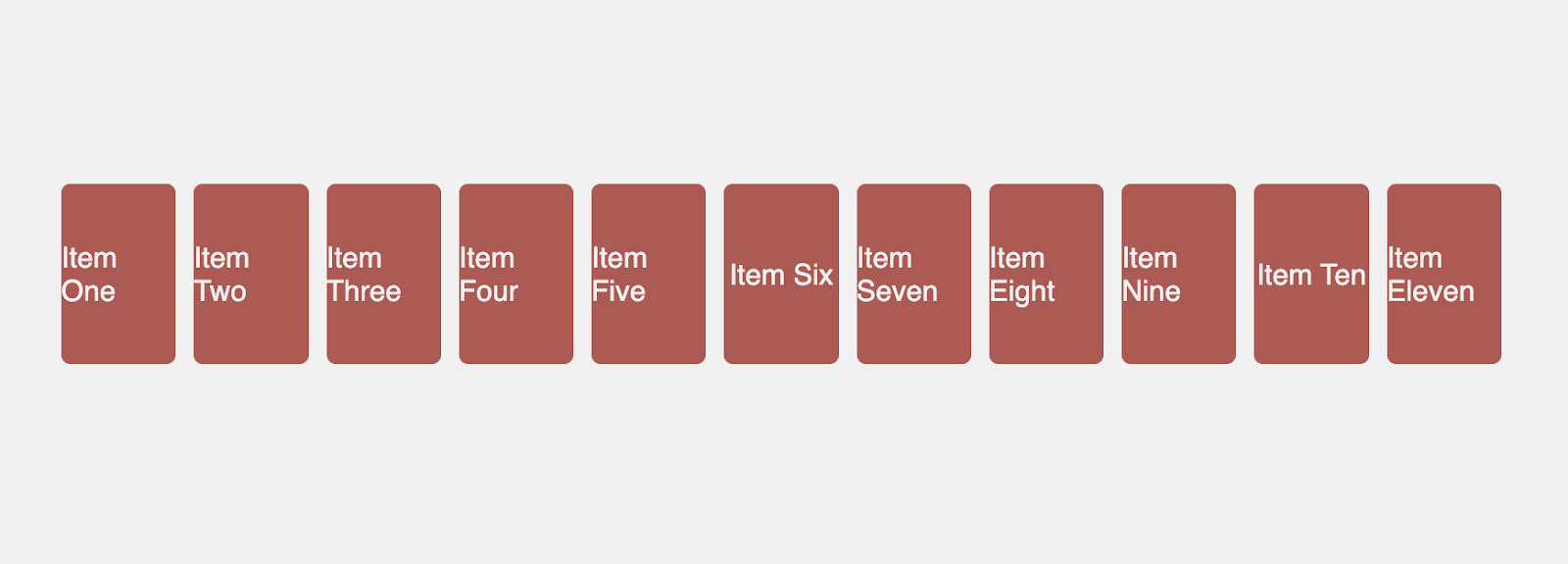
You can change that and let the items wrap as needed with the flex-wrap property. This property has three values, but the wrapped value will help avoid your flex items from shrinking onto one line.
.flex-container {
    display: flex;
    flex-wrap: wrap;
}Code language: CSS (css)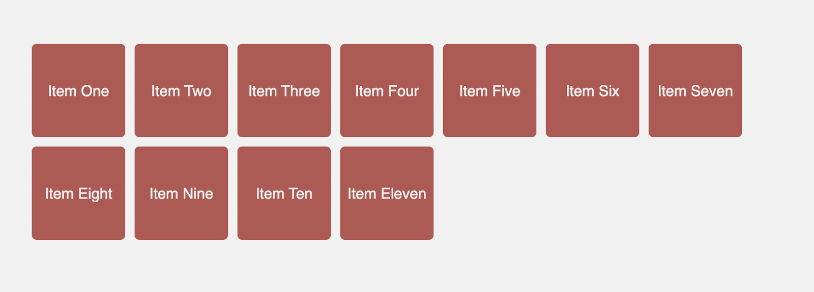
There are two other values, nowrap and wrap-reverse. wrap will help you wrap your items onto multiple lines, from top to bottom, rather than compressing all flex items to one line. While the default value of nowrap causes all flex items to shrink onto one line, wrap-reverse causes the flex items to wrap across multiple lines from bottom to top.
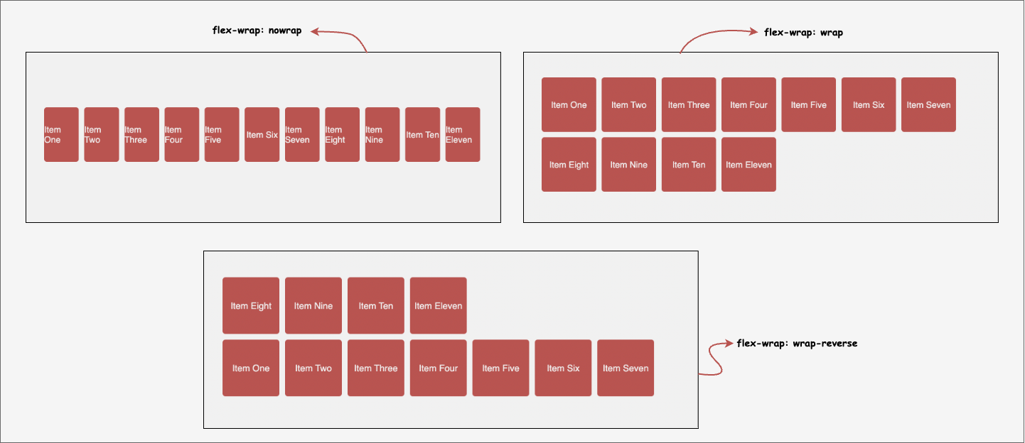
So far, you have learned two significant properties: flex-direction and flex-wrap. If you need to use both properties, then you can use the flex-flow shorthand property.
.flex-container {
    display: flex;
    flex-flow: column wrap;
}Code language: CSS (css)
How to align items along the main axis
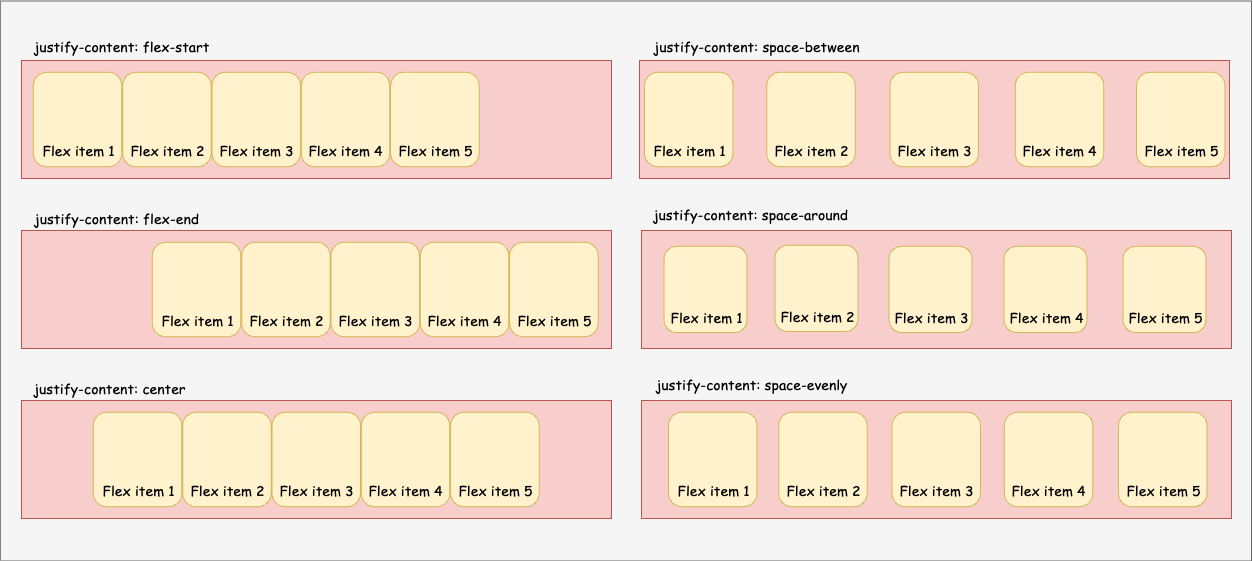
The justify-content property defines the horizontal alignment of flex items. This property has six major values that perform individual functions, all aimed at exerting some control over the alignment of flex items.
.flex-container {
    justify-content: flex-start | flex-end | center | space-between | space-around | space-evenly;
}Code language: CSS (css)flex-start: This is the default value in which flex items are packed toward the start of the main axis orflex-direction.flex-end: This is the opposite offlex-start, as flex items are packed toward the end of the main axis orflex-direction.center: This perfectly fits the flex items within the flex container. Other options, such as start, end, left, and right, do what the value indicates. For example, when you set a value toright, the flex items will be packed toward the container’s right edge.space-between: This option evenly distributes flex items in the line starting and ending on the flex container border, except for padding or margin.space-around: This option will evenly distribute flex items in line with equal space around them (left, right, bottom and top). It is important to know that between each element, the gap won’t be the same as the top and bottom because this is the sum of the gap on the right and left of both elements.space-evenly: This creates an exact space between each flex item, ensuring that the space between any two items and the edges is equal.
How to align items along the cross-axis
Asides from aligning items along the main axis, you can also do for the cross-axis using the align-items property. Just like the justify-content property, align-items also has about five values that can be used to align flex items.
.flex-container {
    display: flex;
    align-items: stretch | flex-start | flex-end | center | baseline;
}Code language: CSS (css)stretch: By default, flex items are stretched to fill the flex container, still respectingmin-widthandmax-widthproperties.flex-start: This places all flex items at the start of the cross-axis based on theflex-direction. Other values similar to this arestartandself-start.flex-end: This is the opposite offlex-start, as flex items are placed at the end of the cross-axis. Other values similar to this areendandself-end.center: This places flex items in the center along the cross-axis.baseline: All flex items are aligned in the sense that their baselines are aligned.
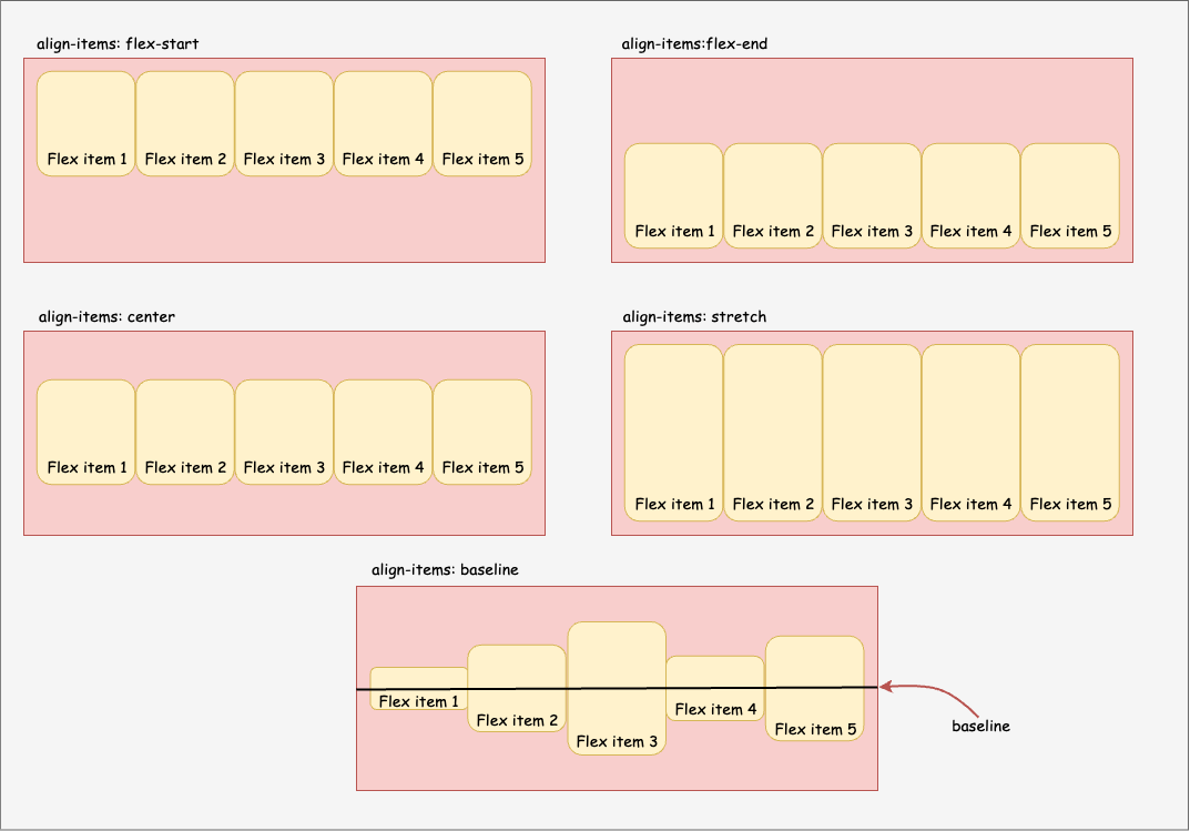
align-items works with the one-line flex items, while you can use the align-content property to define the vertical alignment of multiple lines of items. This property has no effect when only one line of flex items exists.
ℹ️ In multiple line flexible containers, the
align-contentproperty will not work unlessflex-wrapis set towraporwrap-reverse.
.flex-container {
    display: flex;
    align-content: stretch | flex-start | flex-end | center | space-between | space-around;
}Code language: CSS (css)
The justify-content property is used to align individual items on the main axis, but you can also use align-content for the cross-axis when you want to space the items, move them to the start or end of the cross-axis, or stretch them.
flex-start: This can be used to move all your flex items to the start of the flex container based on theflex-direction. This is also similar to usingstart.flex-end/end: This is the opposite offlex-startorstart. The flex items are moved to the end of the flex container. This is also similar to usingend.center: All flex items are placed at the center of the flex container.space-between: This will space all flex items evenly, starting and ending on the edge of the flex container.space-around: This helps you evenly distribute equal space around each flex item. You can also make use ofspace-evenlyfor perfect spacing.stretch: flex items are stretched to take up the entire space.
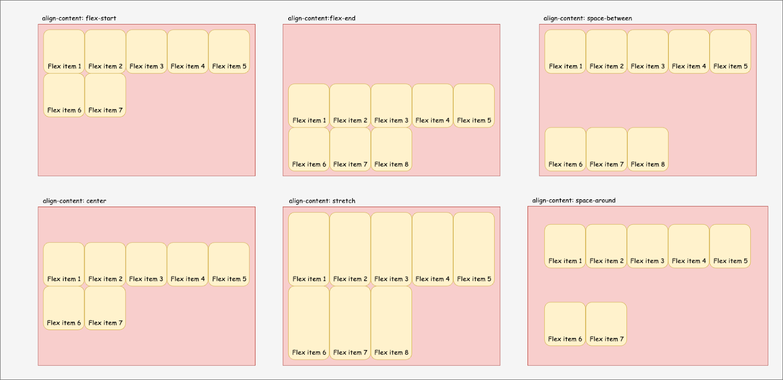
So far, you have learned how to align all flex items through the container element. But it is important to know that you can also align each item individually using the align-self property. The align-items property allows you to override the alignment specified for the flex container.
.flex-item {
    align-self: stretch | flex-start | flex-end | center | baseline;
}Code language: CSS (css)
The align-self property has the same values and meaning as align-items. Here’s an example of what happens when you give each flex item its own align-self value.

align-self is used to align each item individually. The image shows each flex item having different values.This property is used when you need to add specific alignment to an individual flex item different from other flex items.
Gapping flex items horizontally and vertically
At this point, one major aspect left for your flex container styling is adding gaps to your flex items. You will want to be able to add equal gaps between flex items either horizontally, vertically, or on both sides.
You can do this with the gap property. The gap property controls the amount of space between each flex item. The gap or spacing is only applied between the flex items and not on the outer edges. This property is for more than just flexbox, as it works in grid and multi-column layouts.
.flex-container {
    display: flex;
    gap: 20px;
}Code language: CSS (css)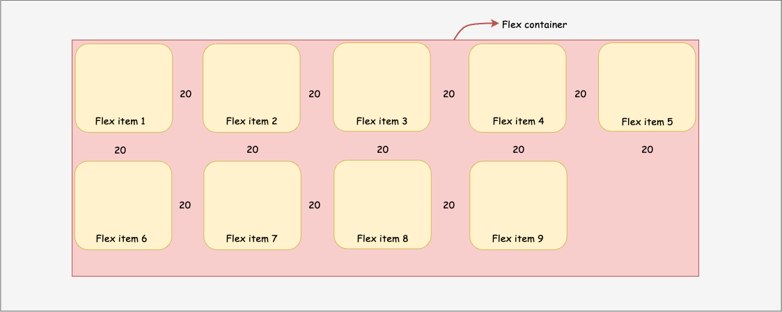
The gap property is a shorthand that you can use to specify one value for both the column and rows. When you want different values, you can use two values. The first is the row, while the second is for the column. Finally, you can use two properties: row-gap and column-gap.
.flex-container {
    display: flex;
    // ...
    gap: 20px;
    gap: 20px 30px; /* row-gap column gap */
    row-gap: 20px;
    column-gap: 30px;
}Code language: JavaScript (javascript)
Ordering elements
You can use the order property to assign how flex items are ordered. You will use integer values to lay out these items from lowest to highest. When flex items have the same order, it will revert to the source order.
.flex-item {
    order: 5;
}Code language: CSS (css)
For example, if you have four items, you can specify how you want them to be ordered by giving them an order value:
- flex item 1:
order: 3 - flex item 2:
order: 1 - flex item 3:
order: 1 - flex item 4:
order: 2
The items above would be displayed in the following order, based on the value you set:
- flex item 2:
order: 1 - flex item 3:
order: 1 - flex item 4:
order: 2 - flex item 1:
order: 3

.item1 {
    order: 3;
}
.item2 {
    order: 1;
}
.item3 {
    order: 1;
}
.item4 {
    order: 2;
}Code language: CSS (css)
Sizing flex items – grow and shrink
Sizing flex items and making them flexible depends on three flex item properties: flex-basis, flex-grow, and flex-shrink.
flex-basis
This property specifies the length of flex items or individual flex items. This overrides any previously defined width for that element. This accepts length values (e.g., 10%, 4rem, etc.) and can also use auto, which uses the declared width value.
.flex-item {
    flex-basis: <length> | auto ;
}Code language: CSS (css)
💡 The `flex-basis` property has no effect if the element or item is not a flex item. This means that if it is not contained within a flex container.

flex-basis helps define the width each flex item takes in the flex containerThe flex container in the image above is wrapped, which means that when it reaches the edge, the items will fall to the new line. The flex-basis property is then applied to the flex items and set to 30%, meaning each item will take up 30% of the total width, leaving 10%. You can use the flex-grow property to help the elements grow and cover up small spaces that cannot accept new flex items.
flex-grow
You can apply the flex-grow property to individual flex items or all flex items simultaneously. It defines a flex item’s ability to grow. It ensures that flex items fill the available space inside the flex container by causing each item to grow following the supplied value. It has a default value of 0 and accepts a unitless value (e.g., 1, 2, 3 …) as a proportion.
ℹ️ Negative numbers are invalid.
.flex-item {
    flex-grow: 1 ;
}Code language: CSS (css)
If all of your flex items (perhaps with the same class name) have their flex-grow set to 1, the container’s remaining space will be distributed evenly to all flex items.

flex-grow ensures that the flex items stretch to fill the space in the flex container.If an item’s flex-grow value is set to 2, it will gain twice the width of other items with flex-grow values of 1.
.item1 {
    flex-grow: 2;
}
.item2 {
    flex-grow: 1;
}
.item3 {
    flex-grow: 1;
}Code language: CSS (css)
flex-grow value set to a higher number than the second and third items.This will work when the flex-basis is not set to any specific value.
flex-shrink
The flex-shrink property applies to flex items and specifies how much it will shrink each element if insufficient space exists. It has a default value of 1 and accepts a unitless value (e.g., 1, 2, 3) as a proportion.
ℹ️ When set to 0, the flex item retains its original size. Negative numbers are invalid.
.flex-item {
    flex-shrink: 2;
}Code language: CSS (css)
When you set a specific width for each flex item, and the sum of the width plus the gap surpasses the flex container width, you can use flex-shrink to indicate how much each element will be reduced.
.item1 {
    flex-basis: 150px;
    flex-shrink: 1;
}
.item2 {
    flex-basis: 250px;
    flex-shrink: 2;
}
.item3 {
    flex-basis: 350px;
    flex-shrink: 3;
}Code language: CSS (css)
ℹ️
flex-shrinkwon’t work if the flex container has theflex-wrapproperty set towrap.
The flex shorthand for better syntax
Finally, you have learned that you can use these three properties to size your flex items. Instead of using three properties, you can combine its value using the flex property. It is a shorthand for flex-grow, flex-shrink, and flex-basis combined.
💡
flex-shrink, andflex-basisare optional.
.flex-item {
    flex: none | [ <'flex-grow'> <'flex-shrink'>? || <'flex-basis'> ];
}Code language: CSS (css)
The default value for flex property is 0 1 auto, but if you use a single number value:
.flex-item {
    flex: 2;
}Code language: CSS (css)
This changes the flex-basis to 0%, so it’s like setting:
.flex-item {
    flex-grow: 2;
    flex-shrink: 1;
    flex-basis: 0%;
}Code language: CSS (css)
It is always recommended that you use this shorthand property because it intelligently sets the other values.
Play with CSS flexbox in the sandbox below:
When to use flexbox over CSS grid
So far, you’ve learned what flexbox is, what it does, how it works, and that it’s a CSS layout system similar to CSS grid. Then you wonder, do I choose one, or is there a situation where you must use flexbox over grid?
It would be best to use CSS flexbox when you have a small design to implement with a few rows or columns. Also, when you need to align elements, flexbox comes in handy.
You can certainly build your entire website or application using only flexbox and achieve the same results as if you were using CSS grid, which is perfectly fine. However, for a better CSS approach, you must write codes that are clean, maintainable, and easy for others to manage over time. CSS grid is the best way to create and fit your layout perfectly.
ℹ️ The flexbox layout is best suited for application components and small-scale layouts, whereas the grid layout is best suited for larger scale layouts.
Learn more about CSS grid in this very in-depth guide.
Wrapping up
In this guide, you have learned what the CSS flexbox is all about, how it works and the various elements that you can use to help you create an awesome layout for your small projects.
There are so many instances when you’d need to make use of the CSS flexbox such as centering items, on your navbar, basic horizontal layouts and lots more. Having a proper understanding of each CSS property and their values will help you.
Have fun coding!