How to Animate A React Application With Framer Motion
Animations on web pages involve moving elements on the screen to improve the visual experience of users. These animations are visually appealing and tend to draw users’ attention to buttons, images, and other important information. Overall, it contributes to establishing a solid connection between users and the content on the screen.
In the past, web pages were very plain and lacked interactivity because they were only intended to display information, and there was no capability to create appealing visual experiences. Things have changed dramatically in recent years, thanks to the availability of libraries and packages that make it easier to animate and add visual experiences to your web pages.
This article will teach you how to use the Framer Motion library to animate a React application. Why should you use Framer Motion? And how it works by animating a mini-project.
What is Framer Motion?
Framer Motion is an open-source production-ready motion library for React. It allows you to add all forms of animations and transitions directly to Document Object Model (DOM) elements defined in your React components. Its syntax is easy to understand, and with a few lines of code, you will be able to implement awesome animations.
Framer Motion uses an awesome API that gives you access to the motion component. You can plug this component into your React DOM elements giving you access to additional props for animation. For example, the div element will become motion.div.
The Framer Motion also has beginner-friendly documentation with lots of practical examples and illustrations showing how to perform simple to complex forms of animations and transitions.
How Framer Motion works
Framer Motion uses the motion component, which you can attach to any DOM element to implement an animation or transition effect.
<motion.div>
    <p> An animated text </p>
</motion.div>Code language: HTML, XML (xml)
Nothing changes when you attach the motion component to your element. Instead, it supercharges that element with animation capabilities, giving you access to props, keys, and values you can use to add any animation. For example, you can access the animate prop, which takes in a dynamic value — an object which contains the different properties and values you want to animate.
<motion.div animate={{x: -10, y: 10}}>
    <p> An animated text </p>
</motion.div>Code language: HTML, XML (xml)
The above animation will cause the div element to slide 10px to the left and then 10px to the bottom when it loads from the original position specified in style.
ℹ️ When units are not specified, calculations are done in pixels. You can also specify your preferred units by attaching them. For example:
animate={{x:"-10rem"}}.
Getting started with Framer Motion in React
Framer Motion is a popular library with over 1.6 million weekly downloads. You can install the library into your React project using the command below in your terminal:
$ npm i framer-motionOnce you have installed it, you can verify if it has been installed in your package.json file’s dependencies object:
"dependencies": {
    // ...
    "framer-motion": "^7.5.3",
    "react": "^18.2.0",
    // ...
},Code language: JSON / JSON with Comments (json)
Once you have installed the Framer Motion library, you can import the motion component into a component you wish to use within your project, and everything will work fine.
import { motion } from 'framer-motion';

<motion.h1 animate={{x: 10, y: 20}}>
    An animated text
</motion.h1>Code language: JavaScript (javascript)
Animating elements in React
The motion component can be applied to any DOM element within your React component. You can apply it to the container elements, headings, text elements, images, and other elements. This motion component gives you access to props like animate, which you can use to adjust the color, size, position, display, and add other animation effects to the DOM element.
<motion.div
    animate={{
        x: 10,
        backgroundColor: '#fff',
        boxShadow: '10px 10px 0 rgba(0, 0, 0, 0.2)',
    }}
>
    <h1>Hi</h1>
    <img src={myImage} alt="" />
</motion.div>Code language: HTML, XML (xml)
In the example above, the background color changes to white. A box shadow is added to the div when it loads, and the elements contained in the div moves 10px to the right.
It is also important to know that you can apply any form of animation based on CSS attributes. For example, you use x, y, and z to move elements similar to translateX, translateY, and translateZ.
You can also scale the size of an element using the scale attribute for both x and y or scaleX and scaleY if you wish to apply separate values. Example:
<motion.div animate={{ scale: 0.8 }} >
    <h1>Hi</h1>
    <motion.img animate={{ scaleX: 1.2 }} src={myImage} alt="" />
</motion.div>Code language: HTML, XML (xml)
The same applies to transformation values like skew and rotate. It’s also important to mention that it supports all forms of value types, such as numbers, strings, and colors in Hex, RGB, and HSLA as strings. You can also calculate values using the calc() function.
<motion.img animate={{ x: "calc(100vw - 50%)" }} src={myImage} alt="" />Code language: HTML, XML (xml)Setting initial animation state
At this point, you have only used the animate prop, which makes you animate elements from the default CSS style to your specified values. But this is not always what you want; sometimes, you want to specify where your animation starts and ends. For example, you might want your text to slide from the left of your screen to the middle.
You can specify initial animation values using the initial props, which work similarly to the animate prop and uses similar attributes and values.
<motion.div
    initial={{ opacity: 0, x: '-100vh' }}
    animate={{ opacity: 1, x: 0 }}
>
    <h1>Hi</h1>
    <p>
        Lorem ipsum dolor sit amet consectetur adipisicing elit. Deserunt
        perspiciatis voluptates nihil dolores eum architecto eligendi
    </p>
</motion.div>Code language: HTML, XML (xml)
How to add transition options to animation
You will notice that these animations happen fast to the extent that you might not see them unless you pay close attention.
You can fix this by adding transition effects using the transition prop. This transition prop defines the type of animation used when animating between two values and how these values animate from one state to another.
For example, if you add a duration of 1, the animation will run for 1 second.
<motion.div
    initial={{ opacity: 0, x: '-100vh' }}
    animate={{ opacity: 1, x: 0 }}
    transition={{ duration: 1 }}
>
    <h1>Hi</h1>
    <p>
        Lorem ipsum dolor sit amet consectetur adipisicing elit. Deserunt
        perspiciatis voluptates nihil dolores eum architecto eligendi
    </p>
</motion.div>Code language: HTML, XML (xml)
There are three major transition types, and they all have their specific effect; they include Tween, Spring, or Inertia. Tween is the default type for all animation, so if you want a spring form of animation, you will need to specify the transition type as Spring.
<motion.div
    initial={{ opacity: 0, x: '-100vh' }}
    animate={{ opacity: 1, x: 0 }}
    transition={{ type: 'spring', duration: 1 }}
>
    <h1>Hi</h1>
    <p>
        Lorem ipsum dolor sit amet consectetur adipisicing elit. Deserunt
        perspiciatis voluptates nihil dolores eum architecto eligendi
    </p>
</motion.div>Code language: HTML, XML (xml)
Each type has some attributes peculiar to them. For example, when you use the transition type of spring, you have access to an attribute like bounce which specifies how elastic the spring effect is on the element.
<motion.div
    initial={{ opacity: 0, x: '-100vh' }}
    animate={{ opacity: 1, x: 0 }}
    transition={{ type: 'spring', bounce: 0.6 }}
>
    <h1>Hi</h1>
    <p>
        Lorem ipsum dolor sit amet consectetur adipisicing elit. Deserunt
        perspiciatis voluptates nihil dolores eum architecto eligendi
    </p>
</motion.div>Code language: HTML, XML (xml)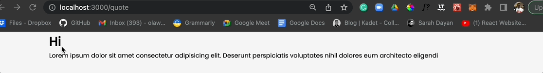
There are other attributes like delay, which you can use to set a delay time before the animation renders.
How to use keyframes and repeat animation in Framer Motion
Sometimes, you may want your elements to animate through several different animation values, which may be from left to right, depending on what you want. In CSS, this is handled with keyframes, but for Framer Motion, you can do this with a square bracket holding as many values as you want.
<motion.button
    animate={{ x: [0, -20, 20, -20, 20, 0] }}
    transition={{ delay: 1 }}
>
    My Button
</motion.button>Code language: HTML, XML (xml)Note that in the example above, the animation waited for 1 second before moving the button to the left 20px and right 20px twice before returning to its original position. This can be applied to any animation transform attribute such as x, y, scale, rotate and others.
<motion.button
    animate={{ scale: [1, 1.2, 1, 1.2, 1] }}
    transition={{ delay: 1 }}
>
    My Button
</motion.button>Code language: HTML, XML (xml)
You will notice that these animations stop after it has completed the number of times specified. The example above will start at 1, which is the default. It will then scale up and down twice to its default value.
However, you may want the animation effect to repeat by using the transition property yoyo and set its value to Infinity or the number of times you wish your animation repeats.
💡 The transition property
yoyolets you specify the number of times you want an animation to repeat.
<motion.button
    animate={{ scale: 1.2 }}
    transition={{ delay: 1, yoyo: Infinity }}
>
    My Button
</motion.button>Code language: HTML, XML (xml)
In the code block above, you will notice you no longer need the square bracket. All you need is the value it should change to when it leaves the default, 1.

Implement hover animation gestures
You often want to apply hover gestures to buttons, cards, and other elements to draw the user’s attention. You might want a button to scale up and down when a user hovers over the button instead of just scaling up and down without any action from the user. To do this, you can use the whileHover prop, which works similarly to previous props.
<motion.button
    whileHover={{
        scale: 1.2,
        transition: { yoyo: Infinity },
    }}
>
    My Button
</motion.button>Code language: HTML, XML (xml)
ℹ️ The transition property for
whileHoverprop is placed within the curly braces and not outside thewhileHoverprop.

Variants: A better way to use Framer Motion in React
At this point, you have learned the basics of Framer Motion, how it works and how you could use it to implement animations directly on your DOM elements. You must have started asking yourself why you should add all animation properties and values directly on each element because it tends to make your code clumsy and not easy to understand.
This is where variants come in. You use variants to remove the props object and place them outside your component, so you only use the object names within your DOM element. This also helps you use the same animation effect for multiple elements within your component to avoid repetition.
import { Link } from 'react-router-dom';
import logo from './../images/logo.svg';
import { motion } from 'framer-motion';

const headerVariants = {
    initial: {
        y: '-100vh',
    },
    animate: {
        y: 0,
        transition: {
            delay: 0.5,
            duration: 0.5,
            type: 'spring',
        },
    },
};

const Header = () => {
    return (
        <div className="container">
            <motion.div
                className="header"
                variants={headerVariants}
                initial="initial"
                animate="animate"
            >
                <Link to="/">
                    <img src={logo} alt="" />
                </Link>
                <h1>Quotes Circle</h1>
            </motion.div>
        </div>
    );
};

export default Header;Code language: JavaScript (javascript)
In the code block above, an object (variant) is created to hold all the animation properties and values. This object contained two child objects, one to hold the initial animation and the second to hold the final animation (animate). You can give them any name:
const headerVariants = {
    initial: {
        y: '-100vh',
    },
    animate: {
        y: 0,
        transition: {
            delay: 0.5,
            duration: 0.5,
            type: 'spring',
        },
    },
};Code language: JavaScript (javascript)
To make use of this variant in your React DOM elements, then you will use the variants prop and pass the variant name into it. Also, you will assign the initial and animate prop with the name you used when creating your variant, but this time as a string and not a dynamic value.
<motion.div
    variants={headerVariants}
    initial="initial"
    animate="animate"
>
    <Link to="/">
        <img src={logo} alt="" />
    </Link>
    <h1>Quotes Circle</h1>
</motion.div>Code language: HTML, XML (xml)
You can have as many variants as possible, and if you use the same initial and animate value, you would not need to declare that for children elements in your component.
const headerVariants = {
    initial: {
        y: '-100vh',
    },
    animate: {
        y: 0,
        transition: {
            delay: 0.5,
            duration: 0.5,
            type: 'spring',
        },
    },
};

const logoVariants = {
    initial: {
        x: '-100vw',
    },
    animate: {
        x: 0,
        transition: {
            delay: 1,
        },
    },
};

const Header = () => {
    return (
        <div className="container">
            <motion.div
                className="header"
                variants={headerVariants}
                initial="initial"
                animate="animate"
            >
                <Link to="/">
                    <motion.img src={logo} variants={logoVariants} />
                </Link>
                <h1>Quotes Circle</h1>
            </motion.div>
        </div>
    );
};Code language: JavaScript (javascript)
If you look at the logo image element, you will notice the variants prop was only defined. There is no need to define the initial and animate prop because it has the same name as the previous one you already declared in the parent element.
How to animate routes in React with Framer Motion
When building applications that have more than one page, you will want to add animation between each page. These animations may not be conspicuous but can add a nice experience rather than having content suddenly leave the screen.
The GIF above almost looks like the routes are animated, but you will notice that it only animates in but not out. This means that the components disappear when they unmount, so you will want to add an animation instead.
This is done with the AnimatePresence component, which notifies components when they will be unmounted and allows them to defer that unmounting until after the animation is complete. This animation is added with the exit prop to your component’s parent element.
To implement this, you will first import AnimatePresence component to the App.js file where you configured your routes or if it’s in the index.js file. Once that is done, you will wrap the Routes component with the AnimatePresence component:
import { Routes, Route } from 'react-router-dom';
import Home from './pages/Home';
import QuotesPage from './pages/QuotesPage';
import Header from './components/Header';
import { AnimatePresence } from 'framer-motion';

const App = () => {

    return (
    <>
        <Header />
        <AnimatePresence>
        <Routes location={location} key={location.key}>
            <Route path="/" element={<Home />} />
            <Route path="/quote" element={<QuotesPage />} />
        </Routes>
        </AnimatePresence>
    </>
    );
};

export default App;Code language: JavaScript (javascript)
Then you will need to use useLocation router hook to know when the route changes. This will be attached to the Route component:
import { Routes, Route, useLocation } from 'react-router-dom';
import Home from './pages/Home';
import QuotesPage from './pages/QuotesPage';
import Header from './components/Header';
import { AnimatePresence } from 'framer-motion';

const App = () => {
    const location = useLocation();

    return (
    <>
        <Header />
        <AnimatePresence>
        <Routes location={location} key={location.key}>
            <Route path="/" element={<Home />} />
            <Route path="/quote" element={<QuotesPage />} />
        </Routes>
        </AnimatePresence>
    </>
    );
};

export default App;Code language: JavaScript (javascript)
At this point, you can now add exit animation to all your component’s parent elements, and the exit animation will work very fine.
For example, if you want to add it to the Home component, which is a route as seen above. You can use variants or add the animation object directly to the exit prop.
// ...
import { motion } from 'framer-motion';

const Home = () => {
    // ...

    const containerVariants = {
        hidden: {
            opacity: 0,
            x: '100vw',
        },
        visible: {
            opacity: 1,
            x: 0,
            transition: {
                type: 'spring',
                mass: 0.4,
                damping: 8,
                when: 'beforeChildren',
                staggerChildren: 0.4,
            },
        },
        exit: {
            x: '-100vw',
            transition: {
                ease: 'easeInOut',
            },
        },
    };

    return (
        <motion.div
            className="container"
            variants={containerVariants}
            initial="hidden"
            animate="visible"
            exit="exit"
        >
            { // ... component elements }
        </motion.div>
    );
};

export default Home;Code language: JavaScript (javascript)
At this point, your routes will be animated when any component leaves the screen. It will animate out by sliding to the left as specified in the exit object:
exit: {
    x: '-100vw',
    transition: {
        ease: 'easeInOut',
    },
},Code language: JavaScript (javascript)
But you will notice that the animation of the new component already happens when the previous component leaves the screen. You can fix this by adding an exitBeforeEnter prop to the <AnimatePresence> component you used to wrap the App.js component.
// ... imports
const App = () => {
    const location = useLocation();
    return (
    <>
        <Header />
        <AnimatePresence exitBeforeEnter>
        { // ... routes }
        </AnimatePresence>
    </>
    );
};

export default App;Code language: JavaScript (javascript)How to animate SVGs with Framer Motion
Framer Motion allows you to animate your Scalable Vector Graphics (SVGs) via their path (A way of drawing your SVGs). This is possible by attaching the motion component to the path element of your SVG and then adding your preferred animation alongside the pathlength property with a value of 0 and 1 for when the animation starts and when it ends.
Suppose you have an SVG, you will notice that these SVGs usually have a path or paths defined with so many attributes and values:
const AnimateSVG = () => {
    return (
        <div className="container">
            <svg
                className="my-svg"
                viewBox="0 0 256 256"
                xmlns="http://www.w3.org/2000/svg"
            >
                <rect fill="none" height="256" width="256" />
                <path
                    d="M108,144H40a8,8,0,0,1-8-8V72a8,8,0,0,1,8-8h60a8,8,0,0,1,8,8v88a40,40,0,0,1-40,40"
                    fill="none"
                    stroke="#000"
                    stroke-linecap="round"
                    stroke-linejoin="round"
                    stroke-width="12"
                />
                <path
                    d="M224,144H156a8,8,0,0,1-8-8V72a8,8,0,0,1,8-8h60a8,8,0,0,1,8,8v88a40,40,0,0,1-40,40"
                    fill="none"
                    stroke="#000"
                    stroke-linecap="round"
                    stroke-linejoin="round"
                    stroke-width="12"
                />
            </svg>
        </div>
    );
};

export default AnimateSVG;Code language: JavaScript (javascript)
You can attach the motion component to the path element and then use the initial and animate props to add animation to the path:
import { motion } from 'framer-motion';

const AnimateSVG = () => {
    return (
        <div className="container">
            <svg
                className="my-svg"
                viewBox="0 0 256 256"
                xmlns="http://www.w3.org/2000/svg"
            >
                <rect fill="none" height="256" width="256" />
                <motion.path
                    d="M108,144H40a8,8,0,0,1-8-8V72a8,8,0,0,1,8-8h60a8,8,0,0,1,8,8v88a40,40,0,0,1-40,40"
                    fill="none"
                    stroke="#000"
                    stroke-linecap="round"
                    stroke-linejoin="round"
                    stroke-width="12"
                    initial={{ pathLength: 0 }}
                    animate={{ pathLength: 1 }}
                    transition={{ duration: 2 }}
                />
                <motion.path
                    d="M224,144H156a8,8,0,0,1-8-8V72a8,8,0,0,1,8-8h60a8,8,0,0,1,8,8v88a40,40,0,0,1-40,40"
                    fill="none"
                    stroke="#000"
                    stroke-linecap="round"
                    stroke-linejoin="round"
                    stroke-width="12"
                    initial={{ pathLength: 0 }}
                    animate={{ pathLength: 1 }}
                    transition={{ duration: 2 }}
                />
            </svg>
        </div>
    );
};

export default AnimateSVG;Code language: JavaScript (javascript)
In the code block above, you will notice that pathLength is used to add animation to the SVG. The initial animation is set to 0, meaning nothing shows, and then within 2 seconds, the SVG will draw.
Instead of adding the animation directly, you can use variants and add that single variant to both paths. You can also add more forms of animation, such as opacity if you wish.
import { motion } from 'framer-motion';

const AnimateSVG = () => {
    const pathVariants = {
        hidden: {
            opacity: 0,
            pathLength: 0,
        },
        visible: {
            opacity: 1,
            pathLength: 1,
            transition: {
                duration: 2,
                ease: 'easeInOut',
            },
        },
    };

    return (
        <div className="container">
            <motion.svg
                className="my-svg"
                viewBox="0 0 256 256"
                xmlns="http://www.w3.org/2000/svg"
            >
                <rect fill="none" height="256" width="256" />
                <motion.path
                    d="M108,144H40a8,8,0,0,1-8-8V72a8,8,0,0,1,8-8h60a8,8,0,0,1,8,8v88a40,40,0,0,1-40,40"
                    fill="none"
                    stroke="#000"
                    stroke-linecap="round"
                    stroke-linejoin="round"
                    stroke-width="12"
                    variants={pathVariants}
                    initial="hidden"
                    animate="visible"
                />
                <motion.path
                    d="M224,144H156a8,8,0,0,1-8-8V72a8,8,0,0,1,8-8h60a8,8,0,0,1,8,8v88a40,40,0,0,1-40,40"
                    fill="none"
                    stroke="#000"
                    stroke-linecap="round"
                    stroke-linejoin="round"
                    stroke-width="12"
                    variants={pathVariants}
                    initial="hidden"
                    animate="visible"
                />
            </motion.svg>
        </div>
    );
};

export default AnimateSVG;Code language: JavaScript (javascript)
Run the sandbox to preview the application in action:
ta-da 🎉!
In this guide, you have learned how to use Framer Motion to add animation to your React application elements, routes, and SVGs. It is important to note that the Framer Motion offers more than what has been covered in this guide, with many more animation options.
This guide has laid a proper foundation to help you navigate through and use the library in your React application for the first time. You can now check out the Framer Motion documentation to understand more options and animate your React application better. You can also get the animated demo project from this article’s GitHub repository.
Have fun coding!
I’m Joel Olawanle, a frontend developer and technical writer interested in making the web accessible to everyone by always looking for ways to give back to the tech community. Follow me and connect with me on Twitter.