React-tooltip: A How-To Guide

A tooltip is an interface element often appearing on an icon, button, text, or image, like a small popup when you hover your mouse over the trigger element. In some cases, it’s even triggered on a click action. It’s also commonly known as a hint tip or an information tip.
Tooltips are a great way to convey additional information for a user’s action. You can also use them to provide a quick how-to for specific user interaction. Since tooltips have a number of use cases, at some point or another, you’re going to need one in your React application. But how do you make a tooltip? Can you create a completely reusable tooltip component in React? Are there any good third-party tooltip packages that you can use?
In this post, I’ll walk you through creating a custom, fully reusable tooltip component for your React application. Then, we’ll also explore a popular tooltip library called Tippy.js and learn how we can use it to add tooltips in React.
How to create a custom tooltip component in React
First, let’s see how we can create our own custom tooltip component from scratch. For brevity, we’ll only cover some basic functionalities of the tooltip. In the end, I’ll briefly discuss how you can make this component more flexible using props. If you’re new to React architecture, here’s a detailed guide on how to create custom components in React.
Project setup
For this article, we’ll be creating a new React CoderPad sandbox. In the sandbox, replace the App element styling in App.css:
.app {
  text-align: center;
  margin: 200px;
}Code language: CSS (css)
In the sandbox, create a new folder tooltip under the src folder. In the tooltip folder, create two files: Tooltip.js and Tooltip.css. The former will hold the code for our tooltip component and the latter will contain some styles for our tooltip component.
Next, let’s add some boilerplate component code to the src/tooltip/Tooltip.js file:
import './Tooltip.css';

export default function Tooltip(){
    return(
        <div>
        </div>
    )
}Code language: HTML, XML (xml)
We have a simple React component called Tooltip that returns an empty div. We also import the Tooltip.css file here for our styles. Let’s also render this inside our App.js file:
import './App.css';

import Tooltip from './tooltip/Tooltip';

function App() {
  return (
    <div className="app">
      <Tooltip />
    </div>
  );
}

export default App;Code language: HTML, XML (xml)
Great! We’re all set up now. Let’s move on.
Tooltip HTML template
Now let’s understand what HTML template our tooltip component will return and why. All tooltips have two components: one is the trigger UI element, and the other is the tooltip itself. The trigger UI element is what actually triggers the tooltip when you either hover your mouse over it or click on it. It can be a button, some text, an image, or anything else.
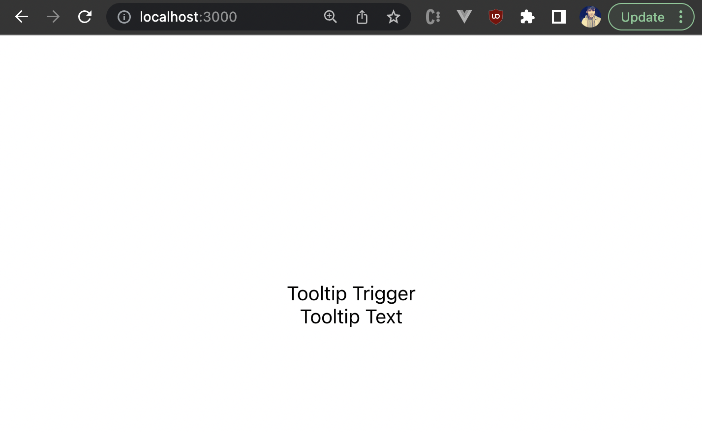
The tooltip is the interface that appears on that trigger element with some text or icon inside it. Hence, we’ll create two nested <div> inside our tooltip component. The outer <div> represents the trigger of the tooltip. The inner <div> is the actual tooltip. Here’s the basic HTML template for our tooltip:
import './Tooltip.css';
export default function Tooltip(){
return(
<div className="tooltip-trigger">
Tooltip Trigger
<div className='tooltip'>
Tooltip Text
</div>
</div>
)
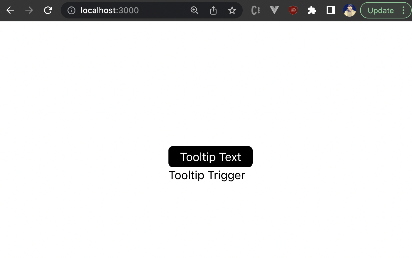
}Code language: HTML, XML (xml)At this point, this should simply render two nested containers with some text, as shown below:
Showing the tooltip on hover
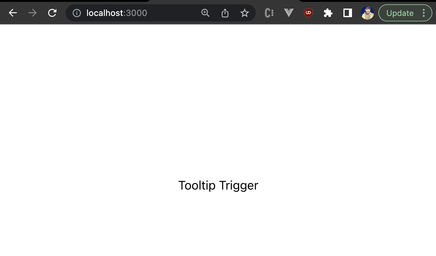
Next, let’s first hide the tooltip initially. For that, we’ll go to the Tooltip.css file and add the following styles:
.tooltip-trigger .tooltip{
    opacity: 0;
}Code language: CSS (css)
We’ve set the tooltip’s opacity to 0 initially. Now only the tooltip trigger should be visible to you:
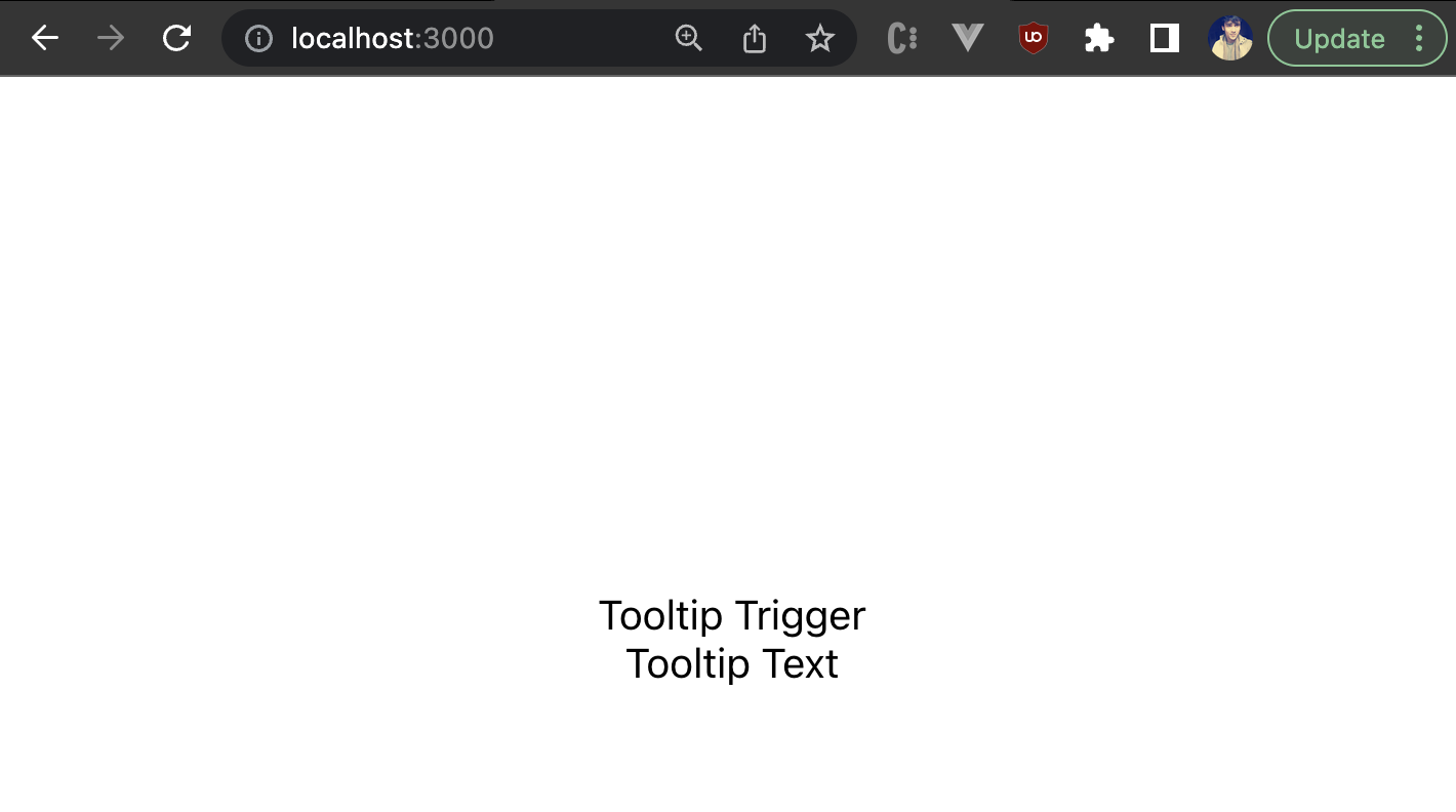
Great! Now we can set the opacity of the tooltip back to 1 on hover using the hover selector:
.tooltip-trigger:hover .tooltip {
opacity:1;
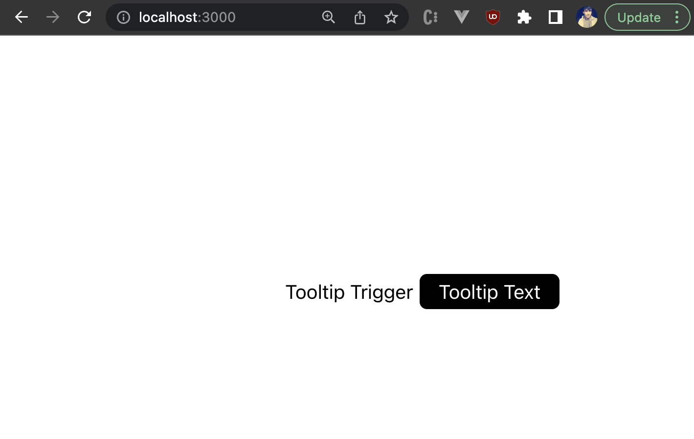
}Code language: CSS (css)Now if you hover over the trigger, you should see the tooltip text underneath it:
Once you remove your mouse from the trigger, the tooltip text should go away. These are the basics of how you can show and hide the tooltip on hover. But the tooltip doesn’t really look like a tooltip yet. So let’s go ahead and style it, and also understand how we can position it with respect to the trigger element.
Styling the tooltip
We need to position the tooltip relative to the trigger. So first, we’ll set the position of the trigger to be relative and also set its display as inline:
.tooltip-trigger {
    position: relative;
    display: inline;
}Code language: CSS (css)
Next, we’ll give some styles to the tooltip element itself:
.tooltip-trigger .tooltip{
    width: 100%;
    background-color: black;
    color: #fff;
    text-align: center;
    border-radius: 6px;
    padding: 5px;
    opacity: 0;
    transition: opacity 1s;
    position: absolute;
    z-index: 1;
}Code language: CSS (css)
We’ve set a 100% width for the tooltip because we want it to expand its size according to the content inside it. You can also give it a max-width if you’d like. For this example, we’ll create the common black tooltip with white text, but you can change the colors. Then, we’ll also give it some padding and border-radius. The position: absolute property will help us position the tooltip relative to the trigger element however we like. You can read about the position property to learn more.
Let’s see how our tooltip looks now:
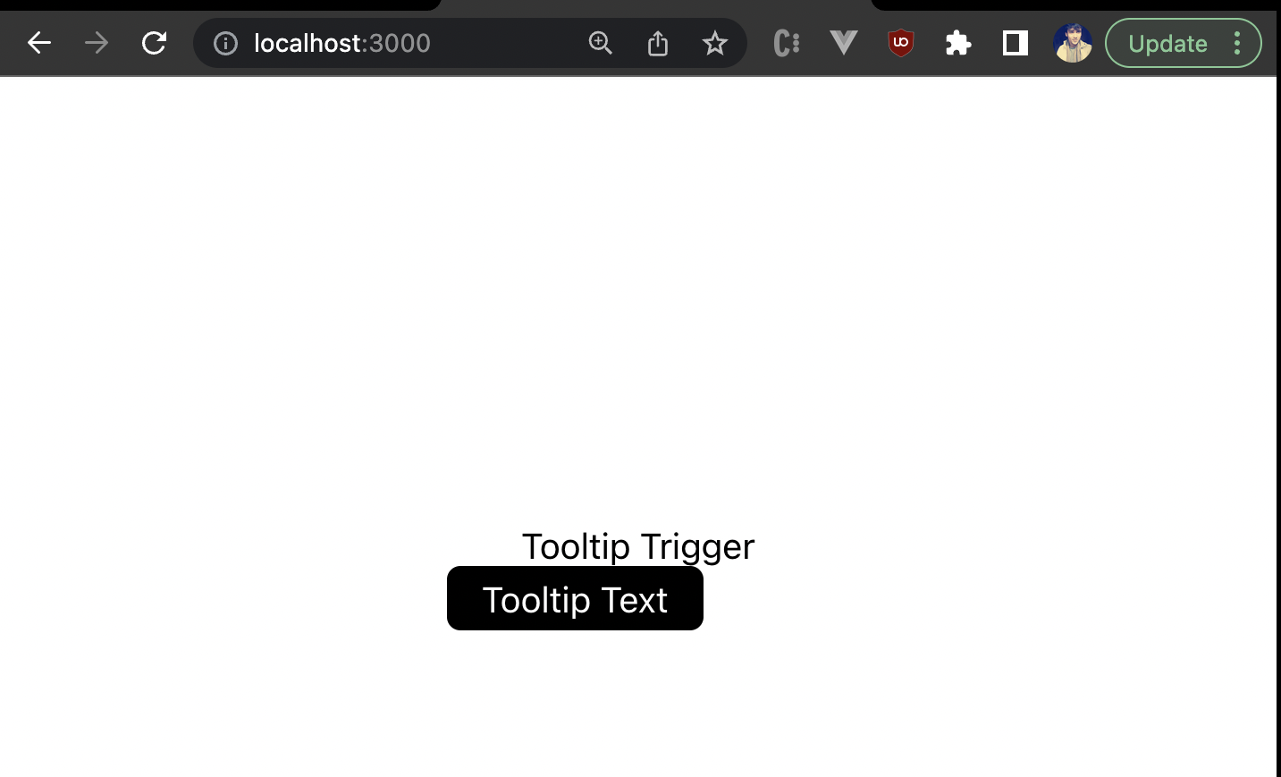
Now it looks more like a tooltip! However, its positioning is a little off. But where should you position it?
Positioning the Tooltip
We need to add some dynamic behavior to the position of the tooltip. For simplicity, let’s look at four common positions:
- Top
- Bottom
- Left
- Right
We’ll create four classes that position the tooltip to the top, left, bottom, and right of the trigger element. So add the following styles in the Tooltip.css file:
.tooltip-right{
    top: -5px;
    left: 105%;
}


.tooltip-left{
    top: -5px;
    right: 105%;
}

.tooltip-top{
    bottom:105%;
    left:0%;
}

.tooltip-bottom{
    top:105%;
    left:0%;
}Code language: CSS (css)
Let’s say we want to position the tooltip to the right of the trigger. Using .tooltip-right gives the tooltip a left position of 105%, which means the tooltip is positioned at a point that is 5% more than the length of the trigger. Similarly, we can position it to the left, top, and bottom as well. But how do we dynamically add a specific position class?
We can take a position prop in our tooltip component and use that in the class assignment of the tooltip container:
import './Tooltip.css';
export default function Tooltip({
position="top",
}){
return(
<div className="tooltip-trigger">
Tooltip Trigger
<div className={`tooltip tooltip-${position}`}>
Tooltip Text
</div>
</div>
)
}
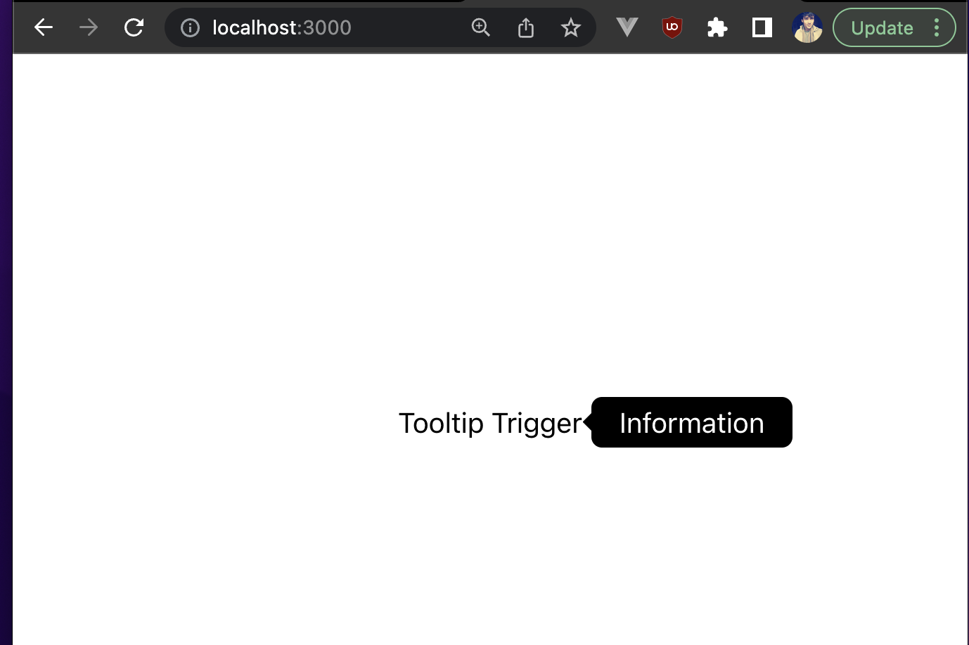
Code language: HTML, XML (xml)Now let’s go back and see what the tooltip looks like:
Let’s also see what the right positioning looks like by setting the position prop to right:
Great! We’ve also learned how to position the tooltip correctly relative to the trigger.
Adding arrow indicators
We can also use some CSS to create an arrow indicator on the tooltip based on its position. To do this, we’ll target the tooltip position class’s ::after selector because the arrow needs to be oriented according to the position of the tooltip. The ::after is a pseudo-selector that can be used to add some content to an element after its own element. There are other pseudo-selectors or pseudo-classes in CSS that have their own specific purposes and are used in different use cases.
We’ll give it an absolute position and then position it with respect to the tooltip element itself. Here are the CSS classes for each tooltip position that creates a dialog like arrow on the tooltip:
.tooltip-trigger .tooltip-top::after {
    content: " ";
    position: absolute;
    top: 100%;
    left: 50%;
    margin-left: -5px;
    border-width: 5px;
    border-style: solid;
    border-color: black transparent transparent transparent;
}


.tooltip-trigger .tooltip-bottom::after {
    content: " ";
    position: absolute;
    bottom: 100%;
    left: 50%;
    margin-left: -5px;
    border-width: 5px;
    border-style: solid;
    border-color: transparent transparent black transparent;
}


.tooltip-trigger .tooltip-right::after{
    content: " ";
    position: absolute;
    top: 50%;
    right: 100%;
    margin-top: -5px;
    border-width: 5px;
    border-style: solid;
    border-color: transparent black transparent transparent;
}


.tooltip-trigger .tooltip-left::after{
    content: " ";
    position: absolute;
    top: 50%;
    left: 100%;
    margin-top: -5px;
    border-width: 5px;
    border-style: solid;
    border-color: transparent  transparent transparent black;
}Code language: CSS (css)
And now you should see a small arrow indicator on the tooltip:

Awesome! Now let’s see how we can use some props to make this tooltip component more reusable.
Reusability
If you notice, we’ve hardcoded the tooltip text up to this point. This won’t be possible in a real-world application. You’d want different tooltips to have different text. So let’s take a prop called tooltipText that we can use instead of hardcoding the tooltip text:
import './Tooltip.css';

export default function Tooltip({
    tooltipText="Tooltip Text",
    position="right",
}){
    return(
        <div className="tooltip-trigger">
            Tooltip Trigger
            <div className={`tooltip tooltip-${position}`}>
                {tooltipText}
            </div>
        </div>
    )
}Code language: JavaScript (javascript)
Then we can pass this prop from App.js, where we’re rendering this component:
import React from 'react'
import Tooltip from './tooltip/Tooltip'
import './App.css'

function App() {
  return (
    <div className="app">
      <Tooltip
      position="top"
      tooltipText="Information"
      />
    </div>
  )
}

export default AppCode language: JavaScript (javascript)
And that should render the new tooltip text as shown below:
Cool! On that note, let’s also make the tooltip trigger dynamic. At this point, we’ve hardcoded it in the tooltip component. What we want is basically our own UI that we wrap our tooltip component around, which can be rendered and act as the tooltip trigger. To achieve this, we can use special props called children in React. Here’s how the tooltip component would be updated:
import './Tooltip.css';

export default function Tooltip({
    children,
    tooltipText="Tooltip Text",
    position="right",
}){
    return(
        <div className="tooltip-trigger">
            {children}
            <div className={`tooltip tooltip-${position}`}>
                {tooltipText}
            </div>
        </div>
    )
}Code language: HTML, XML (xml)
And now we can pass any UI while rendering the tooltip component:
import './App.css';
import Tooltip from './tooltip/Tooltip';

function App() {
  return (
    <div className="app">
      <Tooltip
        tooltipText="Information"
      >
        <button>Tooltip Button</button>
      </Tooltip>
    </div>
  );
}

export default App;
Code language: JavaScript (javascript)
And that should render a custom tooltip trigger as shown:
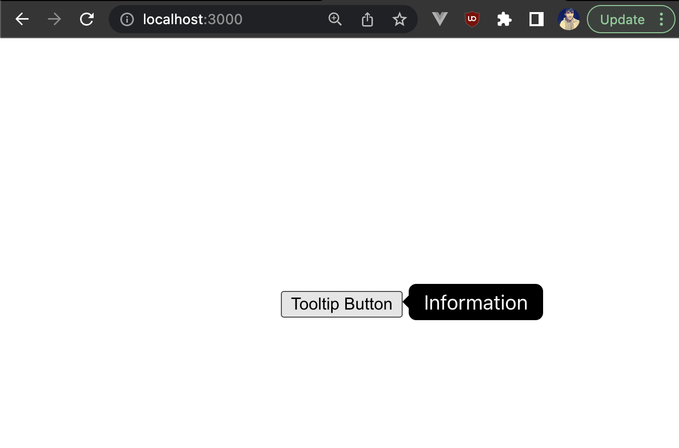
Great! We’ve built our own custom and reusable tooltip component from scratch. However, there are still a lot of use cases for which this tooltip component will need additional props for customization, such as triggering the tooltip on a click, rendering some custom template against the hardcoded tooltip template, or modifying the colors of the tooltip.
Instead of building all these use cases from scratch on your own, let’s see how we can use a popular tooltip library called Tippy.js.
How to use Tippy.js for tooltips in React
First, install the React version of Tippy by running the following command:
npm i @tippyjs/reactCode language: CSS (css)Now we’ll create a new a new folder tippy-tooltip in the src folder and a component inside the folder called TippyTooltip.
We’ll start by importing the main Tippy component from the library, along with the built-in styles they provide. You can skip the styles if you want to fully customize how you want the tooltip to look. Then, we pass the tooltip itself to the content prop of the Tippy component. Finally, we render the tooltip trigger UI wrapped inside the Tippy component as shown below:
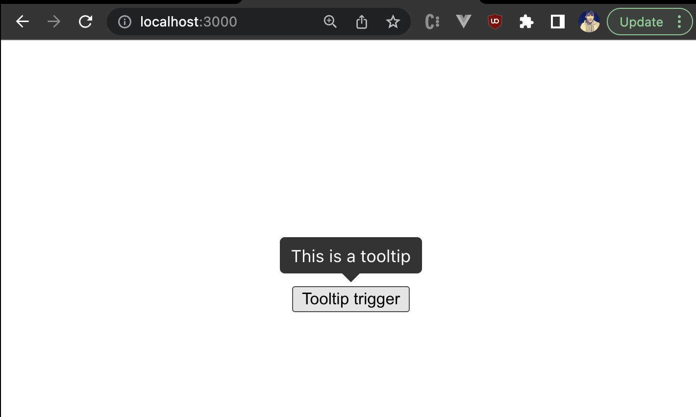
import Tippy from '@tippyjs/react';
import 'tippy.js/dist/tippy.css';


export default function TippyTooltip(){
    return(
        <Tippy content={<span>This is a tooltip</span>}>
            <button>Tooltip trigger</button>
        </Tippy>
    )
}Code language: JavaScript (javascript)
Notice that the content prop can take HTML templates instead of just strings. This is more useful than what we had built in the earlier section because it gives us more flexibility with the overall interface design of the tooltip. Now let’s render our TippyTooltip component inside App.js:
import './App.css';
import TippyTooltip from './tippy-tooltip/TippyTooltip';

function App() {
  return (
    <div className="App">
      <TippyTooltip/>
    </div>
  );
}

export default App;Code language: JavaScript (javascript)
You should now be able to see a nice-looking tooltip by Tippy as shown:
It looks very similar to what we made but definitely looks better!
You can play with the tooltips built in this article in the sandbox:
React Tooltip: Final thoughts
We’ve walked through how to build your own custom tooltip in React from scratch. We’ve also shown you how we can use a popular tooltip library like Tippy to quickly create and use a tooltip in your React application.
There’s a lot more you can do from here. If you wish to explore the custom tooltip component we built, you can try adding more features and functionalities to it, such as rendering the tooltip on click or passing a custom tooltip template instead of a string. You can also explore other props and features of Tippy. Or maybe dive deeper into React and learn to build something cool like a photo editor.
Finally, if you wish to play around with the source used in this tutorial, you can check out the code.
This post was written by Siddhant Varma. Siddhant is a full stack JavaScript developer with expertise in frontend engineering. He’s worked with scaling multiple startups in India and has experience building products in the Ed-Tech and healthcare industries. Siddhant has a passion for teaching and a knack for writing. He’s also taught programming to many graduates, helping them become better future developers.