Understanding the CSS Position Property and How It Works With Example
When using HTML to build web pages, elements are arranged after each other vertically by default. You will always want to add styling to either change your page’s layout or organize its elements so that elements can be positioned horizontally on your screen. This is possible with CSS flexbox and CSS grid. However, more is needed to create stunning web pages.
The CSS position property fills in the blanks by allowing you to create an asymmetrical web page where you can place HTML elements wherever you want by detaching each element from the normal flow and other elements, making your web page more appealing and easy to navigate.
In this article, you will learn what the CSS position property means, how it works, the various values and how they can help you properly position items on your webpage.
What is the CSS position property?
As the name implies, the CSS position property is used to position an element on a web page. It specifies and lets you take an element from your web page’s normal flow layout and position it wherever you want it to be using other CSS properties like top, right, bottom, and left.
The position property has five values that perform different functions, all aimed at helping you position elements. This article will explain how these values work and their differences, making it easy for you to know where and when to use a particular value.
CSS position values
Here are the five CSS position values:
1. static
2. relative
3. absolute
4. fixed
5. sticky
selector {
  position: static | relative | absolute | fixed | sticky;
}Code language: CSS (css)
To get started, let’s make use of a parent div with five div elements and a paragraph to identify each div:
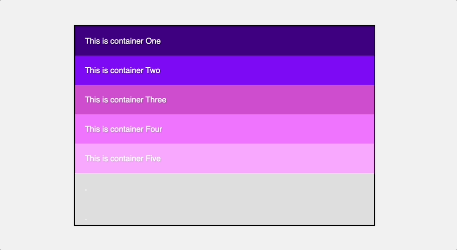
<div class="parent-container">
  <div class="div-item container1">
      <p>This is container One</p>
  </div>
  <div class="div-item container2">
      <p>This is container Two</p>
  </div>
  <div class="div-item container3">
      <p>This is container Three</p>
  </div>
  <div class="div-item container4">
      <p>This is container Four</p>
  </div>
  <div class="div-item container5">
      <p>This is container Five</p>
  </div>
</div>Code language: HTML, XML (xml)
Let’s style these divs to look like this.

CSS static position
The CSS static position is the default value for the position property. It is the position HTML elements have by default. This position value means that an element will follow based on the normal flow of the page and will follow the standard positioning rules as expected with or without any CSS styling.
This means when you do not apply the position property to an element, it is static, meaning most elements you work with are statically positioned. They are not affected by the top, right, bottom, left, and z-index properties.
In the example below, a position of static is applied to the second div container, but you will notice that it does not affect the element’s output.
.container2 {
  background-color: #7f0df4;
  position: static;
}Code language: CSS (css)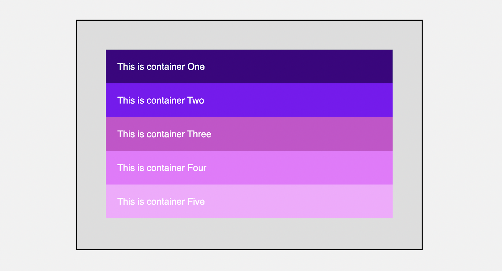
Nothing is exciting about this position value, but it is worth knowing that it exists 🙂. Let’s explore other position values that change an element’s position from the default position.
CSS relative position
The CSS relative position is used to position an element according to the normal flow of the webpage. This position value alone does nothing. For example, if you apply the position of relative to the third div container.
.container3 {
  background-color: #ce4dcd;
  position: relative;
}Code language: CSS (css)
There will be no change to the element and the entire elements in the web page because It works just like the static value with more advantages.

The advantage of using this property is that it gives you access to directional properties that you can use to move any element without affecting the offset position of the relative positioned element. These directional properties include top, left, right, bottom, and z-index. For example, you can move the element down and towards the right with the top and left properties.
.container3 {
  background-color: #ce4dcd;
  position: relative;
  top: 50px;
  left: 40px;
}Code language: CSS (css)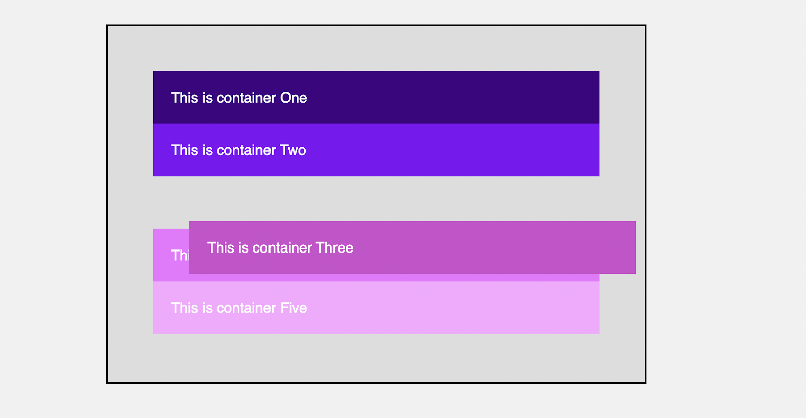
You’ll notice that the offset does not affect the surrounding elements because the space the element initially occupies is left empty. At this point, you can begin to ask yourself the use of the relative position.
Surprisingly, it is not particularly useful because you want to avoid a situation in which other elements are unaffected. This position value can be used to set the z-index or specify the stack order of an element, or it can be used as a container for an “absolutely” positioned element.
For example, in the preceding example, the third element is stacked on top of the fourth. Adding z-index alone to the fourth element will have no effect, but adding a relative position will allow you to stack the element on top of the third.
.container4 {
  background-color: #ef74ff;
  position: relative;
  z-index: 1;
}Code language: CSS (css)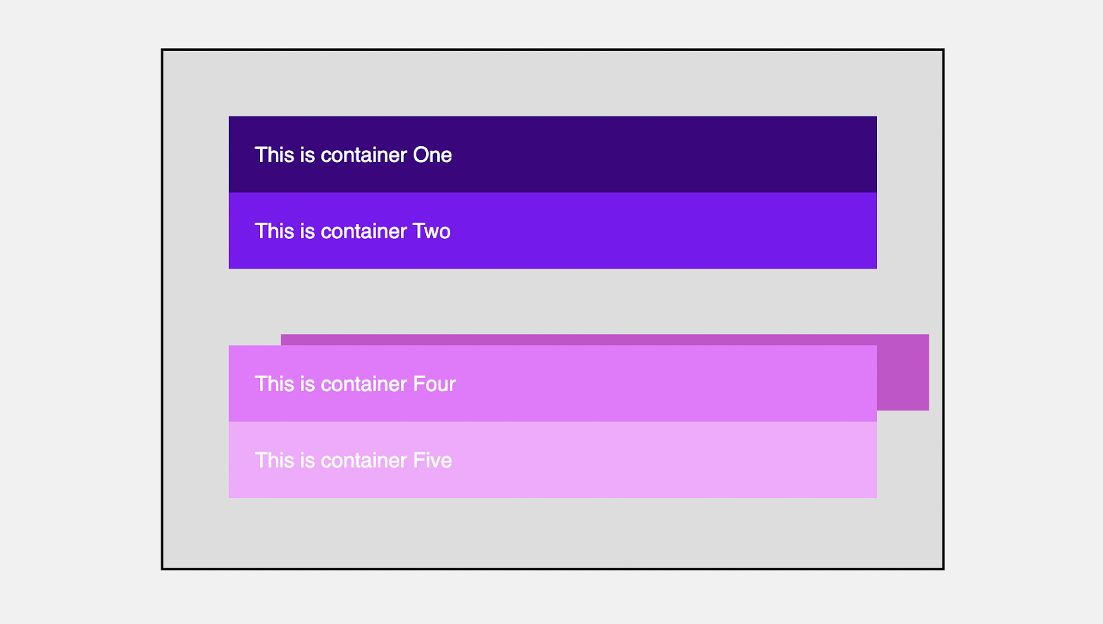
z-index property.CSS absolute position
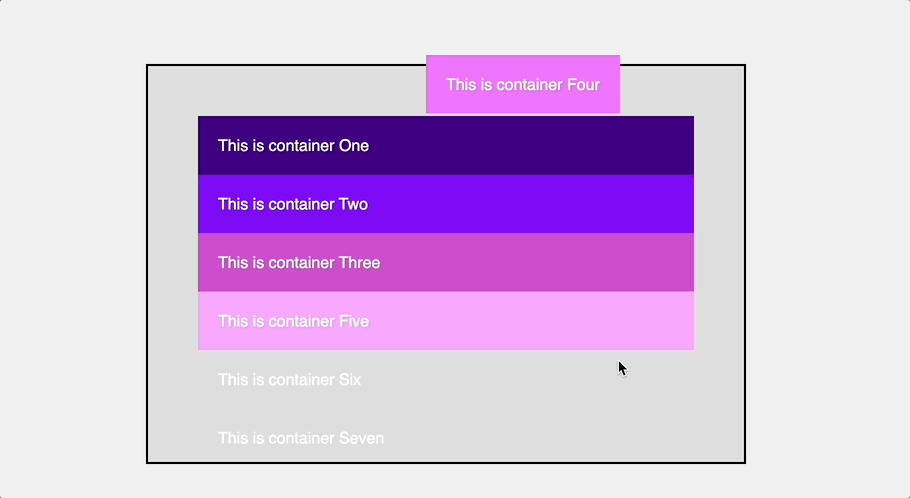
The absolute position is used to remove an element from the normal flow of a web page and then position it relative to the element’s nearest positioned ancestor (any element with a position value that is not static).
When an element has an absolute position, the elements around it act as if that element does not exist on the web page. Depending on how the elements were previously arranged, the element stays on top of one another and collapses the available space.
.container2 {
  background-color: #7f0df4;
  position: absolute;
}Code language: CSS (css)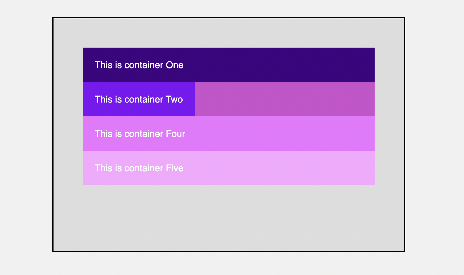
absolute position value causes the third element to take the place of the second.In the preceding example, the third element takes the place of the second element, leaving the second element to linger. You’ll also notice that the element is no longer the full width. This is because absolute positioned elements have the width set to auto.
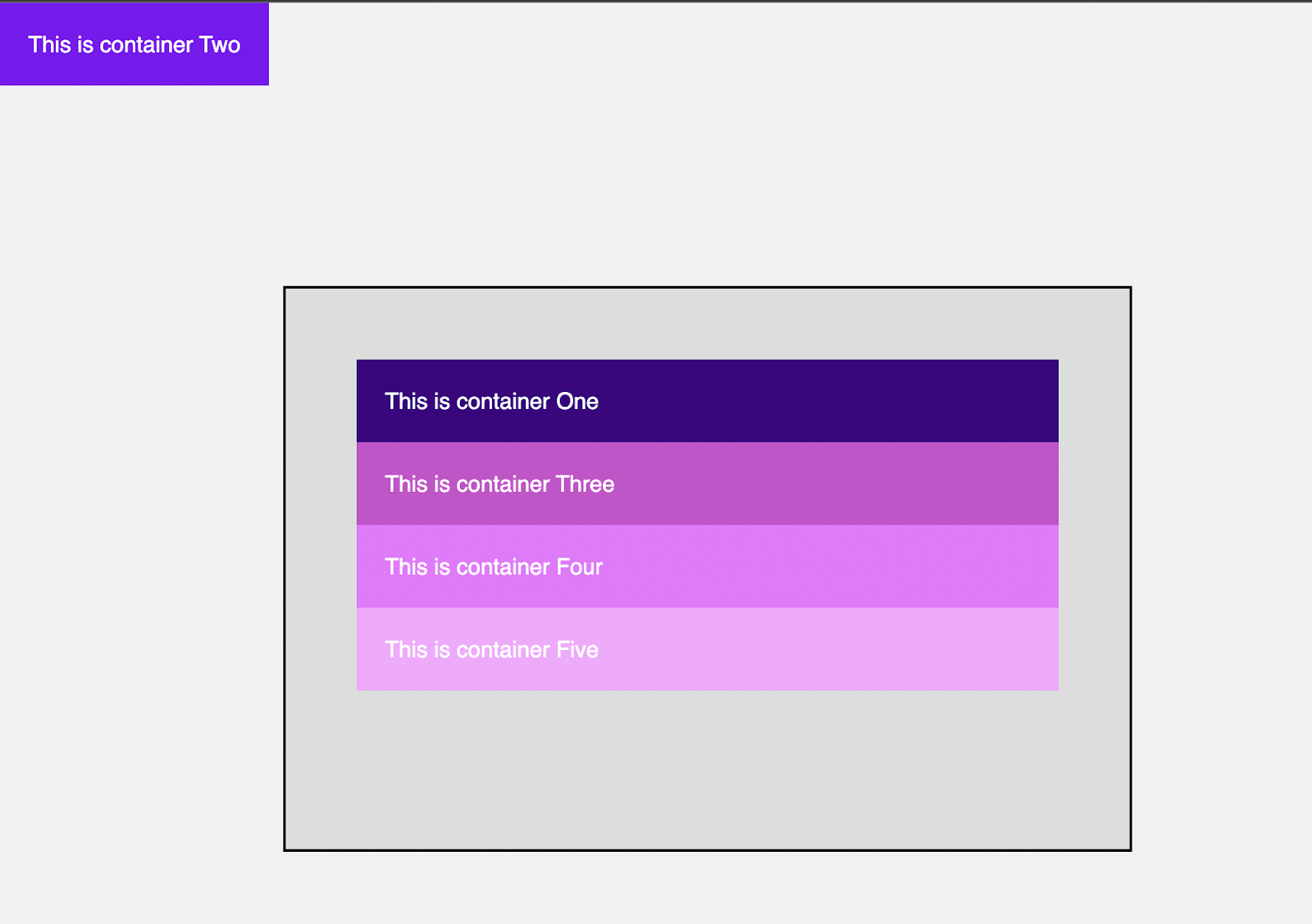
The absolutely defined element can now be positioned using directional properties such as top, left, right, and bottom. It is also important to understand that this element will be positioned closest to the ancestor. This means that the parent container should be relative to serve as a positioned ancestor.
.parent-container {
  // ...
  background-color: #ddd;
  border: 2px solid #000;
  position: relative;
}

.container2 {
  background-color: #7f0df4;
  position: absolute;
  top: 0;
  left: 0;
}Code language: CSS (css)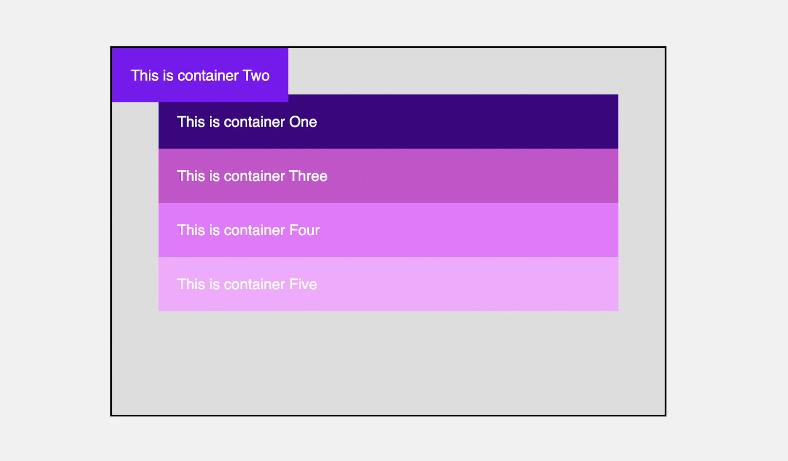
top and left properties.Because the top and left positions were set to the starting point, the element is now positioned at the top of the container. You can use this to place an element in the center or at a specific location on your website.
If the parent container is not set to a relative position, the element will be positioned at the top left of the next positioned ancestor, which is now the body of the entire page.
CSS fixed position
As the name implies, this fixed position is used to fix an element to a specific position of your web page. It removes an element from the normal flow of the web page and positions it relative to the viewport (the part of the document visible in your browser) rather than the nearest positioned ancestor as absolute.
.container4 {
  background-color: #ef74ff;
  position: fixed;
}Code language: CSS (css)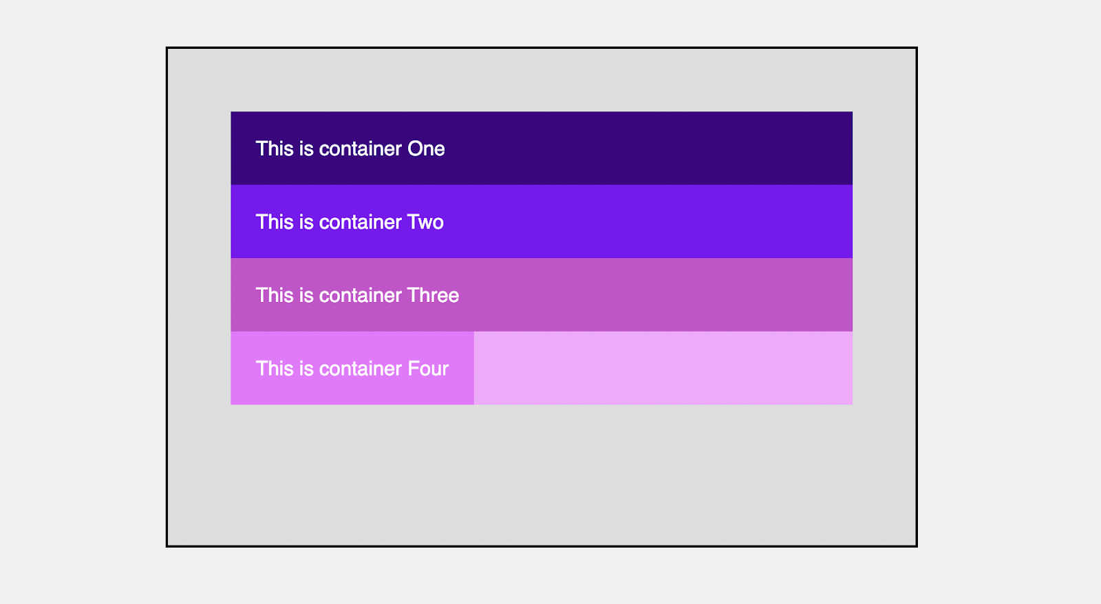
You will use directional properties to specify a position you want the element to be positioned.
.container4 {
  background-color: #ef74ff;
  position: fixed;
  top: 50%;
  left: 0;
}Code language: CSS (css)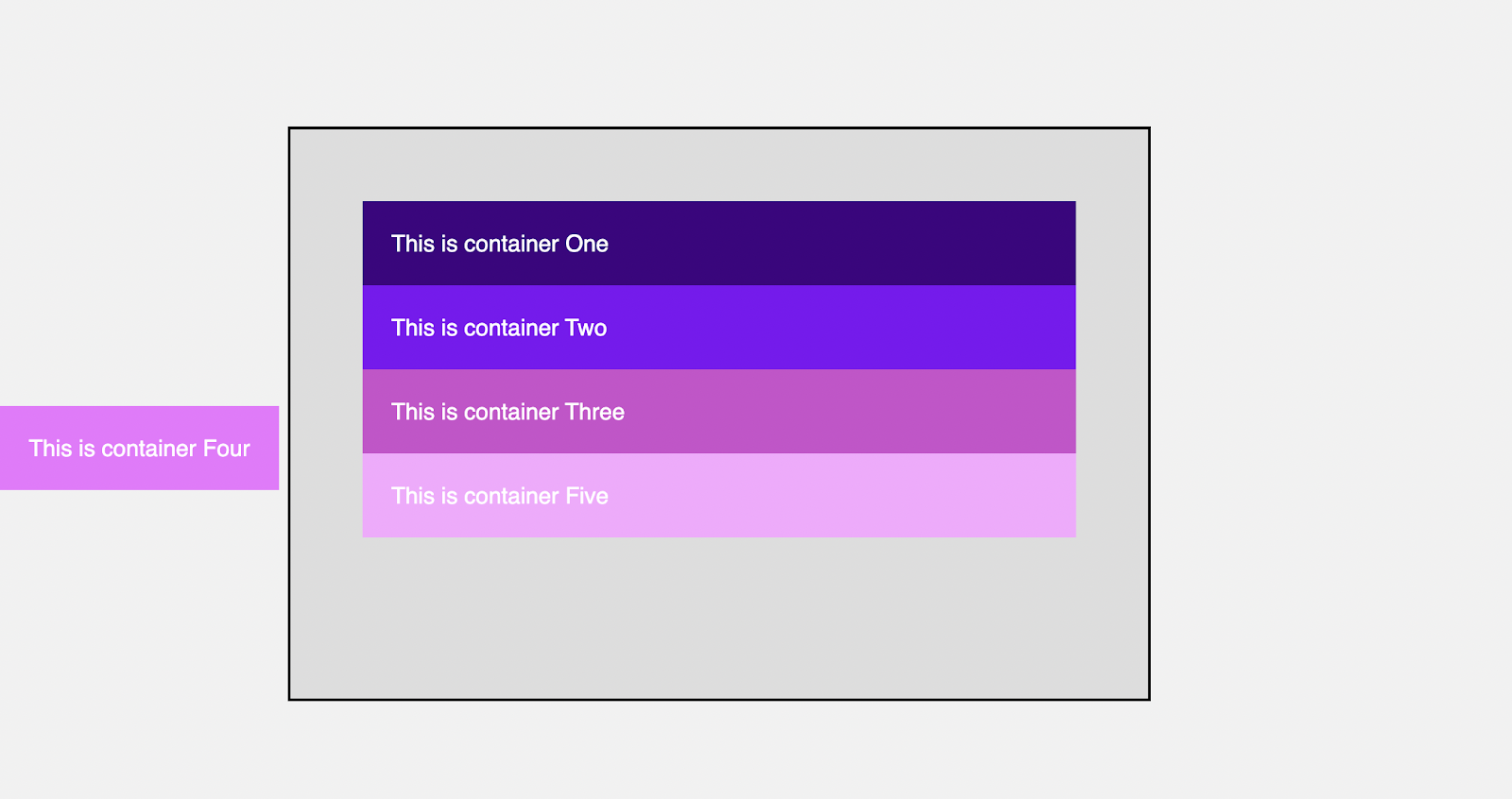
This is mostly used when you want to move a button to the bottom of your page, such as the scroll up button. You can use the fixed position if you also want to fix the nav bar to the top of the webpage screen.
When you position an element to be fixed, it will remain in that position even if you scroll through the page, distinguishing it from the absolute position. It also does not leave a blank space as position relative does.
CSS Sticky Position
The sticky position is very superb. It is a combination of static and fixed positions. This is because an element will remain in the normal flow of the web page as you scroll until it gets to the specified position, then it becomes fixed.
.container3 {
  background-color: #ce4dcd;
  position: sticky;
  top: 0;
}Code language: CSS (css)
In the example above, all elements will scroll normally until the third element reaches the parent element’s top. It then sticks. It behaves like a static element until it gets to a specified position; then, it becomes fixed and appears to stick to that spot.
ℹ️ For sticky positioning to work, You must specify at least one of the top, right, bottom, or left properties.
This is perfect when you have a navbar positioned after your hero section and will like to stick to the top when a user scrolls to the top of the screen. Also, when you have a list of elements with separate headers which you want to stick as the user scrolls, you can achieve this with the sticky position.
position property values.Here is a demo that shows the use of all position values.
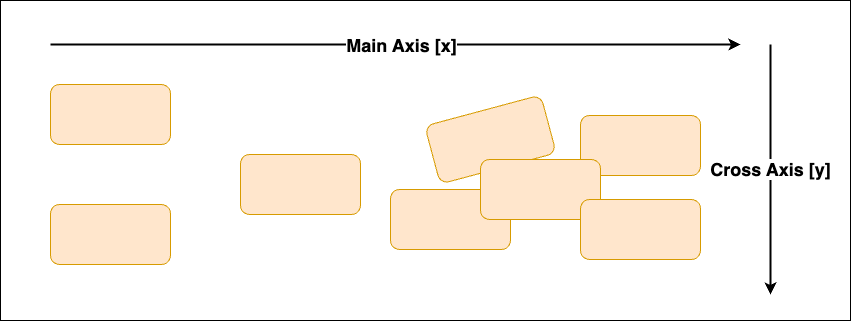
Distinguishing between the position property and CSS layout systems
The CSS flexbox and grid are layout systems that you can use to define basic and complex layouts. But you can’t place these elements anywhere you wish because you’re limited around the main (X) and cross (Y) Axis.
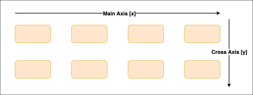
With the CSS position property, you can place your content anywhere you wish by detaching each element from the other elements. In other words, you can move elements freely around your screen as you are not restricted to any axis.
Wrapping up
In this article, you have learned about position property, how it works, and its various values. You have also learned the differences between these values, so you know when to use a particular CSS position property and its value.
Have fun coding!
I’m Joel Olawanle, a frontend developer and technical writer interested in making the web accessible to everyone by always looking for ways to give back to the tech community. Follow me and connect with me on Twitter.