How to Build a Photo Editor With React and CSS Filters

CSS is the language used to control the style of a web document in a simple and easy way. It helps makes a web application look more presentable and visually appealing.
In a world of constant development and evolution, especially in the software engineering world, CSS isn’t left behind; it now includes new features that allow developers to apply effects that previously would only seem possible with graphics applications such as Adobe. These new features are “CSS Filters,”which we recently covered in-depth on our blog.
Text, photos, and other aspects on a webpage can have visual effects applied to them using CSS filters. We can access effects like color, blur, and shifting on an element’s rendering before the element is displayed, thanks to the CSS filter property.
In this article, we will build a photo editor using React and some CSS filters.
Specifically, in this article we’ll learn how to:
- Understand the CSS filter properties with a quick recap
- Set up our React project and start building out our application
- Set up the JSX structure for our project.
- Style our project using standard CSS. This includes our project sidebar.
- Make our sidebar, containing our CSS filters, responsive using JavaScript.
- Add some functionality to our slider using JavaScript
- See the final app in action
A quick recap of 11 CSS filter properties
Let’s look at some of the CSS Filter properties and what they do:
- blur():
blur()applies the blur effect to an element. If the blur value is not specified then it takes in0as the default value.
The result when adjusted to 70% blur:

- brightness():
brightness()controls how bright the element is. It is completely black at0%brightness, and it is identical to the original at 100% brightness. Elements are brighter when the values are higher than100%.
The result when adjusted to 99% brightness:

- contrast():
contrastaids in adjusting an element’s contrast. When the contrast is0%, an element is completely black; when it is100%, it shows the original element.
The result when adjusted to 70% contrast:

- grayscale(): The colors of an element are changed to black and white in a grayscale. The grayscale
0%represents the original element, while100%grayscale displays the element in grayscale entirely. Values ofgrayscalein between0%and100%are a mix of grayscale and color. Negative values are not accepted by grayscale.
The result of 100% grayscale:

- hue-rotate(): The image is given a different color rotation with
hue-rotate(). The value specifies how many degrees the picture samples will be rotated around the color circle. The default value of 0 degrees represents the original image.
The result when adjusted to 70% hue-rotate:

- sepia():
sepia()transforms an image into a sepia image, where100%of the image is sepia and 0% is the original image.
The result when adjusted to 70 sepia:

- saturate(): To control an element’s saturation,
saturate()is used.100%saturate represents the original element, while0%saturate denotes an element that is entirely unsaturated. An element that is super-saturated has a value greater than100%.
The result when adjusted to 100 saturate:

Other CSS filters include:
- invert(): The element is reversed by
invert(). The default value of 0% represents the initial image. The image is entirely inverted when the percentage is100%. Negative values are not recognized byinvert.
- opacity(): The image’s opacity effect is controlled by
opacity(). When an element has0%opacity, it is fully transparent; when it has100%opacity, the original element is displayed. A negative value is not recognized by this filter.
- drop-shadow():
drop-shadow()gives the element a drop shadow appearance. It accepts the valuesblur,spread,color,h-shadow, andv-shadow. It can be applied to shapes as well as images because it can have the same shape as the original. The shadow will be moved to the left of the image by the negative values for theh-shadowandv-shadow.
- url(): In order to apply some effects to an HTML element, the url filter uses a string value linking to an SVG filter element.
To learn more about CSS Filter properties with more in-depth practical examples, check out our article titled “Everything You Need to Know about All 11 CSS Filters”.
Set up a React project
The first thing we want to do in order to create our CSS-filter-powered photo editing application is to create a React project. We can do this by running the following command on our terminal:
npx create-react-app my-editorThis will automatically install all the dependencies needed to run a React app, and build a React project. To run your newly installed React app on your browser, run the npm start command. This is what it will look like in the browser:
Build out the HTML using a bit of JSX
Let’s get started on adding in photo editing functionality to our newly generated React app by writing out some JSX for our application. The first thing we want to do is head into our App.js file and edit the code to look like this:
import React from 'react';
import './App.css';
import Slider from './Slider'
function App() {
  return (
    <<strong>div</strong> className='container'>
      <<strong>div</strong> className='main-image' />
      <<strong>div</strong> className='sidebar'>

      </<strong>div</strong>>
      <<strong>Slider</strong> />
    </<strong>div</strong>>
  );
}
export default App;Code language: PHP (php)
Here, we have created a div for our container, main-image, and sidebar. We’ll style these classes in the next section.
After this, we created a Slider.js custom component and included the following code:
import React from 'react';
export default function Slider() {
    return (
        <<strong>div</strong> className='slider-container'>
            <<strong>input</strong> type='range' ClassName='slider' />
        </<strong>div</strong>>
    )
}Code language: PHP (php)
Within the Slider component we added an input to act as our slider. We did that by creating a div with a className of slider-container and, inside our container, added the expected input element. This is what it looks like when you run the code:
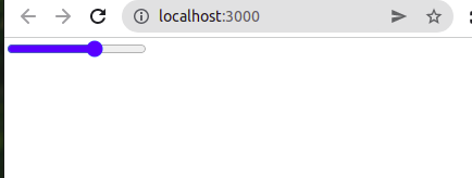
Now we have a slider for our project that we can use later.
Style an app sidebar with CSS
Let’s do some styling in our App.css file. In our App.css file, we’ll include the following code:
*::before, *::after {
  box-sizing: border-box;
}
body {
  margin: 0;
}
.container {
  display: grid;
  grid-template-columns: 1fr auto;
  grid-template-rows: 1fr auto;
  grid-template-areas:
    "image sidebar"
    "slider sidebar";
  height: 100vh;
  width: 100vw;
  background-color: #DADADA;
}
.main-image {
  grid-area: image;
  background-image: url("https://coderpad.io/wp-content/themes/coderpad/assets/logos/coderpad.svg");
  width: 100%;
  height: 100%;
  background-position: top center;
  background-size: contain;
  background-repeat: no-repeat;
}
.sidebar {
  grid-area: sidebar;
  background-color: pink;
}
.slider-container {
  grid-area: slider;
  margin-top: 2rem;
  padding: 2rem;
}
.slider {
  width: 100%;
  cursor: pointer;
}Code language: CSS (css)
In this code snippet, we first set our margin to 0, to remove any margin from our body. Then we styled the rest of our project to make sure our image takes as much space as possible while everything else is pushed to the side.
The image below shows the result of the CSS above:

Sidebar
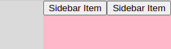
Before we style our sidebar, we need to actually put some content inside of it. To do that, we’ll first create a SidebarItem component in our App.js file:
function App() {
  return (
    <<strong>div</strong> className='container'>
      <<strong>div</strong> className='main-image' />
      <<strong>div</strong> className='sidebar'>
        <<strong>SidebarItem</strong> />
        <<strong>SidebarItem</strong> />
      </<strong>div</strong>>
      <<strong>Slider</strong> />
    </<strong>div</strong>>
  );
}
export default App;Code language: PHP (php)
Then we’ll create a SidebarItem.js component in our src folder, where we can include the following code:
import React from 'react'
export default function SidebarItem() {
    return(
        <<strong>button</strong> className='sidebar-item'>Sidebar Item</<strong>button</strong>>
    )
}Code language: JavaScript (javascript)
This is the result in the image below:
Sidebar CSS
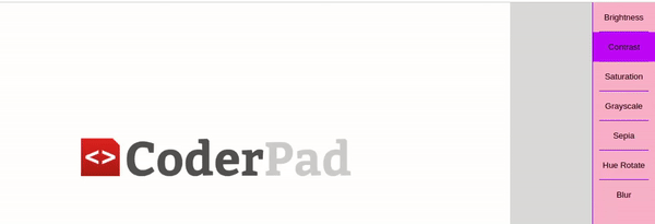
OK! Now to style our sidebar. Let’s head into our App.css file again to make the following changes:
.sidebar {
  grid-area: sidebar;
  background-color: pink;
  border-left: 1px solid hsl(265, 100%, 56%);
  display: flex;
  flex-direction: column;
  align-items: stretch;
}
.sidebar-item {
  cursor: pointer;
  border: none;
  outline: none;
  background-color: pink;
  padding: 1rem;
  position: relative;
  transition: background-color 150ms;
}
.sidebar-item:hover, .sidebar-item:focus {
  background-color: hsl(265, 100%, 76%);
}
.sidebar-item::after {
  content: ' ';
  position: absolute;
  width: 80%;
  left: 10%;
  bottom: 0;
  height: 1px;
  background-color: hsl(265, 100%, 46%);
}
.sidebar-item:last-child::after {
  display: none;
}Code language: CSS (css)
Using the above CSS, we styled our sidebar to give us the result in the GIF below:

Add in sidebar functionality with React
Now that we’ve gotten styling out of the way – let’s get going on the fun part: where we add in different controls for CSS Filter options. To get started, we’ll first write some code in our App.js file:
import React, {useState, useMemo} from 'react';
import './App.css';
import Slider from './Slider'
import SidebarItem from './SidebarItem'

const getDefaultOptions = () => [
  {
    name: 'Brightness',
    property: 'brightness',
    value: 100,
    range: {
      min: 0,
      max: 200
    },
    unit: '%'
  },
  {
    name: 'Contrast',
    property: 'contrast',
    value: 100,
    range: {
      min: 0,
      max: 200
    },
    unit: '%'
  },
  {
    name: 'Saturation',
    property: 'saturate',
    value: 100,
    range: {
      min: 0,
      max: 200
    },
    unit: '%'
  },
  {
    name: 'Grayscale',
    property: 'grayscale',
    value: 0,
    range: {
      min: 0,
      max: 100
    },
    unit: '%'
  },
  {
    name: 'Sepia',
    property: 'sepia',
    value: 0,
    range: {
      min: 0,
      max: 100
    },
    unit: '%'
  },
  {
    name: 'Hue Rotate',
    property: 'hue-rotate',
    value: 0,
    range: {
      min: 0,
      max: 360
    },
    unit: 'deg'
  },
  {
    name: 'Blur',
    property: 'blur',
    value: 0,
    range: {
      min: 0,
      max: 20
    },
    unit: 'px'
  }
];
function App() {
  const [selectedOptionIndex, setSelectedOptionIndex] = useState(0)
  const [options, setOptions] = useState(getDefaultOptions())
  const selectedOption = options[selectedOptionIndex]
  return (
    <div className='container'>
      <div className='main-image' />
      <div className='sidebar'>
        {options.map((option, index) => {
          return (<SidebarItem
            key={index}
            name={option.name}
            active={index === selectedOptionIndex}
            handleClick={() => setSelectedOptionIndex(index)}
          />
          )
        })}
      </div>
      <Slider />
    </div>
  );
}
export default App;Code language: JavaScript (javascript)
First, we create a variable DEFAULT_OPTIONS , then we set it to an array of objects. These objects define each one of our buttons, with each of them containing the names of the CSS filter we are using for the project. For each of our objects, there is a property field that is set to a CSS filter name, and this is what it corresponds to in CSS.
We also have our default value, the range which is essentially the min and max of our slider, then we have our unit for each CSS filter object.
Next, we’ll take our const DEFAULT_OPTIONS, and turn them into an options object we can use in React, and modify it. We’ll also edit our sidebar.js file to look like this:
import React from 'react'
export default function SidebarItem({ name, active, handleClick  }) {
    return(
        <<strong>button</strong>
        className={`sidebar-item ${active ? 'active' : ''}`}
        onClick={handleClick}
        >
            { name }
            </<strong>button</strong>>
    )
}Code language: PHP (php)
Here, we’re taking the name from the props in our App.js file like this; { name }. Below are the results of our code above:
Make the CSS filter input slider functional
Now we’ll look at how to make our slider correspond with our active value. In our App.js file, we’ll include the following code:
<Slider
        min={selectedOption.range.min}
        max={selectedOption.range.max}
        value={selectedOption.value}
        handleChange={handleSliderChange}
      />Code language: HTML, XML (xml)
In our Slider, we passed in different props than we had previously, which in our case is the min, max, value, and handleChange. Then, inside of App, we created a function to handle changes in selected options for us:
function App() {
  const [selectedOptionIndex, setSelectedOptionIndex] = useState(0)
  const [options, setOptions] = useState(DEFAULT_OPTIONS)
  const selectedOption = options[selectedOptionIndex]


  function handleSliderChange({ target }) {
    setOptions(prevOptions => {
      return prevOptions.map((option, index) => {
        if (index !== selectedOptionIndex) return option
        return { ...option, value: target.value }
      })
    })
  }Code language: JavaScript (javascript)
Now that we have our function created, we are passing all the needed values down to our Slider. Now, in our slider.js file let’s use these new values. To do this, we’ll add the following code:
import React from 'react'
export default function Slider({ min, max, value, handleChange}) {
  return (
    <<strong>div</strong> className="slider-container">
      <<strong>input</strong>
        type="range"
        className="slider"
        min={min}
        max={max}
        value={value}
        onChange={handleChange}
      />
    </<strong>div</strong>>
  )
}Code language: PHP (php)
We now have the results below:

As shown in the example above, when we change these different values, it updates the values of the filter selected internally.
While this is great progress, it’s not yet applying those CSS filters to the image itself. Let’s fix that.
The final product: Apply CSS filters to an image
All that is left to do to make our image editor functional is take all the values and add them to our image and do the filtering for us:
<strong>const</strong> getImageStyle = useMemo (<strong>function</strong> <strong>getImageStyle</strong>() {

<strong>const</strong> filters = options.map(option => {
    <strong>return</strong> `${option.property}(${option.value}${option.unit})`
  }
)

  <strong>return</strong> { filter: filters.join(' ') }
}, [options])


console.log(getImageStyle)

  <strong>return</strong> (
    <div className='container'>
      <div className="main-image" style={getImageStyle} />
      <div className='sidebar'>
        {options.map((option, index) => {
          <strong>return</strong> (<SidebarItem
            key={index}
            name={option.name}
            active={index === selectedOptionIndex}


  handleClick={() => setSelectedOptionIndex(index)}
        />
        )
      })}Code language: HTML, XML (xml)
In our App.js file, we first create a const getImageStyle = useMemo, which is going to contain the style we apply to our image. In our function, we created our const filters = options. map. This map loops through all of our options to get them converted to a usable CSS property.
We are now done with our demo photo editor app with React and CSS Filters.
Take a look at the practical results.
Here’s us modifying Brightness, Contrast, and Saturation:

Now here’s an example of us modifying the Grayscale, Sepia, Hue Rotate, and Blur:

Try out the photo editor in the sandbox below:
Wrapping up
Wow! We’ve learned quite a bit just by creating a simple photo editing application that uses CSS filters to apply different effects to an image.
If you want to see the full source code for the React application we built today, you can see the source code over on my GitHub repository containing the project.
Once you’ve mastered CSS filters, you’ll likely want to use them in combination with CSS math functions throughout your app’s styling. Here’s an article outlining what CSS math functions are, and how to use them.
Lastly, as you continue to expand your React photo editor, you’ll need a way to show your users different pages based on the URL. Here’s how you can add in a routing solution into React.
Hopefully this article has been helpful in learning how to practically apply CSS filters and build an app of your own. Until next time!
Uma Victor is a software developer based in Nigeria who is familiar with a variety of different web technologies and frameworks. He is also keen on finding ways to explain things as simple as possible. You can reach out to me on twitter.