An Overview of Five CSS Math Functions

CSS math functions are one of the powerful features of CSS. They are special CSS values that enable front-end developers to perform mathematical calculations and basic arithmetic directly within their CSS stylesheets.
CSS has five math functions that allow you to perform basic arithmetic operations—addition, subtraction, multiplication, comparison, and division on CSS numeric units such as numbers (for example, 10, 0.8, -6), lengths (px, rem, vw), and percentages (50%), with the ability to interpolate between these units. These functions enable the browser to dynamically compute and update the value for any CSS property these functions are passed to.
The math functions available in CSS are as follows:
This article will introduce you to these math functions and explore some of their practical use cases. Let’s dive in!
Combine values using calc()
The CSS calc() function lets us perform basic arithmetic—addition (+), subtraction (-), division (/), and multiplication (*) on numbers and CSS length units. It takes a single mathematical expression as its parameter, computes the value, and returns the result as a single value.
A common use case for using the calc() function is to combine different units to create values that are impossible to represent with traditional CSS units. For example, you might want a website’s main section to take up most of the viewport height except for the height of the navigation bar. You can use the calc() function to accomplish this by subtracting the navigation bar height from the viewport height.
For example:
nav {
      height: 8rem;
}

main {
      height: calc(100vh - 12rem)
}Code language: CSS (css)
Here, the navigation bar has a height of 8rem, and the main tag is given a height of the entire screen, minus 12rem. This automatically puts a margin of 4rem between the navigation bar and the main contents of the website — another use case of the calc() function.
Now no matter how long or short the viewport height is, the main tag will always be 12rem shorter than the full height of the screen.
Restrict numerical values with clamp()
The CSS clamp() function lets us define a range of possible values for a CSS property. These values are evaluated and applied as the width and height of the viewport change.
The clamp() function accepts three comma-separated expressions as its parameters. The first is the minimum or lowest value of the range, the middle is the preferred value, and the third is the maximum value of the range.
Syntax:
clamp(<mininum-value>, <target-value>, <maximum-value>)Code language: HTML, XML (xml)For each parameter, you can use different CSS length units (px, rem, em, etc.). CSS then applies them accordingly as the size of the viewport changes.
For example:
h2 {
    font-size: clamp(1.75rem, 5vw, 3.5rem)
}Code language: CSS (css)
In the code above, the clamp() function is used to set a range of values for the h2 element font-size. The order of clamp() values can be interpreted as the minimum allowed value for the h2 font-size is 1.75rem, the ideal size should be 5vw (i.e., 5% of the viewport), and the maximum allowed value is 3.5rem.
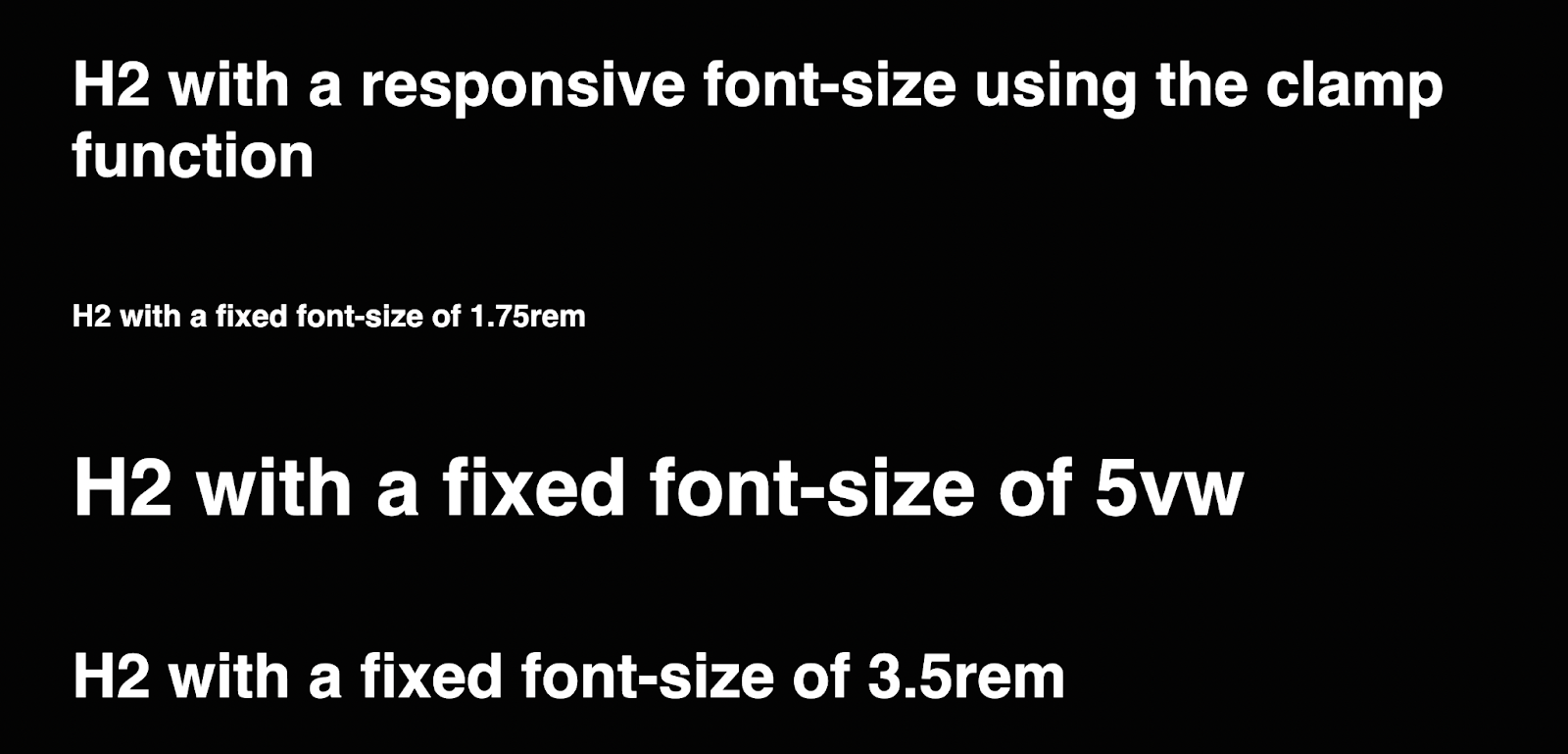
This means that on large screens where 5vw of the viewport may be larger than the maximum allowed value — 3.5rem, rather than exceeding that value, 3.5rem is used as the target value. And on smaller screens where 5vw of the viewport is smaller than the minimum allowed value, 1.5rem is used.
That is to say, as the element is resized across viewports, its value will grow and shrink across that range. But it will always compute to a value within the range of 1.75rem to 3.5rem.
A significant benefit of the clamp() function is that it reduces the need for media queries. Instead of heavily relying on media queries to control your CSS values across viewports, it lets you can set up, to a degree, a responsive transition of values for a CSS property.
You can also use arithmetic operators on any of the three expressions passed to the clamp, min, and max functions, just as you would using the calc() function.
For example:
aside {
    width: clamp(100vw - 70%, 50rem, 70%)
}Code language: CSS (css)
Get the larger of two numbers with max()
The max() function is a method that compares values and returns the largest value. It takes one or more comma-separated expressions as its parameter and applies the most positive value from the list as the value of the CSS property.
For example:
div {
     width: max(90vw, 460px);
}Code language: CSS (css)
In the code above, using the max() function, we instruct the browser to set the div’s width to the largest value — 90vw on wider viewports. On smaller or zoomed-in viewports where 90vw is the smaller value, 460px will be used.
As the viewport resizes, the max function picks the largest (most positive) expression value in the list as the value of the CSS property.
Use min() to get the smallest number in a set
The CSS math function min() is the opposite of the max() function. It takes one or more comma-separated expressions as its parameter, then applies the smallest (most negative) value from the list as the value of the CSS property.
For example:
div {
     width: min(90vw, 460px);
}Code language: CSS (css)
These are the same values passed to the max() function in the section above. However, they work differently here. On the broader viewports, 460px will be used as the div’s width because it is the smaller value of the two options, and on smaller viewports where 460px is the larger value, 90vw will be used. This means that the div’s width will never exceed one of these values, and the browser will always select the minimum value from the list at any given time.
Get the absolute value of an expression with abs()
The last of the math functions and much less known, abs(). The abs() function takes a single expression as its argument and returns the absolute value of that expression (i.e., the value of the expression without regard to its sign).
Syntax:
h1 {
    margin: abs()
}Code language: CSS (css)
A common use case of the abs() function is to ensure that a value is always positive. For example, say you start working on a large CSS codebase with a lot of custom properties. You might not know which properties are positive or negative. To get the absolute value of a property, you can wrap it in the abs() function to convert its value, whether negative, to a positive one.
body {
      font-size: abs( var( --base-font ) );
}Code language: CSS (css)
As of the time of writing, the abs() function is still in experimental mode and not yet widely supported across all browsers.
Helpful reminders and usage notes
Here are some additional guidelines you should follow when using CSS math functions.
- The
+and-operatorsmust be surrounded by whitespaces. For example, the expressioncalc(20% -8px)will be parsed as a percentage followed by a negative length — resulting in an invalid expression — whilecalc(20% - 8px)is a percentage followed by a subtraction operator and a length value. - The * and / operators do not require whitespace, however, adding it for consistency is both allowed and recommended.
- Divisions by zero will result in an error generated by the HTML parser.
- For lengths, you can’t use 0 to mean 0px (or another length unit); instead, you must use the number with the unit:
margin-top: calc(0px + 2rem);is valid, whilemargin-top: calc(0 + 2rem);is invalid.
In this article, you have learned all about the five math functions in CSS, how they work, and how you can use them to declare responsive and dynamic values in your stylesheets to build responsive and math-driven UIs. We encourage you to try them out in your next project.
If you’d like to read more informative articles from our blog, check out the related posts below:
- What You Never Learned about JavaScript Functions
- Everything You Need to Know about All 11 CSS Filters
- Dev Discussions: How to Reduce your Angular Bundle Size with Google Developers Expert Santosh Yadav
Victor is a frontend developer and technical writer interested in the JAMStack. and has a knack for breaking down developer concepts to understandable bits for others.