CSS Pseudo-Classes: The Must-Have, the Unusual, and the Experimental

Pseudo-classes are CSS features that allow us to do pretty amazing things when it comes to stylizing our content.
Some common uses are applying styles to:
- Mouse/keyboard interactions (ex:
:hover,:active,:focus), - Fields based on their content (ex:
:blank,:valid,:checked) or - Elements based on their position in the DOM (ex:
:first-child,:nth-child(),:root).
Pseudo-classes themselves are keywords that we add after our selector.
🗒️ That syntax might remind you of pseudo-elements like
::beforeand::selection. Pseudo-classes and pseudo-elements are different things. Pseudo-classes target states of an element like hover, disabled, or visited. Pseudo-elements affect elements that aren’t explicitly written to the DOM, like a before element, a backdrop, or the selection. This post will focus on pseudo-classes only.
In this post, we’ll deep dive into pseudo-classes: the must-have, the unusual, and even the brand-new experimental ones!
Relative Selectors
Relative selectors are any pseudo-class used to select an element based on its position on the DOM.
First, we have :first-child and :last-child. As their name suggests, they are used to select an element’s first or last child.
On top of that, you can use :nth-child whenever you need to select the nth element.
Here is an example:
/* Make the first li red */
li:first-child{
  color:red;
}

/* Make the 3rd li blue */
li:nth-child(3){
  color : blue
}Code language: CSS (css)
Another example of a relative selector I use all the time for styling tables is the :nth-child(even) selector that selects even elements.
There is also the standard trick of setting a margin-bottom to some elements and making it 0px on the :last-child.
💡 For more information, read the MDN documentation for relative selectors, referred to as Tree structural pseudo-classes.
User Interaction Selector
A user interaction selector is any selector responding to user input like a mouse click, a hover, or an element focused on with the keyboard.
In CSS development, we use these a lot, so let’s dive into them!
Link status pseudo-classes
First, let’s talk about the links. You can use the :visited pseudo-class to target any link that a user visited:
a:visited{
  color: #c58af9;
}Code language: CSS (css)
That is the purple color you see on the Google results you’ve already visited:
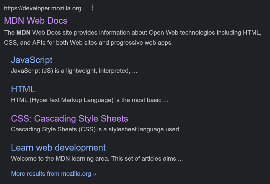
:visited pseudo-class.You can also target non-visited links by using the :link pseudo-class.
In great news for CSS developers, another fascinating pseudo-class has recently been released — :any-link. It combines :visited and :link, and it targets all links (and area) with a valid href attribute.
There’s also :local-link, the recently developed but not-yet-supported pseudo-class that targets links of the same domain you’re currently on.
With these pseudo-classes, you can have a different style for a link pointing to an external domain than for the link pointing to the current website. If the href target is the same as the document URL, it will match.
Hover, Focus, and Active
To target an element hovered over by the mouse, use the :hover pseudo-class. We use this for links, buttons, and other elements that will be clickable.
Here is how you make a link go red on hover:
a:hover{
  color: red;
}Code language: CSS (css)
⚠️ In reality, you can use
:hoveron any element you want, but be careful. If not done sparingly, it will confuse your users and create a bad experience for them.
:focus is often used to target a field the user clicked or tabbed into. It’s super useful for form fields and buttons.
By default, the browser uses an outline on :focus, and of course you can overwrite this. That is how you edit the default outline:
a:focus{
  outline: 2px dashed blue;
}Code language: CSS (css)
⚠️ Before you remove an outline on focus, remember that the browser uses an outline for accessibility concerns: keyboard users should be able to clearly identify what’s being focused on (aka what will be triggered when pressing
Enter). More information on this matter can be found in the focus indicator section of Introduction to Web Accessibility by Corbin Crutchley.
:active is used when a click is being made or held. I always use this to make the button “pop” on a click. It provides excellent visual feedback to the user, so they know the website acknowledged their click.
I usually make a small transform: translateY(2px); when :active for my buttons — but you can get more creative, like the way Material UI Buttons react on clicks:
Focus-visible and Focus-within
By default, when the user clicks on something with their mouse, it activates the :focus styling, even if you want to show that styling only for the keyboard. We may not want that behavior when focusing with the mouse simply because it does not look good, but we need it when using the keyboard for accessibility reasons.
With the help of :focus-visible, you can style an element only when the user is focused with their keyboard. It will target elements that need to show focus, so it will target our element only if :focus is using tab.
So when focusing on an element, the browser would determine if it matched :focus-visible, based on the input method used.
💡 Check out the example below and the MDN documentation for more information on
:focus-visible.
Now let’s talk about :focus-within. This powerful selector allows us to select an element based on its children’s focus state. Focus-within enables you to target a form that has a focus element within.
Let’s say you want the focus of an input to make the field container look focused instead of the input itself. You can disable the focus on the field and use :focus-within on the field container to make it look how you want it to.
Take a look at the example below that demonstrates both Focus-visible and Focus-within. If you focus on the email field, you’ll notice that the error message appears. Also, the focus is on the whole field, not just the input.
Try clicking the different buttons. You’ll see that the ones using focus-visible don’t show any outline:
The :target selector
Did you know that instead of carrying you to another page, a link can target an element of the current page instead?
If you use the # symbol and the element ID as an href attribute for your link, clicking it will make the user “jump” to the new element. In HTML, we call that an anchor.
Anchors were always powerful and became even more so since the introduction of smooth-scrolling and scroll-padding-top. You can now make with native CSS what would have been quite a pain to do in JavaScript a few years ago.
The :target pseudo-class expands what you can do with anchors by letting us stylize the targeted element.
For our example below, you have a few paragraphs and a summary. By using :target, you can add an outline to the current paragraph:
💡 If you wonder how deep you can go with anchor links and the target pseudo-class, look at Kevin Powell recreating the Netflix carousel with only CSS.
Styling Form Fields
Many pseudo-classes are available for us to make our form fields look significantly better.
In this section, you’ll look at disabled, required, optional, valid, and invalid pseudo-classes.
Disabled
A disabled element cannot be interacted with — usually, this will be an input, a select, or a button. To disable an element, use the disabled attribute on our element in HTML.
Visually, we show it by graying it out, making it evident that the element cannot be interacted with.
Required & Optional
In HTML, use the required attribute on an input to indicate its need to be filled before submitting the form. You can then use the :required pseudo-class to target those elements and put an emphasis on them.
CSS also provides the :optional pseudo-class to target the inputs that are not required.
Valid & Invalid
When dealing with fields in HTML, you can specify what types of data are acceptable and what types are not. Using a REGEX expression, you can ask for numbers, an email address, or even a custom pattern.
In CSS, inputs have a valid or invalid state that you can stylize using the :valid and :invalid selectors.
Usually, we display a red outline on invalid fields to clearly show the user which fields are blocking their form submission.
Example
The example below is a form using all the form-related pseudo-classes we just mentioned.
- The name field is
requiredand is currently empty, so it’sinvalidand has a red outline. - The address is not required, so it is
validand has a green border even though it’s empty. - The company is
disabled, so its opacity is lower, and the cursor is set tonot-allowed. - The email field is invalid as the value contains two
@symbols. It isinvalidand is stylized with a red border.
And as you can see, the form itself can be stylized with :valid and :invalid too. A form needs all its fields to be valid to be valid itself:
New Pseudo-Classes
All the pseudo-classes mentioned in this post, except for :focus-within and :focus-visible, were available in the ecosystem for quite some time.
But in this section, we’ll talk about new and exciting stuff.
The :not selector
The :not pseudo-class is pretty much self-explanatory. It allows us to declare what we do NOT want in our selector. It makes life much easier sometimes to exclude elements from our selector instead of including all the ones we want.
The :not pseudo-class allows us to write a cleaner and more descriptive selector.
Let’s say you want to target every link that is not a button. You can now write it in a much simpler way:
/* without using :not */
a {
  color: brown;
}
.button {
  color: white;
}

/* using :not */
a:not(.button) {
  color: brown;
}Code language: CSS (css)
It doesn’t look like a lot, but when using the :not selector, you don’t even need to know the button’s color.
💡 Modern browsers have supported
:notsince 2020, look at the caniuse page for more information.
The :where & :is pseudo-classes
The :is selector allows us to write DRYer code by consolidating multiple selectors. Let’s say you need to target buttons from .header, .footer and .sidebar.
Without the :is selector, you might write something like this:
.header .button,
.footer.button,
.sidebar .button {
  background: teal;
}Code language: CSS (css)
This feels like unnecessary repetition, doesn’t it?
Using :is you can write:
:is(.header, .foooter, .sidebar) .button {
  background: teal;
}Code language: CSS (css)
This code is shorter, easier to read, and supported in major web browsers.
To understand :where, we need to talk about selector specificity.
First, if you are unfamiliar with specificity, read this great deep dive from Smashing Magazine.
Also, to try your selector specificity, I recommend this great tool from Polypane.
When working with large CSS codebases, specificity is always a struggle. When defining defaults, we need the specificity to be as low as possible.
The :where pseudo-class acts like :is, but it always has a 0 specificity, when :is specificity will be the most specific in its selector list.
It makes the :where super helpful in writing base styles that can easily be overwritten.
💡 I recommend this post by Mojtaba Seyedi going through an actual use case of the
wherepseudo-class in the context of a CSS reset.
All about :has, a promising but experimental selector
The :has selector allows you to select an element based on its children. You can, for example, use it for selecting any field container with an :invalid input inside.
Unfortunately, as of this writing, the :has pseudo-class is not yet supported in major browsers.
Still, we are getting there, and this is exciting progress for CSS developers.
💡 If you want to read more about
:has, I recommend Ibadehin Mojeed’s article on it, How and when to use the CSS:hasselector. Also, check the MDN documentation for it.
I’m Tom Quinonero, I write about design systems and CSS. Follow me on Twitter for more tips and resources 🤙
Sources and Links: