Demystifying The CSS Display Property
The web page treats and sees every element as a box(to be precise, a rectangular box). There are two basic forms of boxes on a web page, and these are block and inline. The display property is a significant CSS property that you can use to determine how elements are displayed in your browser.
When you load a webpage in your browser, you will notice that the HTML elements on the page have their default ways of displaying. Some elements stack up on different lines, while others follow each other on one line. For example, all paragraph elements (<p>) stack up following each other on different lines, while the <a> elements, images, and others line up on a single line.
In this article, you will learn what the display property means, how it works, and the major values that affect how elements appear on the web page.
What is the CSS display property?
The CSS display property sets how HTML elements display on your browser and the layout flow. The display property has about seven major values, which all affect how elements are displayed. Two major values you may be conversant with are flex and grid which you can use to organize the layout of elements on your web page.
This article focuses on the flow of elements, and to perfectly understand, here are the display values that will be explained and used. These values include:
blockinlineinline-blockinline-flexinline-gridnone
// Syntax
.selector {
    display: inline-block;
}Code language: CSS (css)
CSS block display
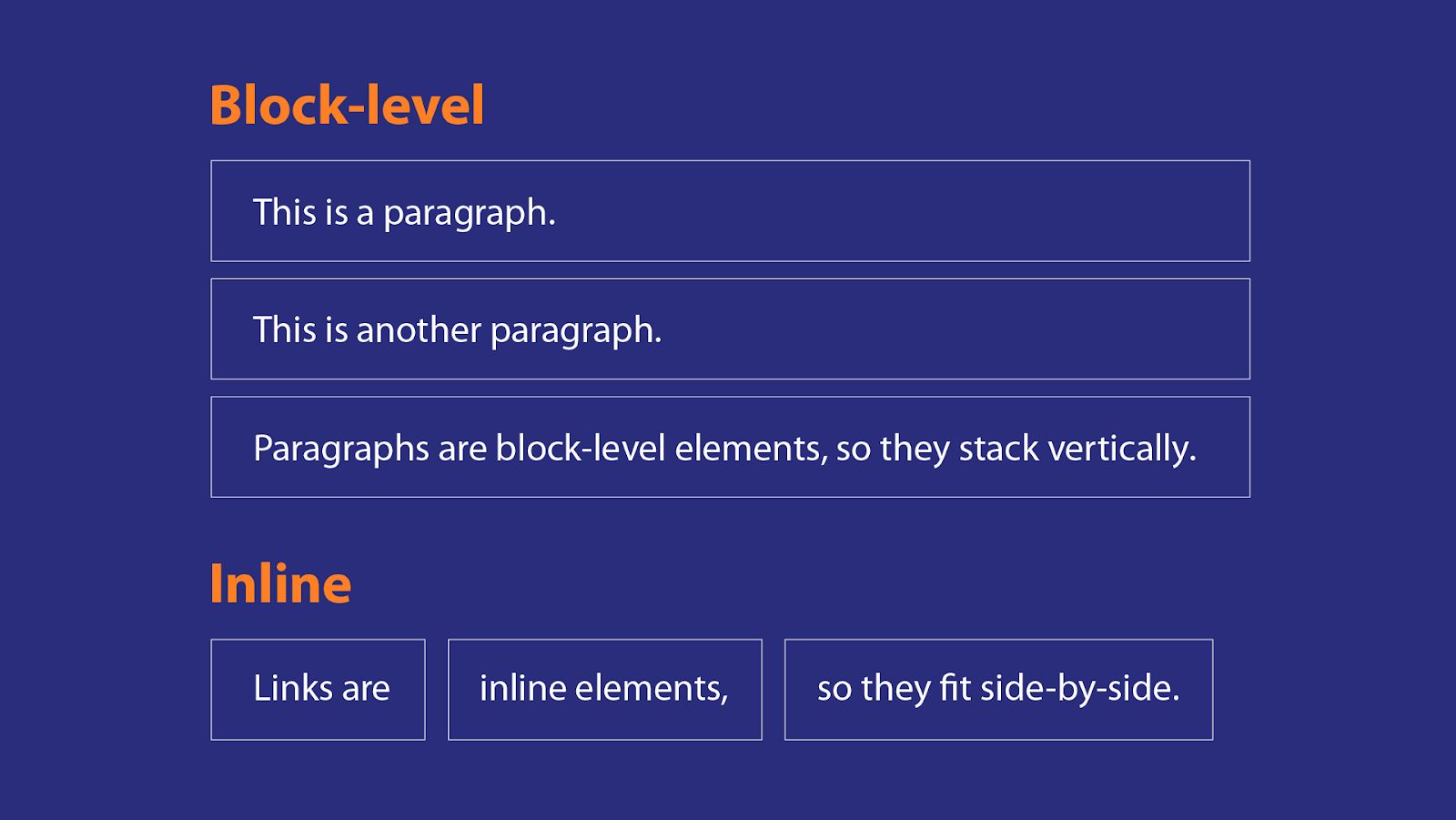
You must have noticed that when you use a heading, paragraph tag, table tag, or semantic tags, they take the full width of space, and each element starts with a new line. This is because they are block-level elements.
Block-level elements will always start on a new line, irrespective of where you use the element. It will also always cover the entire width of the parent container, which stretches out to the left and right of its parent container.
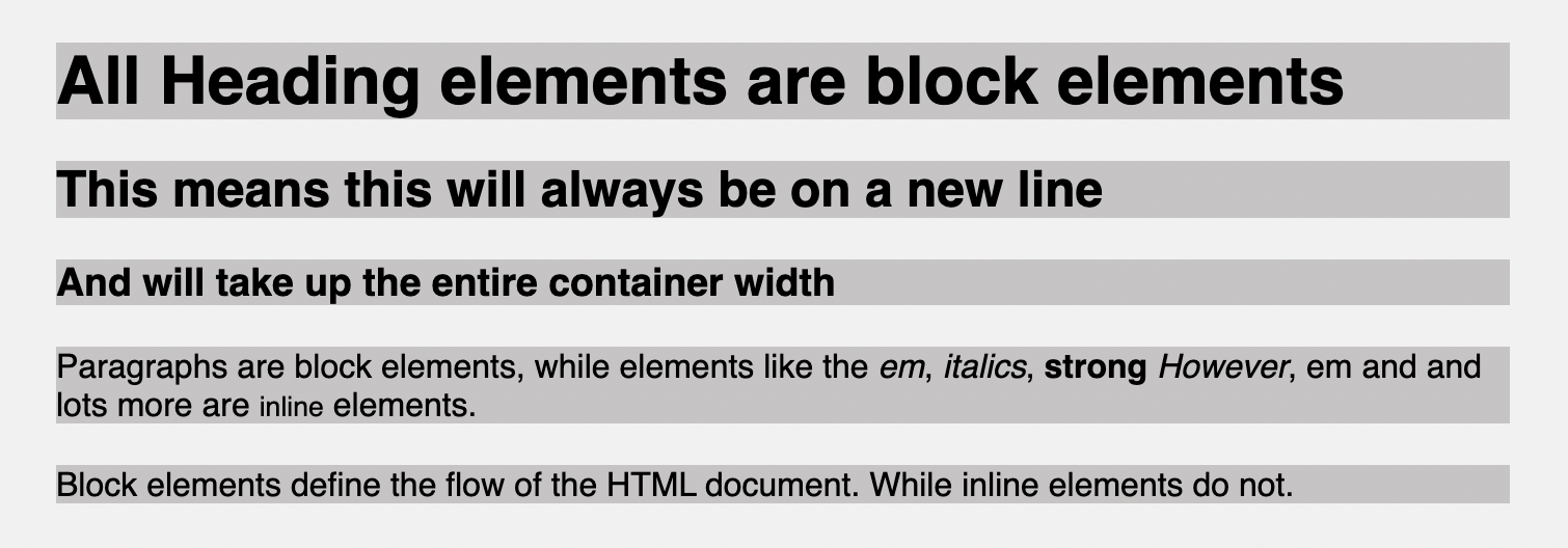
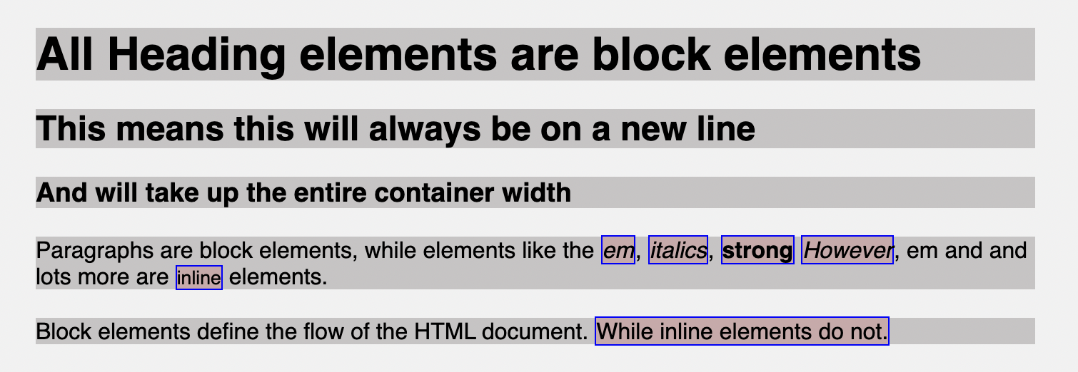
To explain this, suppose your HTML looks like this where you have a heading, paragraph tags, and also tags like bold, italics, span, and others within the paragraph tag:
<body>
    <div>
        <h1>All Heading elements are block elements</h1>
        <h2>This means this will always be on a new line</h2>
        <h3>And will take up the entire container width</h3>
        <p>
            Paragraphs are block elements, while elements like the <em>em</em>,
            <i>italics</i>, <strong>strong</strong> <em>However</em>, em and and
            lots more are <small>inline</small> elements.
        </p>
        <p>
            Block elements define the flow of the HTML document.
            <span>While inline elements do not.</span>
        </p>
    </div>
</body>Code language: HTML, XML (xml)
To illustrate the block elements, I will add background-color, so you notice how they fill up the entire width and move to new lines.
Normally, you might expect that since there is still more space after the first paragraph, the next paragraph should start from where it stopped, but it doesn’t work that way because it is a block-level element.
When you’re working with inline elements and want them to possess the qualities or act like block elements, you set the element’s display value to block. For example, you can set the span element’s display property to block so that it is no longer inline but now block.
span {
    display: block;
}Code language: CSS (css)
Then your page will look like this.
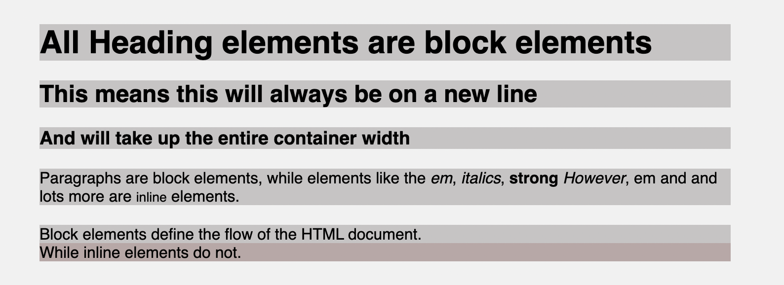
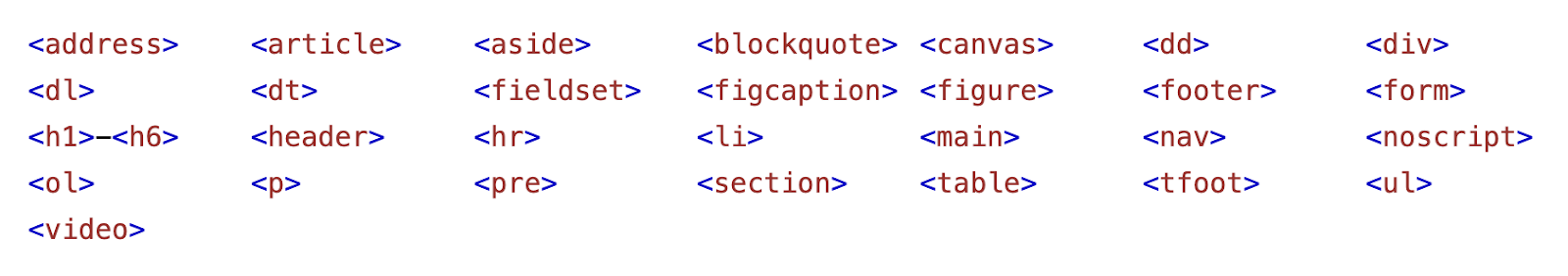
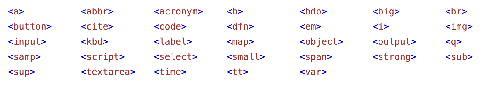
Notice that the last paragraph takes up two lines because span now acts like a block element. Below are examples of block elements for reference purposes:
It is important to know that you can specify block elements width and height. You can also work with padding and margin efficiently, but it’s not so with inline elements. Let’s now explore inline elements.
CSS inline display
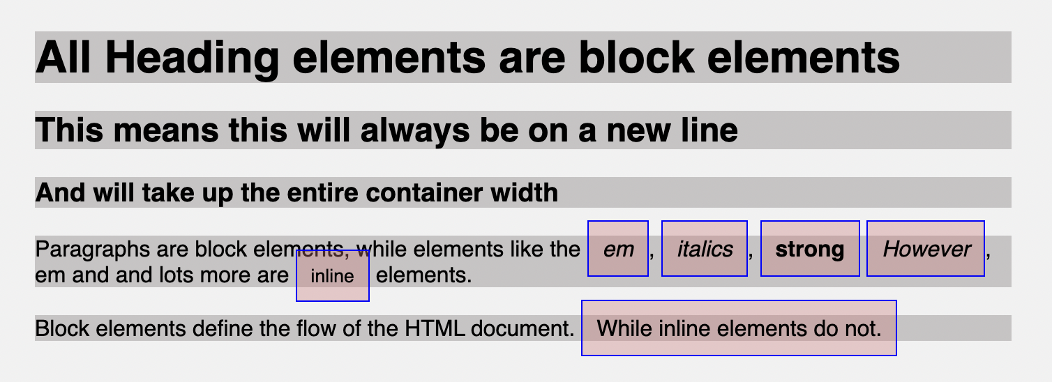
The CSS inline display value is used to set a block element as an inline element. Inline elements are the opposite of block elements because they do not start on a new line and only take up as much width as their content.
For example, if I add a background-color property to each inline element in the HTML example, you will notice that these inline elements stick within other elements. They’re not for determining layout; they’re only used within block elements for styling.
You can convert a block element to act like an inline element using the display property set to inline. For example, let’s make the paragraph tags inline so that all the text comes together.
p {
    display: inline;
}Code language: CSS (css)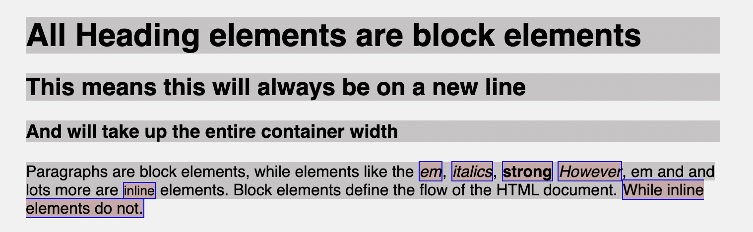
You will notice that the background color for the paragraph goes around the text and no longer takes up the full width of the container.
It’s also important to know that inline elements do not accept width and height. They ignore it if you decide to use it. They accept margin and padding, but the element will still sit inline and only push other elements horizontally away, not vertically.
Below are examples of inline elements for reference purposes:
CSS inline-block display
You now understand what the inline and block display values mean and how they work. One angle is still missing; you might want a particular element to be set inline with the natural flow of text but also move to a new line and work with properties like height and width. This is where inline-block is useful.
The inline-block display value helps bridge the gap making it possible to have the major characteristics of the inline elements and the block element. This is not configured by default for any element. You get to apply this manually. For example, if you want to style the <a> tag, which sits in a paragraph to be a button.
<p>
    Block elements define the flow of the HTML document.
    <span>While inline elements do not.</span> <a href="">Click Me</a>
</p>Code language: HTML, XML (xml)
By default, the <a> tag is an inline element. Suppose you want to move it to a new line. You will notice it takes up the entire container width if you use block.
a {
    display: block;
    margin: 10px;
    padding: 10px 20px;
    background-color: rgb(50, 163, 255);
    border-radius: 5px;
    text-decoration: none;
    color: #fff;
}Code language: CSS (css)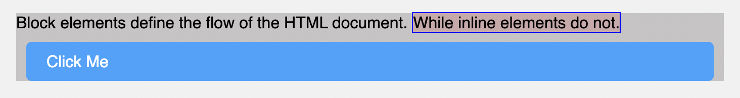
To fix this, you can use inline-block, which will move the <a> element to a new line and not take up the entire width. Then you can also use properties like height, width, padding, and margin, which works properly compared to the inline element.
a {
    display: inline-block;
    margin: 10px;
    padding: 10px 20px;
    background-color: rgb(50, 163, 255);
    border-radius: 5px;
    text-decoration: none;
    color: #fff;
}Code language: CSS (css)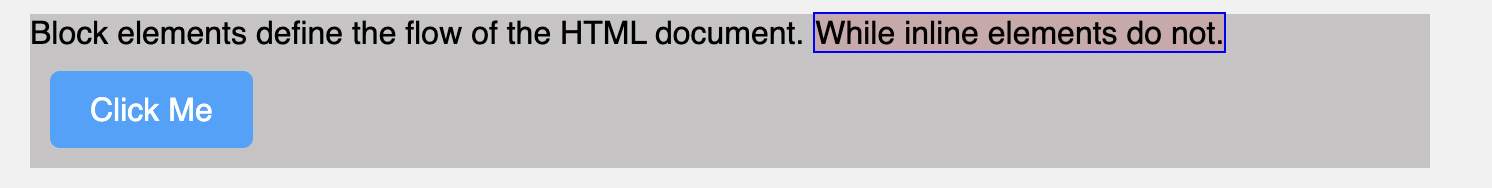
ℹ️ You can apply the
inline-blockvalue to any element you wish when you want to move an element to a new line and avoid it from taking the entire width of your container. Also, when you want to be able to addwidthandheightto inline elements.
CSS inline flex and inline grid
When exploring the CSS flexbox and grid layout properties, you will notice little or no emphasis made to the inline-flex and inline-grid options which work similarly to the flex and grid options but with little differences.
.box-container {
    display: inline-flex;
}Code language: CSS (css)
The flex, grid, inline-flex, or inline-grid values are usually applied to container elements. By default, these container elements like div are block elements. When you use either flex or grid as its display property, it functions like block-flex (it’s called flex) or block-grid (it’s called grid). However, there is nothing like block-flex or block-grid. But this means that the container works like a block container, but you now apply flex functionalities.
This means the container will take up full width, start from a new line, and all block features will work with the container element where the display value is added.
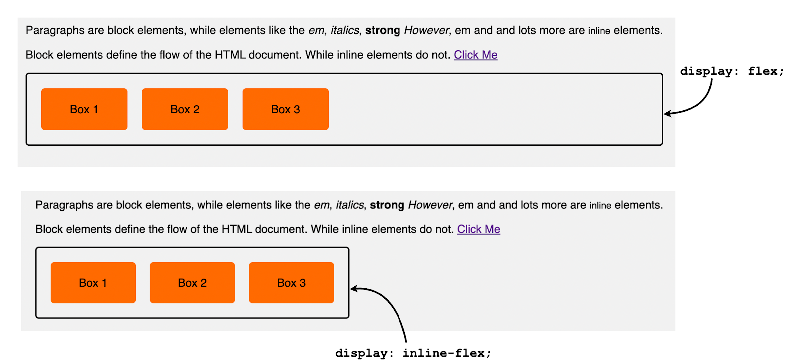
This is also similar to CSS grid. It is important to know that the inline-flex, flex, grid, and inline-grid is added to the container, and the inline or block display flow will only affect the container and not the container items.
CSS display none
So far, you have learned very important display values. One last value to be explained is the none value. This value hides HTML elements from displaying on your web page. For example, you can use this display value if you have a portion of your web page or an element you wish to hide from appearing on the screen.
div {
    display: none;
}Code language: CSS (css)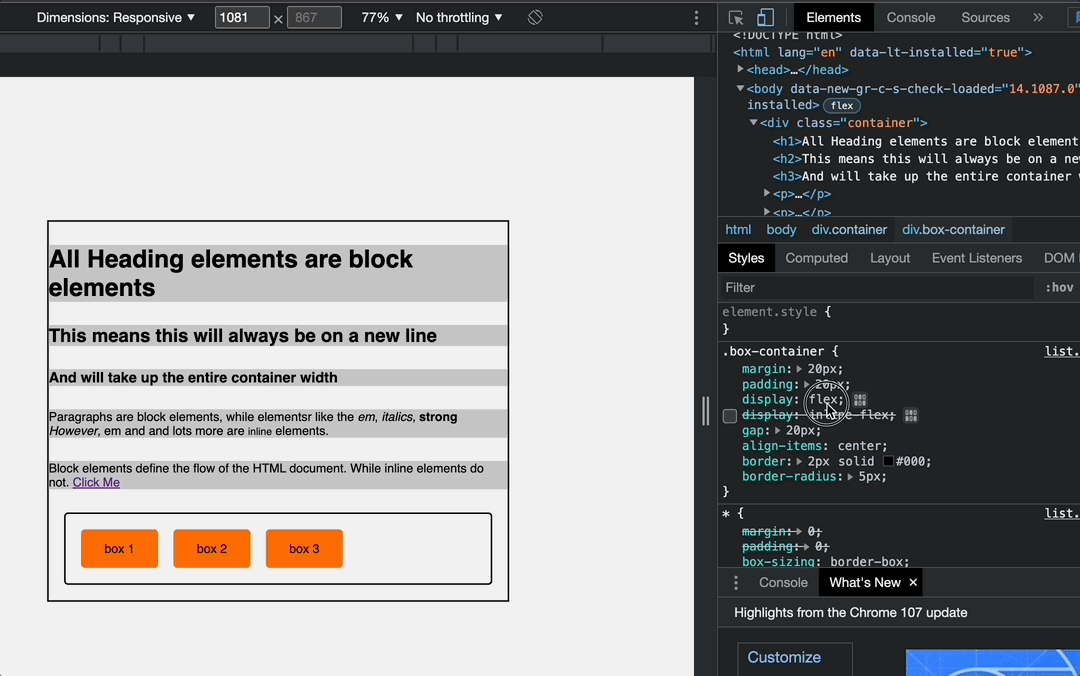
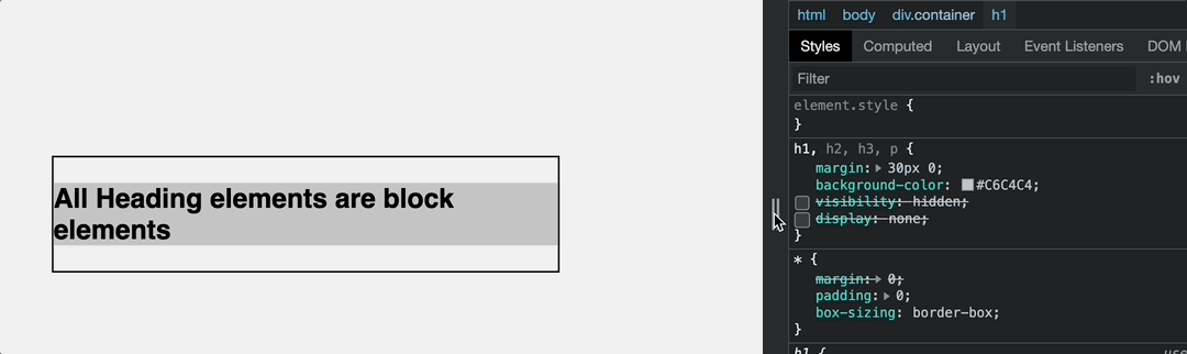
display: none.You might be conversant with the CSS visibility property which does a similar task to help hide HTML elements from displaying on the screen, but they both have some differences.
CSS display none vs. visibility hidden
A very plain explanation is that when you use visibility with hidden as its value, it hides the HTML elements. However, the gap occupied by the hidden element will remain and affect the page. While the display property set to none will remove the element and its effects from the web page, the elements and tags will remain visible in the source code.
If you are building responsive web pages, you can use the none value of the display property to hide specific sections and display when on larger devices or when maybe a button is clicked, like the navigation menu.
That’s it 🎉
In this article, you have learned what the CSS display property means and how it can help you set how HTML elements are displayed on your browser. You also learned the various values and how they work.
This is essential to make you aware of some behavior certain elements exhibit when working with them, so you don’t think an element filling up the entire width of your container is a bug when you want it to only take up the width of its content.
Thanks for reading, and have fun coding!
I’m Joel Olawanle, a frontend developer and technical writer interested in making the web accessible to everyone by always looking for ways to give back to the tech community. Follow me and connect with me on Twitter.