A Very, Very In-Depth Guide on CSS Grid

As websites progressed from simple documents into complex, interactive applications, web developers have utilized multiple approaches to organize and control the layout of UI elements on a webpage:
- Floating elements around the webpage with the CSS float property to
- Inserting elements into an HTML table element to create a table-based layout
- Positioning elements using the position property
- Using the Flexible box layout (Flexbox) to align content on the page.
While these techniques enable us to organize and control the layout of elements on a webpage, they are not always sustainable, as some lead to performance bottlenecks. For example:
- Floats affect a web page’s SEO.
- Table-based layouts lead to non-semantic markup on our sites, compromising accessibility.
- Positioning elements require using CSS hacks.
Enter CSS Grid.
CSS Grid is a layout system—a method of organizing elements on a webpage—used for building two-dimensional layouts. It is a structure made up of intersecting horizontal and vertical lines known as grid lines that divide the layout of an HTML element into rows and columns.
CSS Grid is a powerful tool that enables web developers to define the position of HTML elements and control how the elements would span horizontally and vertically across the page—a feat that cannot be achieved using other layout systems.
This article is a comprehensive guide for everything you need to know about the CSS Grid layout system.
In this article, we’ll go over:
- The CSS Grid vocabulary
- How to make a basic grid
- Inserting gutters between grid elements
- Aligning grid items horizontally
- Aligning grid items vertically
- Measurement units introduced with the CSS Grid layout
- Useful CSS functions you should utilize when working with CSS Grid
- Expanding grid items across multiple grid lines
- Syntax to shorten the amount of CSS you need to type
The CSS Grid vocabulary
CSS Grid introduces a few new concepts you should familiarize yourself with before diving into its usage.
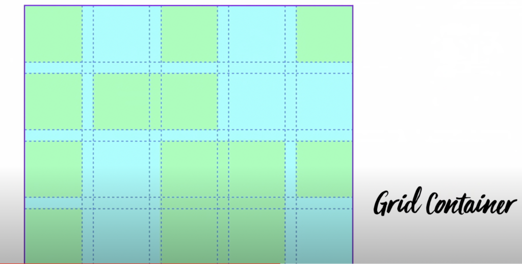
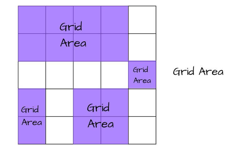
Grid container: The HTML element on which the grid layout is applied.
Grid item(s): All direct child elements of the grid container.
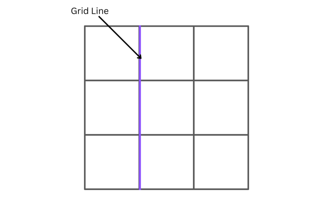
Grid line: These are the horizontal and vertical dividing lines that make up the structure of the grid. These lines reside on either side of a column (column grid lines) or row (row grid lines). Hence, a grid with four columns will have five column lines, with one after the last column.
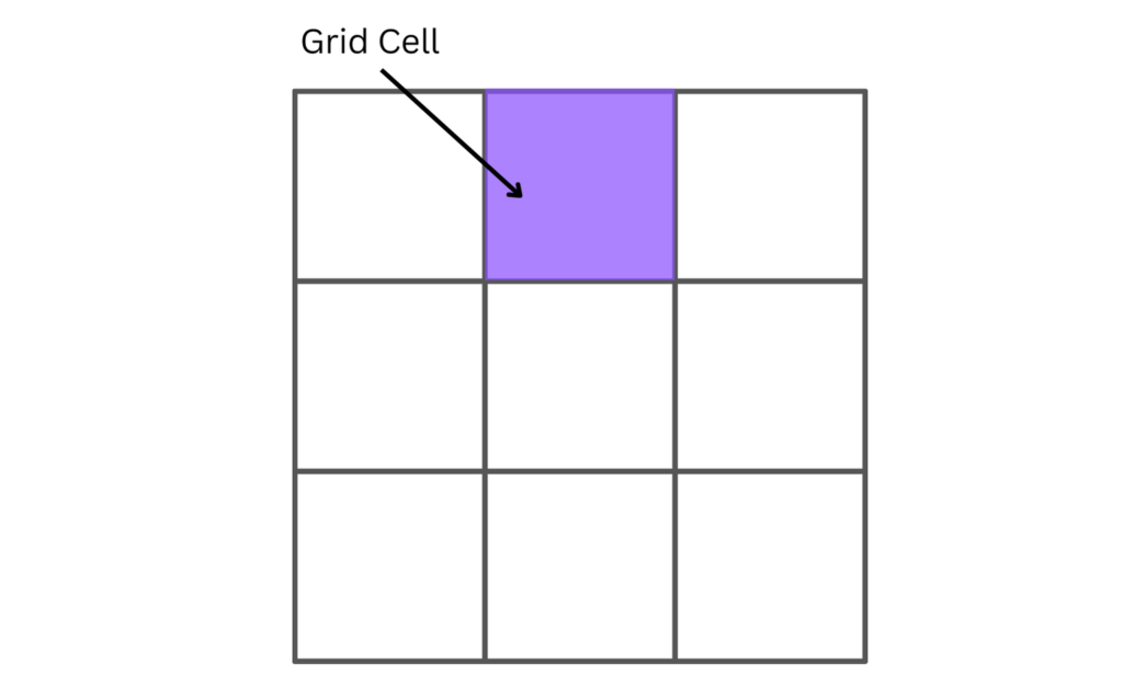
Grid cell: The space between two column grid lines and two adjacent row grid lines, also known as grid tracks. It is a single unit of a grid and the smallest unit possible. By default, all grid items are laid out one item per grid cell.
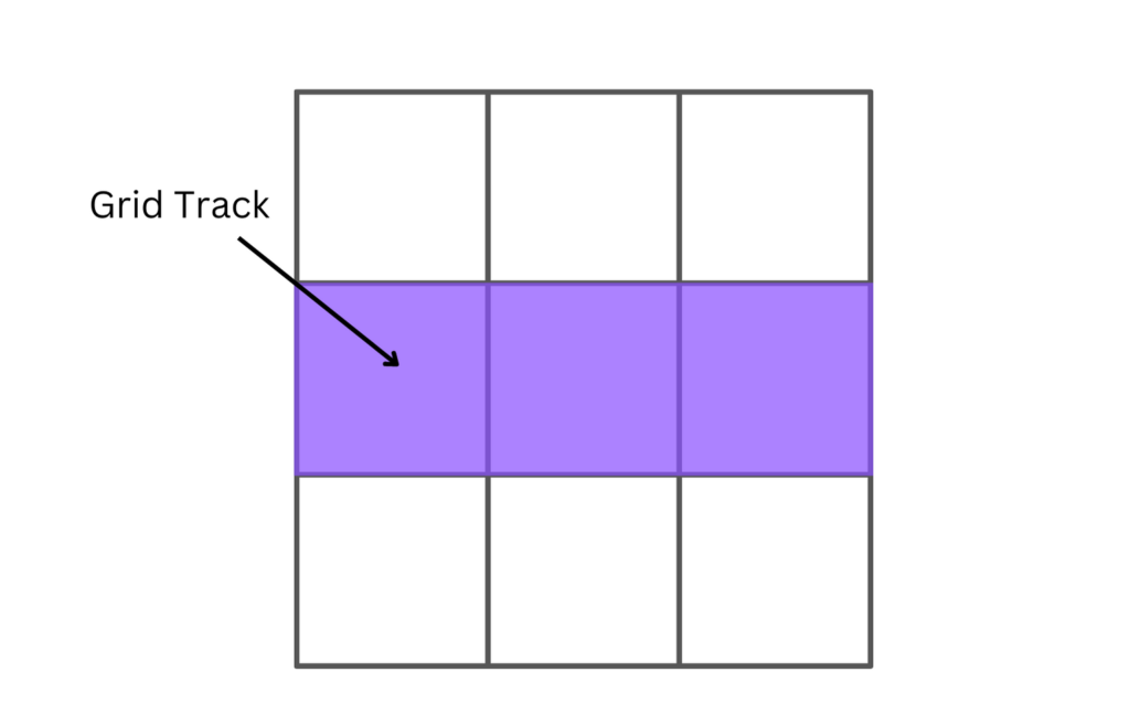
Grid track: The area between two adjacent grid lines. The gap between two grid row lines is a row track, and the gap between two grid column lines is a column track. The size of a grid track determines the width and height of our grid items.
Grid area: A rectangular area on the grid made up of one or more grid cells. Grid areas are created when a grid item spans over one-to-many grid tracks. They must be rectangular; creating a T- or L-shaped grid area is impossible.
Now, without further ado, let’s dive in!
How to make a basic grid
To create a CSS Grid layout, you’ll first need to define a grid container. The grid container can be any individual parent element (for example, a div).
To define a grid container, pass the display property with either a value of grid or inline-grid to an element’s style block. Doing this will implicitly convert all direct child elements of the grid container into grid items.
.block-level-grid-container {
display: grid;
}

.inline-level-grid-container {
display: inline-grid;
}
Code language: CSS (css)
The value grid makes the parent grid element act a bit like an un-styled div, making it span the full width of a page by default due to them being block-level elements. In contrast, the value inline-grid behaves much like an un-styled span, making it act like an inline element to its siblings.
Let’s look at an example.
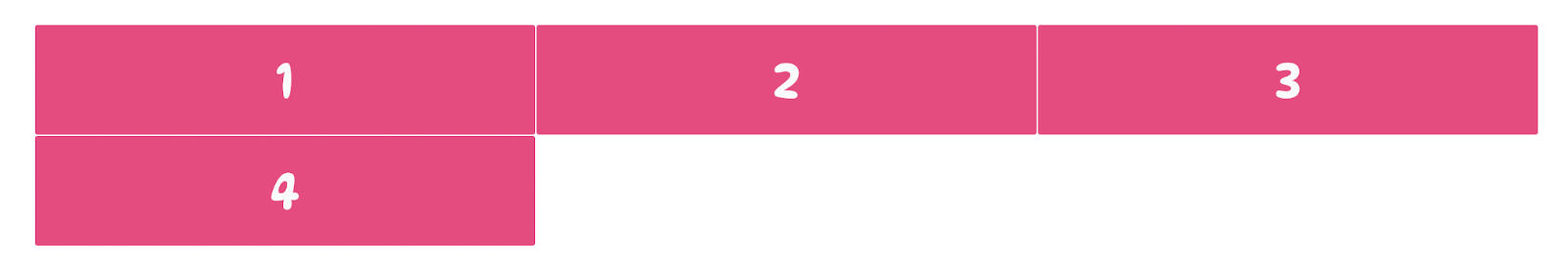
<div class="container">
        <div class="box a">1</div>
        <div class="box b">2</div>
        <div class="box c">3</div>
        <div class="box d">4</div>
</div>
Code language: HTML, XML (xml)
In the code block above, we define a div with a class of "container". Within the div are four child elements.
We can now set the div as a grid container.
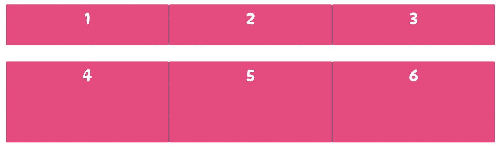
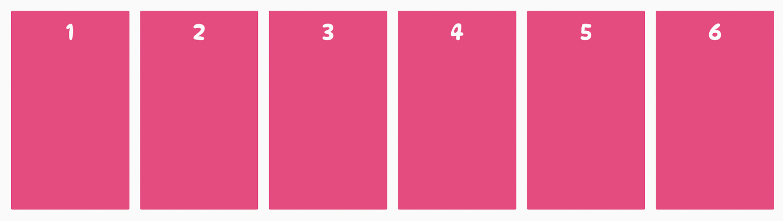
.container {
     display: grid;
}Code language: CSS (css)
The result:

Setting an element to a grid container alone will not immediately affect how the child elements are displayed, as we still haven’t specified how the layout should look. Hence, CSS lays out the grid items in a single-column grid.
To change the layout of the grid items within a grid, we must explicitly define the rows and columns we want our grid to have. To do that, we’ll use the CSS properties grid-template-columns and grid-template-rows.
Grid Template Columns
The grid-template-columns property lets us specify the number of columns we want in a grid container and how wide each column should be.
The grid-template-columns property accepts one or more non-negative CSS length unit values. The number of CSS-length values passed to the property specifies how many columns our grid container will have, and each value represents how wide each column (i.e., each grid track) would be.
For example:
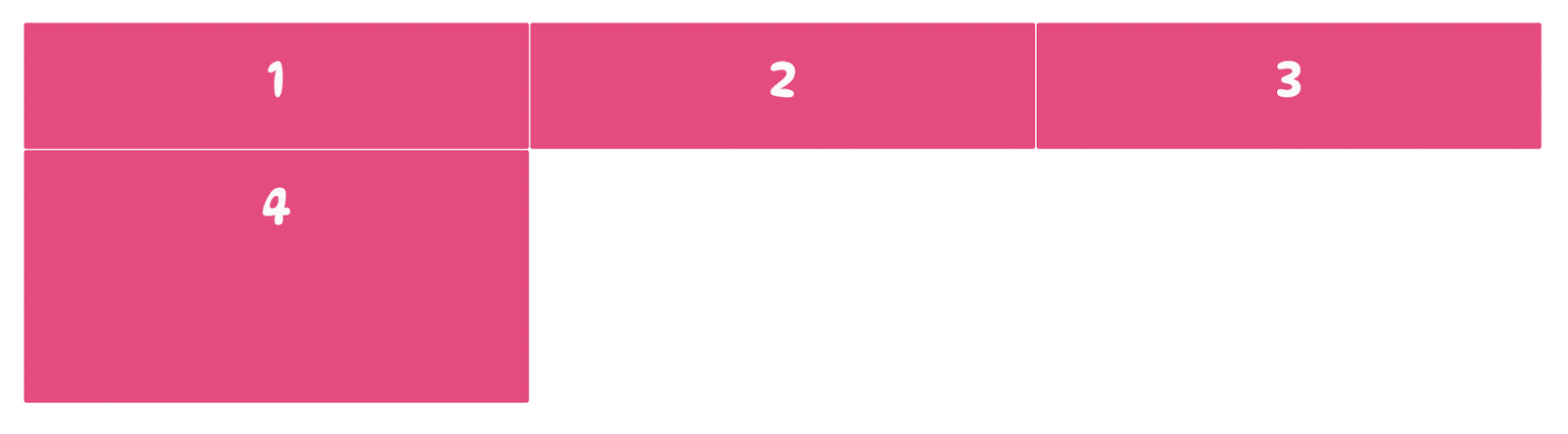
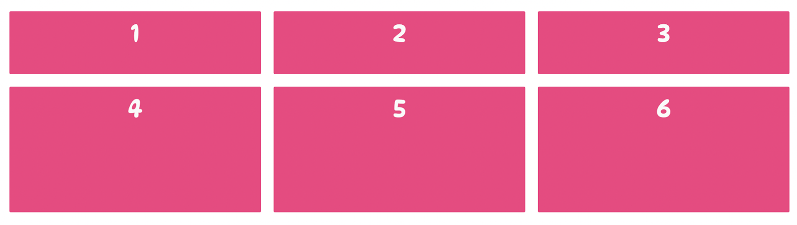
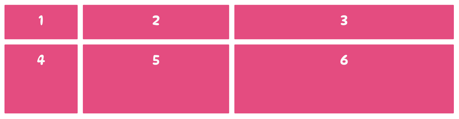
.container {
  display: grid;
  grid-template-columns: 400px 400px 400px;
}Code language: CSS (css)
The result:
In the example above, we use the grid-template-columns property to change the layout of our grid container to be divided into three columns, each 400px wide.
Notice that the last grid item starts on a new row below the first three columns. That is because we only specified three columns that are each 400px wide. Consequently, when the number of grid items in the grid container exceeds three, CSS will wrap other grid items into new rows to maintain the container’s layout.
⚠️ You can’t assign negative values to the CSS properties associated with the grid layout. Passing a value such as
-400pxto the grid-template-columns property will not affect the structure of a grid.
Grid Template Rows
The grid-template-rows property lets us specify the height of each row in a grid container.
Unlike the grid-template-columns property, it doesn’t specify the number of rows our grid container should have. It only sets the height of each row. Such behavior occurs because a grid container will implicitly create a new row whenever grid items wrap into new lines. Hence, we can’t control the number of rows that should be present in a grid using the grid-template-rows property.
The grid-template-rows property accepts one or more non-negative CSS length values where each value represents the height of each row in a grid container, from the first to the last.
For example:
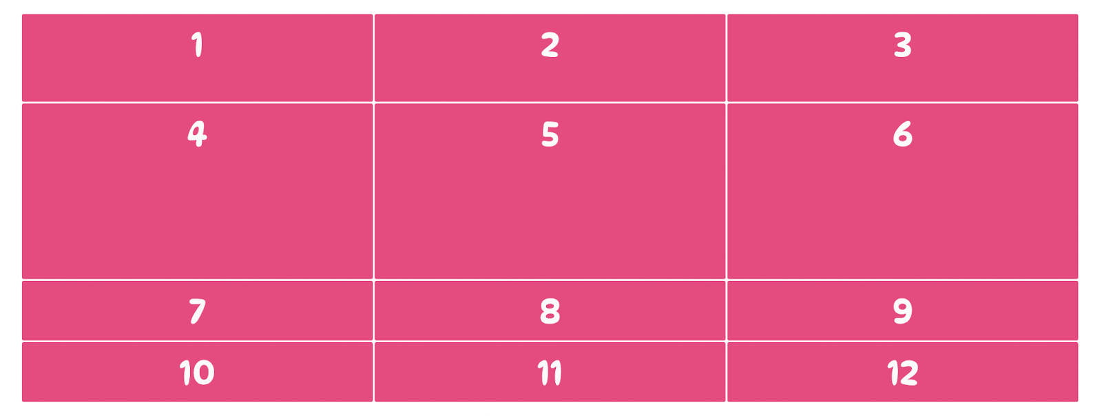
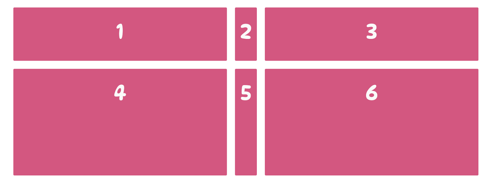
.container {
  display: grid;
  grid-template-columns: 400px 400px 400px;
  grid-template-rows: 100px 200px;
}Code language: CSS (css)
In the code above, values of 100px and 200px are passed to the grid-template-rows property. This gives the first row in the grid container a height of 100px and the second row a height of 200px.
The result:
In the code above, the grid-template-rows property sets only the heights of the first two rows in the grid container. If we are to add more grid items to the grid container and it creates new rows to wrap them onto, the heights of these implicitly created rows will not be determined by the grid-template-rows property but by the size of their content.
Adding a gap between rows and columns
Adding more rows and columns to a grid container without properly spacing them apart would make the grid look too jam-packed and not helpful as a layout system. We can add gutters (spacing) between columns and rows to space them apart by adjusting the size of our grid lines. Let’s explore how we can do that.
column-gap
The column-gap property adds some spacing between columns by adjusting the width of the vertical grid lines in a grid container. It accepts a non-negative CSS length value which defines how broad the grid line between each column will be.
For example:
.container {
   display: grid;
   column-gap: 28px;
}Code language: CSS (css)
The code above sets the width of every vertical (column) grid line in the grid container to 28px. This adds a space of 28px between every column in the grid.
The result:

row-gap
Just like column-gap, the row-gap property adds some spacing between rows in a grid container by adjusting the height of all horizontal grid lines in a grid container. It accepts a non-negative CSS length value which defines how large the grid line between each row will be.
For example:
.container {
   display: grid;
   column-row: 40px;
}Code language: CSS (css)
The code above sets the height of every horizontal (row) grid line in the grid container to 40px. This adds a distance of 40px between every row in the grid.
The result:
We can combine the column-gap and row-gap properties to space our columns and rows.
.container {
   display: grid;
   column-row: 40px;
   row-gap: 20px;
}Code language: CSS (css)
The result:
Using just a few lines of CSS, we have created a grid layout with all the basic CSS Grid properties such as columns, rows, and gutters.
How to align content horizontally
CSS Grid exposes six properties that let us control the alignment of grid items along the rows (inline axis) or columns (block axis) of a grid container. In this section, we’ll go over each property that aligns grid items horizontally along the columns of the grid container.
justify-items
The justify-items property controls the alignment of all grid items along a grid container’s inline (column) axis. It is passed to the grid container, and its value applies to all grid items within the grid. It accepts four possible values.
- start — aligns grid items to the beginning of all columns, which is the left edge of their cell.
For example:
.container {
   justify-items: start;
}Code language: CSS (css)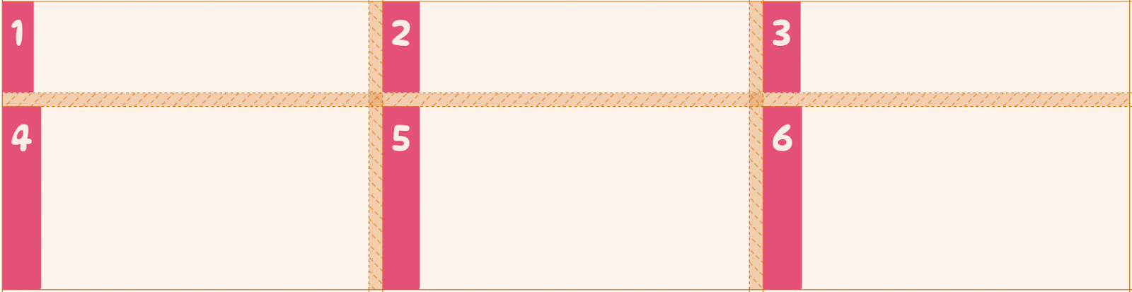
- end — aligns grid items to the end of all columns, which is the right edge of their cell.
For example:
.container {
   justify-items: end;
}Code language: CSS (css)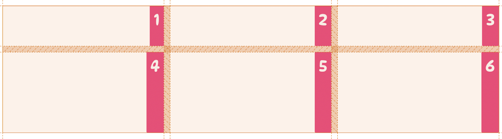
- center — places all grid items at the center of their cells.
For example:
.container {
   justify-items: center;
}Code language: CSS (css)
- stretch — will stretch out the grid items to fill the whole width of their cells: this is the default value of the justify-items property.
For example:
.container {
   justify-items: stretch;
}Code language: CSS (css)
justify-content
The justify-content property lets you set the horizontal alignment of the entire grid within the inline (row) axis of the grid container. It accepts seven possible values.
- start — aligns the entire grid to the left edge of the grid container.
For example:
.container {
   justify-content: start;
}Code language: CSS (css)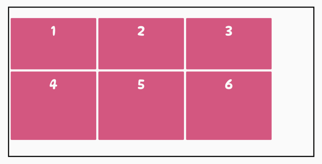
- end — aligns the entire grid to the right edge of the grid container.
For example:
.container {
   justify-content: end;
}Code language: CSS (css)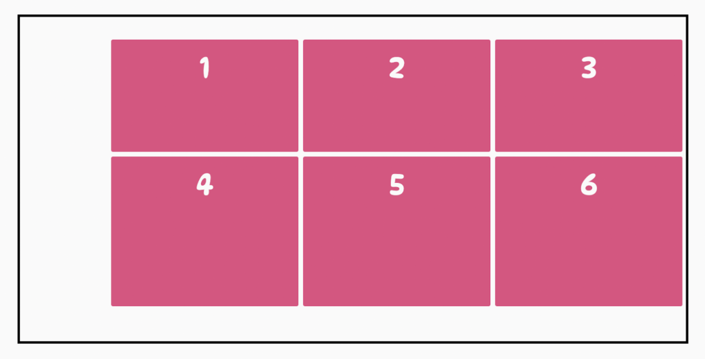
- center — places the entire grid horizontally at the center of the grid container.
For example:
.container {
   justify-content: center;
}Code language: CSS (css)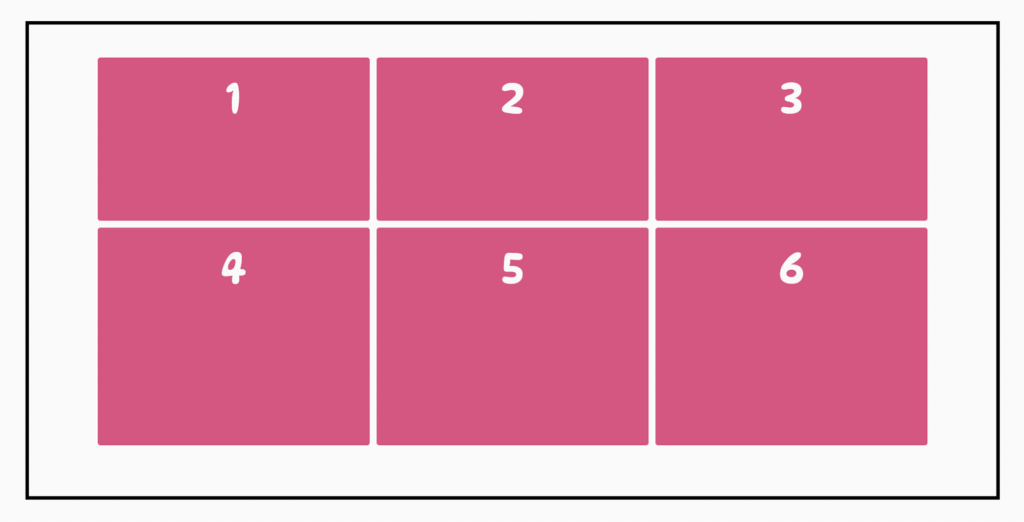
- stretch — resizes the grid items to allow the grid to fill the entire width of the grid container: this is the default value of the justify-content property.
For example:
.container {
   justify-content: stretch;
}Code language: CSS (css)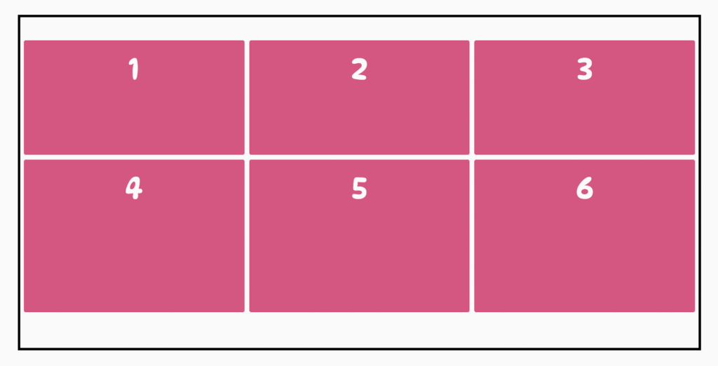
- space-around — adds an even amount of space between each grid item, with half-sized spaces on both ends of the grid.
For example:
.container {
   justify-content: space-around;
}Code language: CSS (css)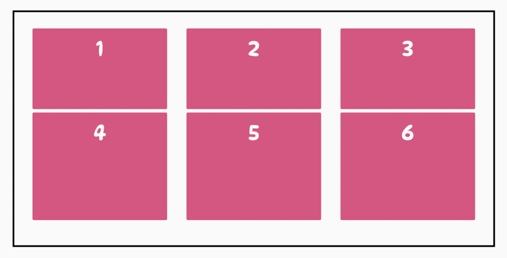
- space-between — creates an even amount of space between each grid item, with no space at the ends of the grid.
For example:
.container {
   justify-content: space-between;
}Code language: CSS (css)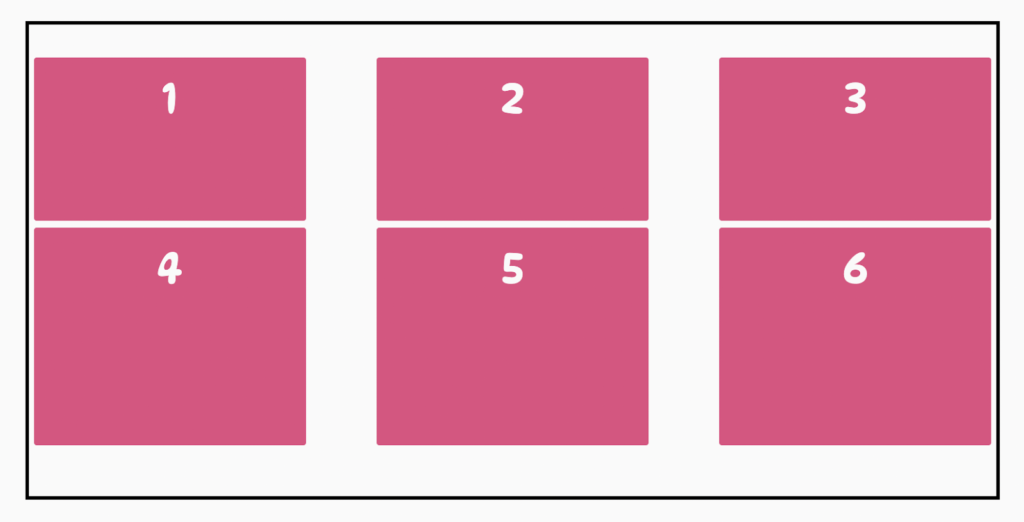
- space-evenly — puts an even amount of space between each grid item and on both ends of the grid.
For example:
.container {
   justify-content: space-evenly;
}Code language: CSS (css)
justify-self
This behavior of the justify-items property that controls the alignment of grid items along the inline (row) axis of a grid container can also be set on individual grid items via the justify-self property. This property is passed to the grid items. It accepts four possible values.
- start — aligns a grid item to the beginning of a column, which is the left edge of its cell.
For example:
.box-1 {
   justify-self: start;
}Code language: CSS (css)
- end — aligns the grid item to the end of a column, which is the right edge of its cell.
For example:
.box-2 {
   justify-self: end;
}Code language: CSS (css)
- center — places the grid item at the center of its cell.
For example:
.box-3 {
   justify-self: center;
}Code language: CSS (css)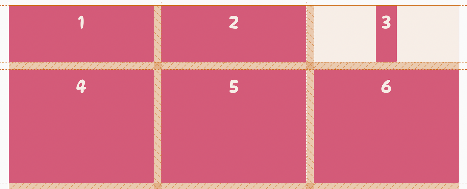
- stretch — will stretch out the grid item to fill the entire cell width; this is the default value of the
justify-selfproperty.
For example:
.box-4 {
   justify-self: stretch;
}Code language: CSS (css)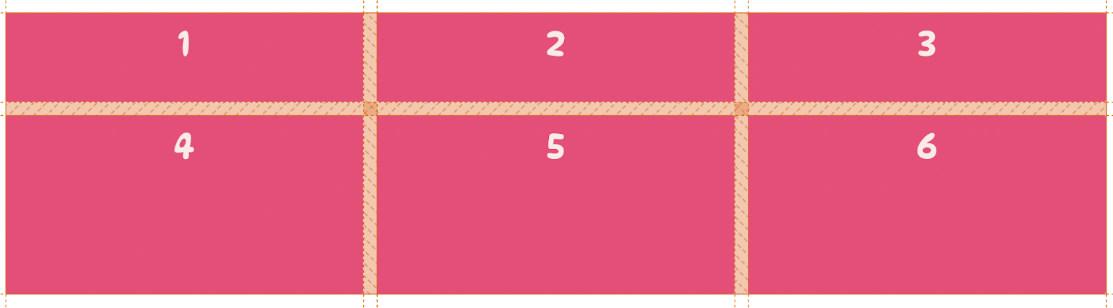
How to align content vertically
Now let’s look at the properties that align grid items vertically along the rows of the grid container.
align-items
The align-items property controls the alignment of all grid items along a grid container’s block (column) axis. It is passed to the grid container, and its value applies to all grid items within the grid. It accepts four possible values.
- start — places all grid items at the top of all rows.
For example:
.container {
   align-items: start;
}Code language: CSS (css)
- end — places all grid items at the bottom of all rows.
For example:
.container {
   align-items: end;
}Code language: CSS (css)
- center — places all grid items at the center of their cells.
For example:
.container {
   align-items: center;
}Code language: CSS (css)
- stretch — will stretch out all grid items to fill the entire height of their cells; this is the default value.
For example:
.container {
   align-items: stretch;
}Code language: CSS (css)
align-content
The align-content property lets you set the vertical alignment of the entire grid within the block (column) axis of the grid container. It accepts seven possible values.
- start — aligns the entire grid to the top of the grid container.
For example:
.container {
   align-content: start;
}Code language: CSS (css)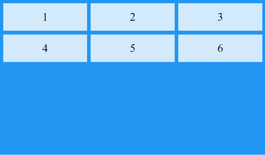
- end — aligns the entire grid to the bottom of the grid container.
For example:
.container {
   align-content: end;
}Code language: CSS (css)
- center — places the entire grid vertically at the center of the grid container.
For example:
.container {
   align-content: center;
}Code language: CSS (css)
- stretch — The grid items stretch to fill the full height of the container grid; this is the default value.
For example:
.container {
   align-content: stretch;
}Code language: CSS (css)
- space-around — creates an even amount of space between each grid item, with half-sized spaces on both ends of the grid.
For example:
.container {
   align-content: space-around;
}Code language: CSS (css)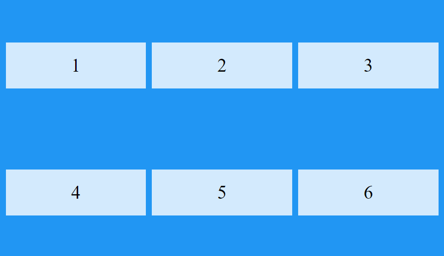
- space-between — adds an even amount of space between each grid item, with no space at the ends of the grid.
For example:
.container {
   align-content: space-between;
}Code language: CSS (css)
- space-evenly — places an even amount of space between each grid item and on both ends of the grid.
For example:
.container {
   align-content: space-evenly;
}Code language: CSS (css)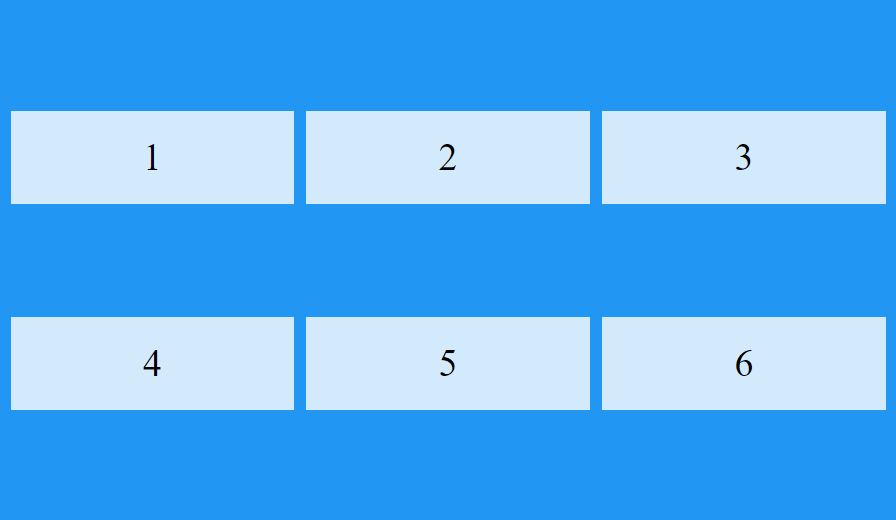
align-self
This behavior of the align-items property that controls the alignment of grid items along the block (column) axis of a grid container can also be set on individual grid items via the align-self property. This property is passed to the grid items. It accepts four possible values.
- start — places a grid item at the top of its cell.
For example:
.box-4 {
   align-self: start;
}Code language: CSS (css)
- end — places a grid item at the bottom of its cell.
For example:
.box-5 {
   align-self: end;
}Code language: CSS (css)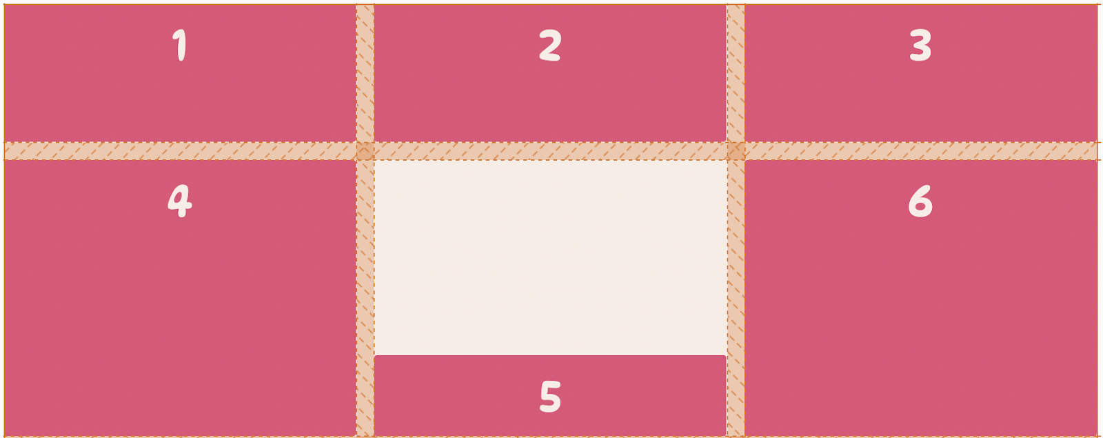
- center — places a grid item at the center of its cells.
For example:
.box-6 {
   align-self: center;
}Code language: CSS (css)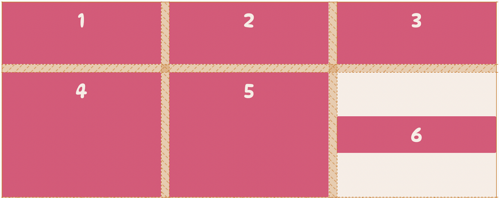
- stretch — will stretch out the grid item to fill the entire height of its cell; this is the default value.
For example:
.box-1 {
  align-self: stretch;
}Code language: CSS (css)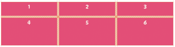
Introducing new measurement units
Aside from non-negative CSS length values such as px, rem, vw, and percentages (%), you can also use special sizing units and keywords to control the size of grid items in a grid.
The fractional (fr) unit
The fr unit, short for “fractional,” is a length unit introduced with the CSS Grid layout. It represents a fraction of the free space available in a grid container. This makes it the ideal unit for defining responsive columns and rows that will scale as the browser’s viewport shrinks and grows.
Let’s look at an example to explain how helpful the fr unit is and why it’s a better alternative to other CSS length units.
Say we are to create a grid layout made up of three columns where the first column takes up 1/6 of the grid’s width, the second column takes up twice the width of the first column, and the third column takes up three times the width of the first column.
If we weren’t using the fr unit in the example above, we’d have to perform some math on our end. We had to figure out the total width of the grid (100%), divide that by 6, then multiply whatever the result is by how wide each column should span, which would be:
- width of first column = 100% / 6 * 1 —> 15%
- width of second column = 100% / 6 * 2 —> 30%
- width of third column = 100% / 6 * 3 —> 45%
As the layout becomes more complex, using percentages or any CSS math function becomes unsustainable. This is when the fr unit comes in handy.
The fr unit tidies all this by letting us specify how the available space in a grid container should be distributed among its rows and columns. Then it spreads the space available in that order.
.container {
   display: grid;
   grid-template-columns: 1fr 2fr 3fr;
}Code language: CSS (css)
In the code above, we assign a fraction of the available space in a grid container to the first column, then twice to the second column, and thrice to the third column.
The result:
min-content
The min-content is a sizing keyword that sets the width of a grid track to its intrinsic minimum width, which is usually the size of the smallest content or text within its grid items. It works similarly to the CSS function min, but is used as a spacing unit instead of a function.
When applied to a column or row, they become as narrow as the longest word in their track. This lets you get the shortest measurement of the content inside the grid items.
For example:
.container {
   display: grid;
   grid-template-columns: 1fr min-content 1fr;
}Code language: CSS (css)
In the code above, we set the first and third columns to be as wide as a fraction of the grid container while passing the min-content to the second column, making it shrink to the size of the words in its grid items.
The result:
max-content
The max-content sizing keyword has the opposite effect of min-content; max-content behaves similarly to a CSS function: max(). When applied to either a column or row, the track becomes as wide as possible for all the content within the grid items to display in one long unbroken line.
The most significant benefit of using max-content is that you can let the content within our grid items breathe and spread out rather than wrapping them into new lines, which causes vertical text overflows.
For example:
.container {
   display: grid;
   grid-template-columns: 1fr max-content 1fr;
}Code language: CSS (css)
The code above defines three columns and sets the width of the second column to the max-content keyword. If we add a lot of words to the grid items in the second column, the text in these grid items won’t overflow. Instead, the width of the second column will grow, and the first and third columns will shrink to accommodate it.
The result:

Useful CSS functions to combine with CSS Grid
When working with the CSS Grid layout, there are a few handy functions you should familiarize yourself with to help increase the efficiency of your CSS.
repeat()
The repeat() function lets us define recurring unit declarations for our grid container’s rows or columns in a more compact form.
For example, suppose you repeat unit declarations when defining columns or rows using the grid-template-rows and grid-template-column properties. You can use the repeat() function to declare these recurring patterns more concisely.
The function takes two arguments:
- repeat count: this is an integer value of 1 or higher, or the keyword values auto-fill or auto-fit. It specifies the number of times the recurring pattern of the rows or columns should repeat.
- track(s) definition: this is where we specify the recurring pattern of rows or columns to repeat. We can pass one or more non-negative length values to it, where each value represents the size of a row or column.
Essentially, its syntax is this:
repeat(<number of columns/rows>, <the height or width of each column /row>);
Say we want to create a grid with six equal columns. Without the repeat() function, we’d have to explicitly define each column using the grid-template-columns property.
.container {
     display: grid;
     grid-template-columns: 1fr 1fr 1fr 1fr 1fr 1fr;
}Code language: CSS (css)
However, as the number of columns increases, this approach becomes unsustainable and verbose. We can rewrite this into a more compact form using the repeat() function.
.container {
     display: grid;
     grid-template-columns: repeat(6, 1fr);
}Code language: CSS (css)
Here we use the repeat() function to create a column that spans over a fraction of our grid container, repeating the process six times. This drastically reduces the number of repetitive unit declarations in our CSS.
The result:
minmax()
When defining a responsive grid layout, you likely want to give each grid track a minimum and maximum size to ensure that they scale up and down to fit their content as the viewport resizes. This is where the minmax() property comes in handy.
The minmax() function lets us specify a minimum and maximum size for a grid track. As the grid is resized across viewports, the grid track will grow and shrink across that range. On smaller screens, it will shrink until it reaches the minimum size. And on larger screens, it will stretch until it reaches the maximum size.
The minmax() function takes two parameters, min and max, where:
- min is the minimum size of the track.
- max is the maximum size of the track.
Syntax:
minmax(<minimum allowed value>, <maximum value>);
The minmax() function also accepts CSS Grid sizing units, keywords, length and percentage values.
Let’s look at an example using the minmax() function.
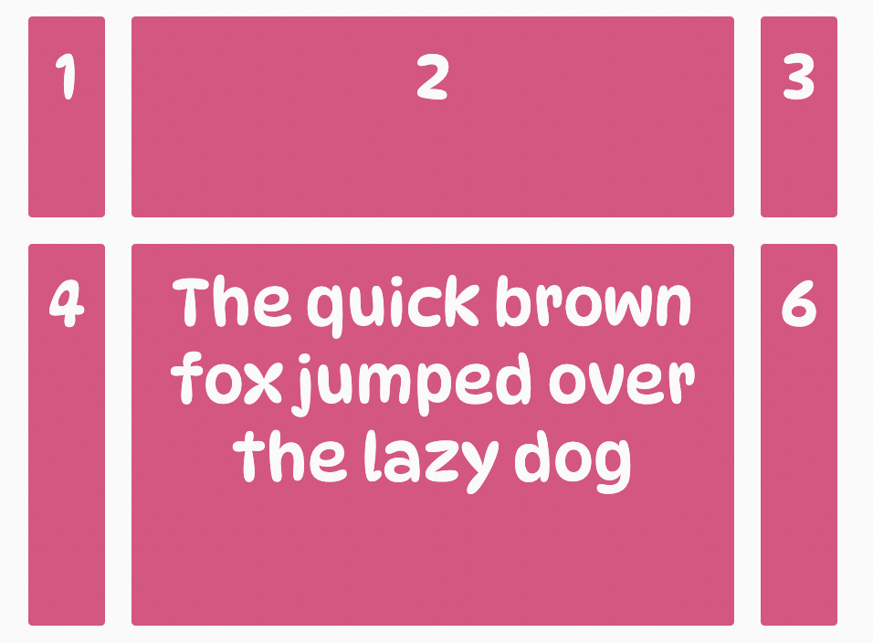
.container {
  display: grid;
   grid-template-columns: repeat(3, 1fr);
   grid-template-rows: repeat(2, minmax(100px, max-content));
}
Code language: CSS (css)
In the code above, we use the minmax() function to set the minimum height of the two rows in our grid container to 100px and the maximum height to max-content, which ensures each row stretches and becomes as wide as possible to contain its contents if it gets taller than 100px.
The result:

A significant benefit of the minmax() function is that it reduces the need for media queries. Rather than relying mainly on media queries to control the size of grid tracks (columns and rows) across viewports, it lets you set up, to a degree, a responsive transition of values for a grid track.
fit-content()
The fit-content() function operates similarly to the minmax() function. The difference is that with fit-content(), the minimum value is the size of the content within the grid item, and the maximum value would be the value we pass to it. This lets you clamp your content to the smallest value and scale it up to a certain value as needed.
When applied to a grid track, it sets the size of the grid track to its intrinsic minimum width, which is the size of the smallest piece of content or text in its grid items. The caveat is that the smallest piece of content or text size is not larger than the value specified in the function.
However, if the value of the intrinsic minimum width exceeds the value supplied to the function, the size of the grid track is set to the value passed to the fit-content() function, and the content of the grid items will begin to wrap.
For example:
.container {
   display: grid;
   grid-template-columns: fit-content(200px) fit-content(300px) fit-content(400px);
}
Code language: CSS (css)
The code above creates three columns with widths of 200px, 300px, and 400px, respectively, using the fit-content() function. This means that the size of each column will be equal to the size of the smallest piece of content or text in its grid items, but if that becomes greater than the value supplied to the fit-content() function, then the size of the columns will be set to the value passed to the fit-content() function.
The result:
Expanding grid items across multiple grid lines
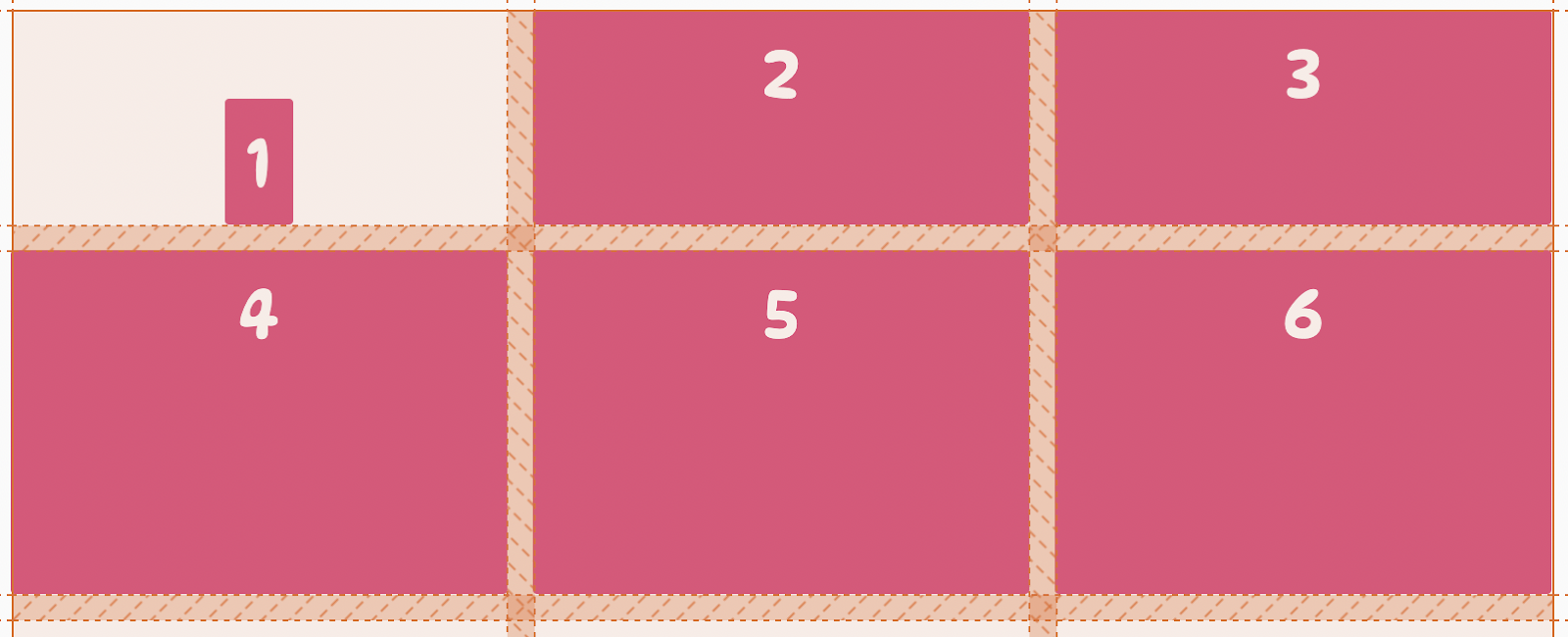
Remember, when talking about grid lines, the horizontal lines reside on either side of a row (known as row grid lines), and the vertical lines reside on either side of a column (known as column grid lines) within the grid container.
In the grid container, each grid line is given a number based on its position on the grid. The first grid line (row or column) is given the number 1, the second 2, and so on.
For example, the image below displays the number of grid lines present on a grid container with three columns and two rows, where the column lines are the numbers inside the orange circle from 1 – 4, while the row lines are the ones inside the blue circle from 1 – 3.
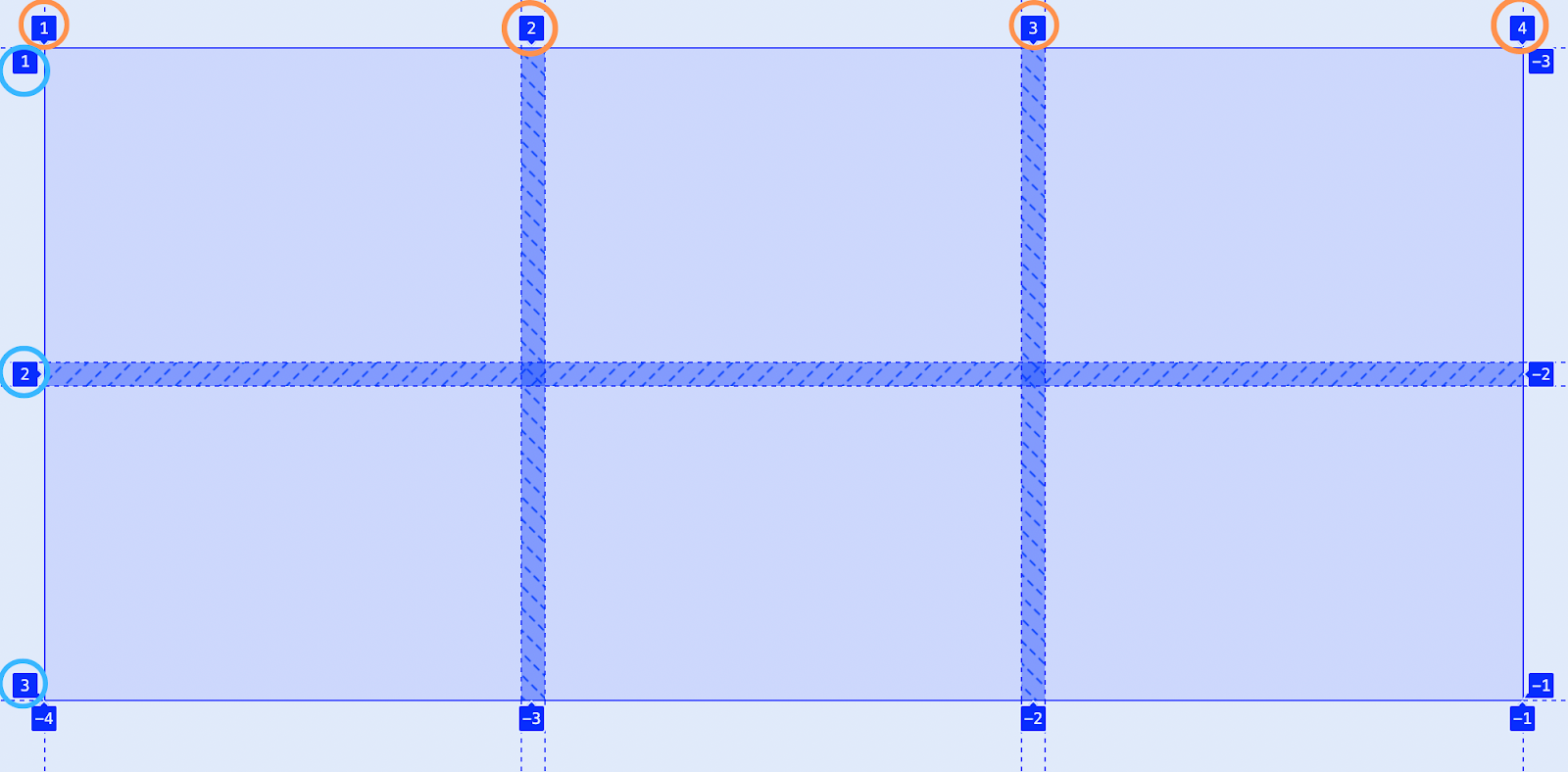
The browser uses these grid lines to control the layout and position of items within the grid. For instance, in the image above, the first column spans from column line 1 to column line 2, and the first grid item will be placed between those lines and span that wide. However, a handful of CSS Grid properties let us control the position of grid items along these grid lines and how wide they would span horizontally and vertically across them.
The properties you can use to control the position of grid items and how they span across these lines are:
grid-column-startgrid-column-endgrid-row-startgrid-row-end
Let’s go over each in detail.
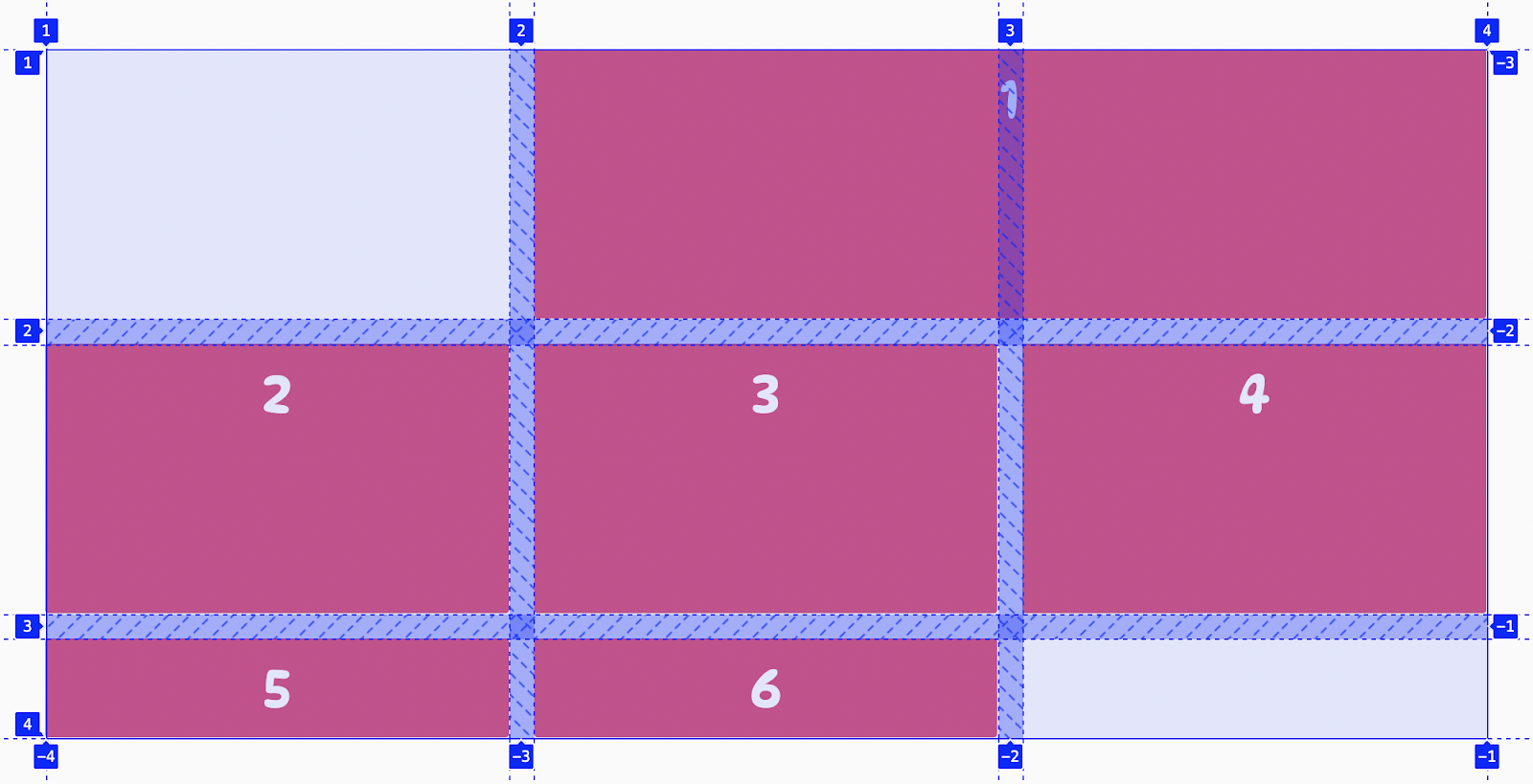
grid-column-start
The grid-column-start CSS property lets us specify the horizontal starting position of a grid item along the column grid lines within the grid container. This start position defines the start of the left edge of the grid item.
Using the grid layout below, let’s target the first grid item and set its horizontal starting position to column line 2.

We can target the div using CSS pseudo-selectors, or you can apply classes to the element and target it with that.
.container div:nth-of-type(1) {
  grid-column-start: 2;
}Code language: CSS (css)
Doing this, the horizontal starting position of the selected grid item will be on the second vertical grid line (column line 2).
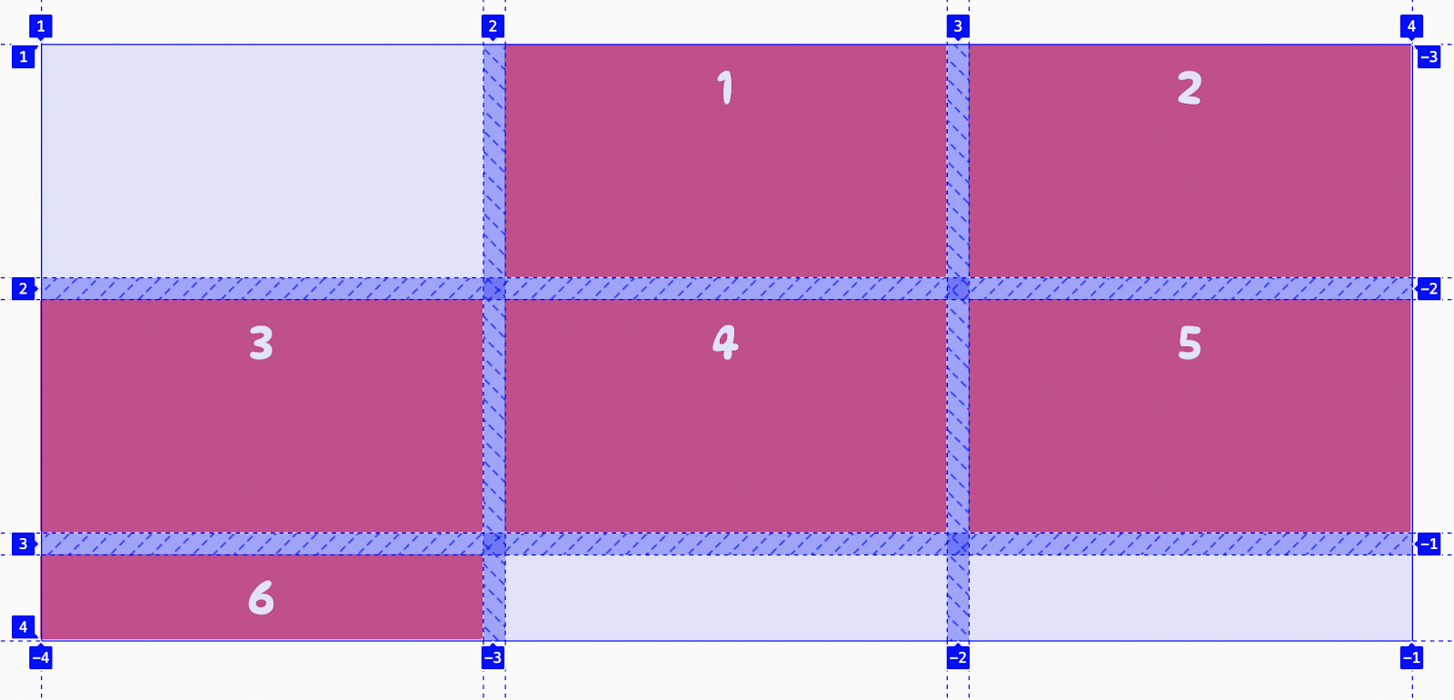
From the image above, the first grid item now begins at column line 2, while the other grid items are pushed over, wrapping onto new rows or creating empty spaces on the grid.
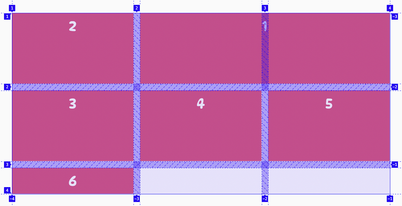
grid-column-end
Along with specifying the horizontal starting position of a grid item with grid-column-start, we can set where the grid item should end using the grid-column-end property.
For example:
.container div:nth-of-type(1) {
  grid-column-start: 2;
  grid-column-end: 4;
}Code language: CSS (css)
This makes the first grid item start on column line 2, span across two grid lines, and end on line 4. Using the grid-column-start and grid-column-end properties, we can effectively control the horizontal starting position of a grid item and how wide it spans across the grid.
The result:
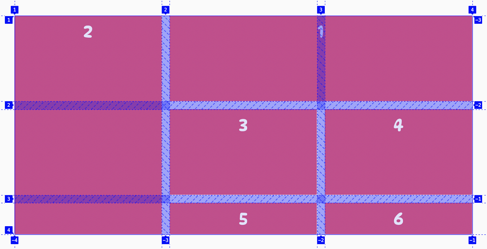
grid-row-start
The grid-row-start property lets us specify the vertical starting position of a grid item along the horizontal (row) grid lines within the grid container. This sets the line where the grid item begins.
For example:
.container div:nth-of-type(2) {
  grid-row-start: 1;
}Code language: CSS (css)
In the code above, we set the vertical starting position of the second div element to row line 1 using the grid-row-start property.
The result:
grid-row-end
The CSS grid-row-end property lets us specify the vertical ending position of a grid item along the horizontal (row) grid lines within the grid container.
For example:
.container div:nth-of-type(2) {
   grid-row-start: 1;
   grid-row-start: 4;
}Code language: CSS (css)
This makes the second grid item start on the first-row line and span down three grid lines, ending on line 4. Using the grid-row-start and grid-row-end properties, we can effectively control the vertical starting position of a grid item and its height down the grid.
The result:
CSS Grid shorthands
Like most CSS properties, CSS Grid offers a handful of shorthand properties that provide a shorter and more forward way to set the values of multiple CSS Grid properties simultaneously. Using these shorthand properties, we can write more concise (and often, more readable) style sheets, saving time and energy.
Let’s take a look at these properties.
Using a single CSS rule to set all gutters in a grid
In this guide, we have seen how we can add gutters (spacing) between columns and rows to space them apart using the column-gap and row-gap grid properties. Using a single property — gap, we can set the values for both the column-gap and row-gap properties.
The gap property is a shorthand for the row-gap and column-gap properties. It lets us add gutters (spacing) between columns and rows.
Syntax:
gap: <row-gap> <column-gap>
The gap property accepts two values where:
<row-gap>is the first value passed to the gap property. It sets the value of therow-gapproperty.<column-gap>is the second value passed to the gap property and sets the value of the column-gap property. It is an optional value, and if omitted, it’s set to the same value as<row-gap>.
For example:
.container {
   display: grid;
   gap: 20px;
}Code language: CSS (css)
This adds a space of 20px between all columns and rows in a grid container and is the same as the code below.
.container {
	display: grid;
	column-row: 20px;
	row-gap: 20px;
}
Code language: CSS (css)
Combining horizontal and vertical alignments into single CSS rules
We talked about the six CSS Grid properties that let us control the alignment of grid items along the rows (incline axis) and columns (block axis) of a grid container. In this section, we’ll go over the shorthand properties that let us set the alignment of grid items much better.
place-items
place-items is a shorthand property that lets us set the values for the align-items and justify-items properties in a single declaration. It allows us to control the alignment of all grid items horizontally and vertically at once.
It accepts two values: the first value sets the value of the align-items property, and the second sets that of the justify-items property. If the second value is not specified, the first value will be assigned as the value of both properties.
For example:
.container {
	display: grid;
	place-items: center;
}
Code language: CSS (css)
This sets the value of both the align-items and justify-items properties to center, placing all grid items at the center of their grid areas.
place-content
place-content is a shorthand property that lets us set the values for the grid properties align-content and justify-content in a single declaration—enabling us to control the horizontal and vertical alignment of the entire grid within the grid container at once.
It accepts two values: the first value sets the value of the align-content property, and the second sets that of the justify-content property. If the second value is not specified, the first value will be assigned as the value of both properties.
For example:
.container {
	display: grid;
	place-content: center;
}
Code language: CSS (css)
This sets the value of both the align-content and justify-content properties to center, centering the entire grid within the grid container horizontally and vertically.
place-self
place-items is a shorthand property that lets us set the values for the align-self and justify-self properties in a single declaration. It enables you to control an individual grid item’s horizontal and vertical alignment within its grid area.
It accepts two values: the first value sets the value of the align-self property, and the second sets that of the justify-self property. If the second value is not specified, the first value will be assigned as the value of both properties.
For example:
.item {
   place-self: end center;
}Code language: CSS (css)
In the code above, the value of the align-self property is set to ‘end,’ which pushes the grid item vertically down to the bottom of its grid cell. And the justify-self property is set to center, which places the grid item horizontally at the center of its cell.
The result:
Shortening the CSS for spanning grid items across columns and rows
Declaring the ‘grid-column-start,’ ‘grid-column-end,’ ‘grid-row-start,’ and ‘grid-row-end’ attributes anytime you want to span a grid item across some columns and rows can be somewhat redundant. Let’s look at some shorthand properties that can help us declare the CSS to span grid items more concisely.
grid-column
The grid-column is a shorthand property for the grid-column-start and grid-column-end properties. It lets us specify the horizontal starting position of a grid item along the column grid lines within the grid container and where the grid item should end.
Syntax:
grid-column: column-start / column-end;
The grid-column property accepts two grid line values separated by a slash (/) where:
- The first value,
column-start, is the value of thegrid-column-startproperty. - The second value after the slash,
column-end, is the value of thegrid-column-endproperty. - And the slash (/) serves as a demarcation between these two values as both can contain one or more whitespaces. As a result, passing the slash is required to eliminate errors and ambiguity. Also, as a best practice, adding some whitespace at both sides of the slash (/) is recommended to make our CSS more readable.
For example:
.gird-item {
  grid-column: 1 / 4;
}Code language: CSS (css)
The code above tells the grid item to span horizontally from column line 1 to column line 4 in the grid.
grid-row
The grid-row property works just like the grid-column property. It is a shorthand property for the grid-row-start and grid-row-end properties. It lets us specify the vertical starting position of a grid item along the row grid lines in the grid container and where the grid item should end, spanning down the grid.
For example:
.gird-item {
  grid-column: 2 / 5;
}Code language: CSS (css)
This causes the height of the grid item to span down from row line 2 to row line 5 in the grid.
Bringing it all to a single property: grid
Lastly, we come to the last of the CSS Grid shorthand properties — grid.
The CSS property grid is a shorthand property that lets us set a value for each of the explicit grid container properties such as grid-template-rows, grid-template-columns, and grid-template-areas, and for each implicit grid container properties such as grid-auto-rows, grid-auto-columns, and grid-auto-flow, in a single declaration.
Syntax:
<grid-template> | <grid-template-rows> / [ auto-flow && dense? ] <grid-auto-columns>? | [ auto-flow && dense? ] <grid-auto-rows>? / <grid-template-columns>
You can read more about it here.
Try out CSS Grid yourself!
Creating the perfect layout for your website has never been easier. With CSS Grid, you can create complex layouts with as few lines of CSS, minimal development time, and less dependence on external libraries and frameworks.
You should now have a solid grasp of the CSS Grid layout, how it works, and how you can use it to lay out content on your websites. We’d love you to give it a try.
This article was written by Victor. Victor is a front-end developer and technical writer interested in Jamstack. He has a knack for breaking down developer concepts into clear, understandable bits for others.