Top 10 CSS Animation Libraries
For the longest time, developers were limited to Flash players and gifs when they wanted to display animations on a web page.
However, the introduction of the keyframes, transition, and animation properties in CSS3 made it much easier to create and display abstract animations that appealed to the eye. The CSS3 update allows for creating animations and conditionally renders them for various pseudo-states. (i.e., hover, focus, etc.).
Creating animations with these properties is pretty straightforward. First, you define a keyframes rule containing the preferred animation sequence:
@keyframes float {
  0% {
    transform: translate(0, 0px);
  }
  50% {
    transform: translate(0, 15px);
  }
  100% {
    transform: translate(0, -0px);
  }
}Code language: CSS (css)
You can see that we define a keyframe named float, which at 0% of the animation flow, sets the element transform property to translate by 0%, at 50% to translate by 15px on the y axis, and at 100% translate back to 0%.
We can then apply this keyframe flow to an element via the animation property:
.element {
  animation: floating 3s ease-in-out infinite;
}

/* OR */

.element:hover {
  animation: floating 3s ease-in-out infinite;
}Code language: CSS (css)
You’ll notice that it takes a lot of code to create a simple float animation, and the code gets even longer when working on more complex ones. Animation libraries essentially solve this problem by making the process of adding animations to webpages as simple as adding class names to the appropriate elements.
This post will look at ten common CSS animation libraries and platforms for various types of animations, such as simple motion, elements/page transitions, lightbox animations, loaders, animating pages on scroll, and many more. We’ll look at their benefits, limitations, and code examples to get you started quickly. Here’s the full list of libraries that we’ll cover:
- Animate.css
- Animista
- Animation Library
- Magic CSS
- lightGallery
- Loading.io
- Skeleton Elements
- Micron
- AnimXYZ
- AOS
Animate.css
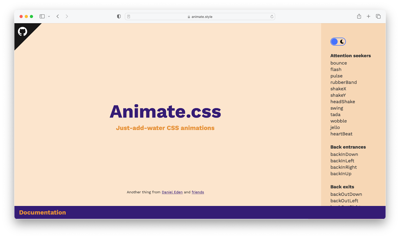
Animate.css library.Animate.css is one of the most popular CSS animation libraries, having over 76k stars on GitHub at the time of this writing. Animate.css allows you to effortlessly add several ranges of animation to your web application by just including their class names in the element you wish to animate. Animate.css is very handy for displaying on-page animations, animation on sliders, and overall attention-grabbing animations.
This library also includes extra utility classes that allow you to adjust animation duration, speed, and repeat animation directly from your markup. You can also integrate animations provided by this library with the native CSS keyframe property, and call them directly from your CSS code.
How to use
Animate.css is available as a npm package, as well as via CDN:
<head>
  <link
    rel="stylesheet"
    href="https://cdnjs.cloudflare.com/ajax/libs/animate.css/4.1.1/animate.min.css"
  />
</head>Code language: HTML, XML (xml)
After including its CDN URL in your markup head section, you may start calling from its list of available animations, as shown below:
<div class="animate__animated animate__pulse">A pulse animated element</div>
<!-- using utility class  -->
<div class="animate__animated animate__pulse animate__infinite">A pulse animated element</div>Code language: HTML, XML (xml)
In the first example, we created a div with a pulse animation that will animate for 1 second by default, and in the second example, we configured the pulse animation to run endlessly using the animate__infinite utility class (which is an equivalent of CSS animation-iteration-count: infinite;). You can learn more about Animate.css via the links below.
Animista
Animista is more of a CSS animation platform than a library in that they provide animation on demand, i.e., you go to the platform, select the type of animation you want, and the animation CSS keyframe code is instantaneously generated for you.
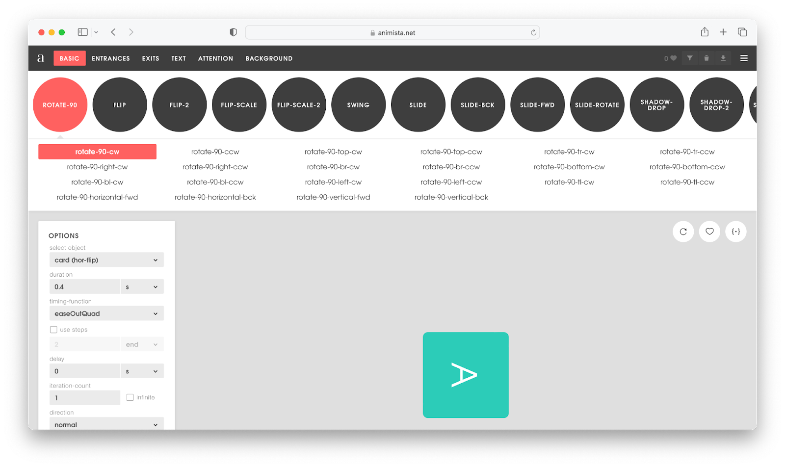
On the surface, the types of animations available on Animista are very similar to those offered on animate.css, but, when you delve deeper, Animista offers a lot more useful animation categories, particularly for animating words and background elements. And, when you’re ready to export your animation code, you can optionally choose to download standard or minified code.
How to use
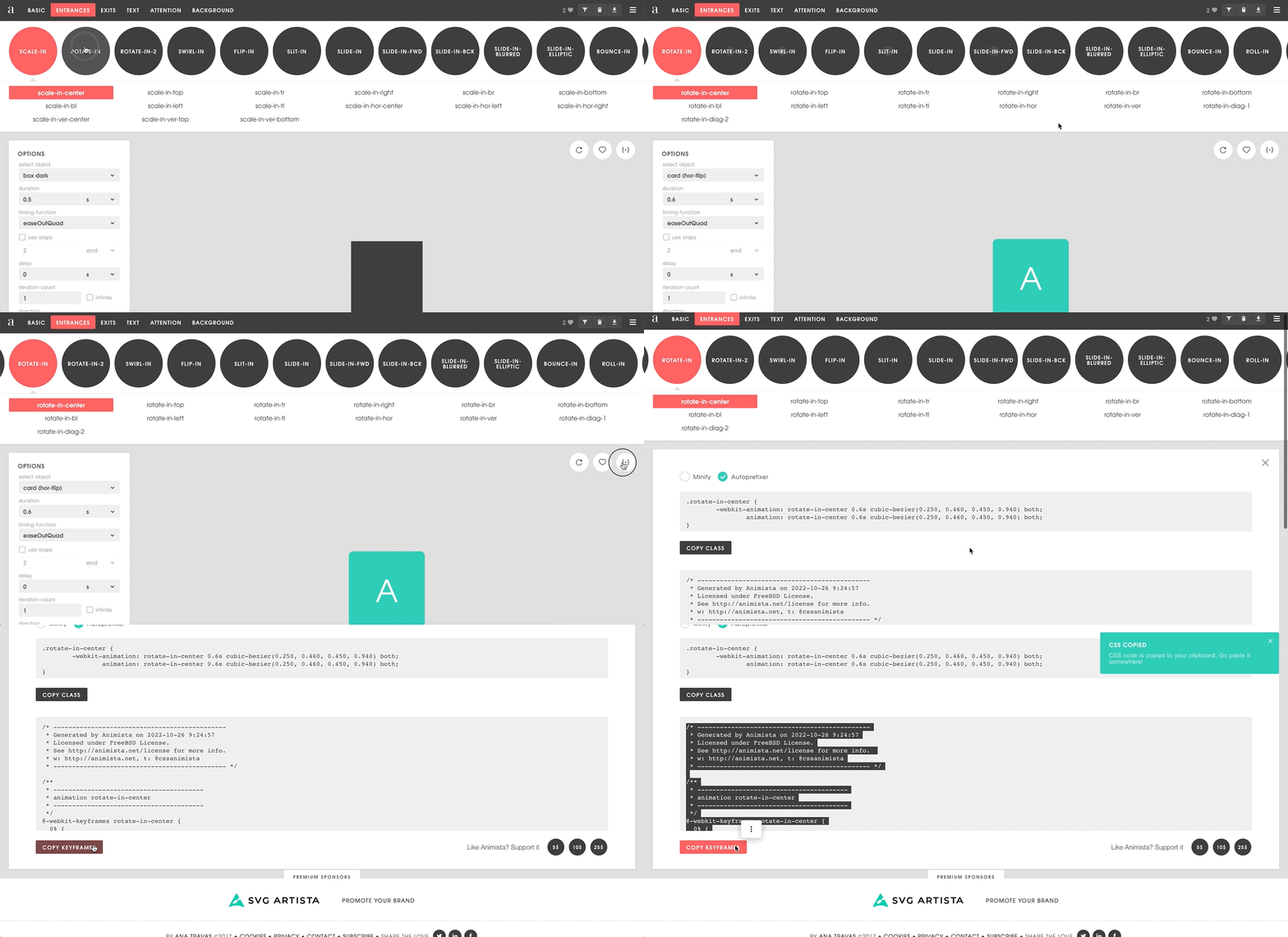
As mentioned previously, you do not need to download any packages or include any CDN in your website to begin utilizing Animista; simply visit their homepage, select your favorite animation, customize the animation sequence as desired, and the code will be generated for you instantly.
Here’s a GIF showing this process:
Animation library
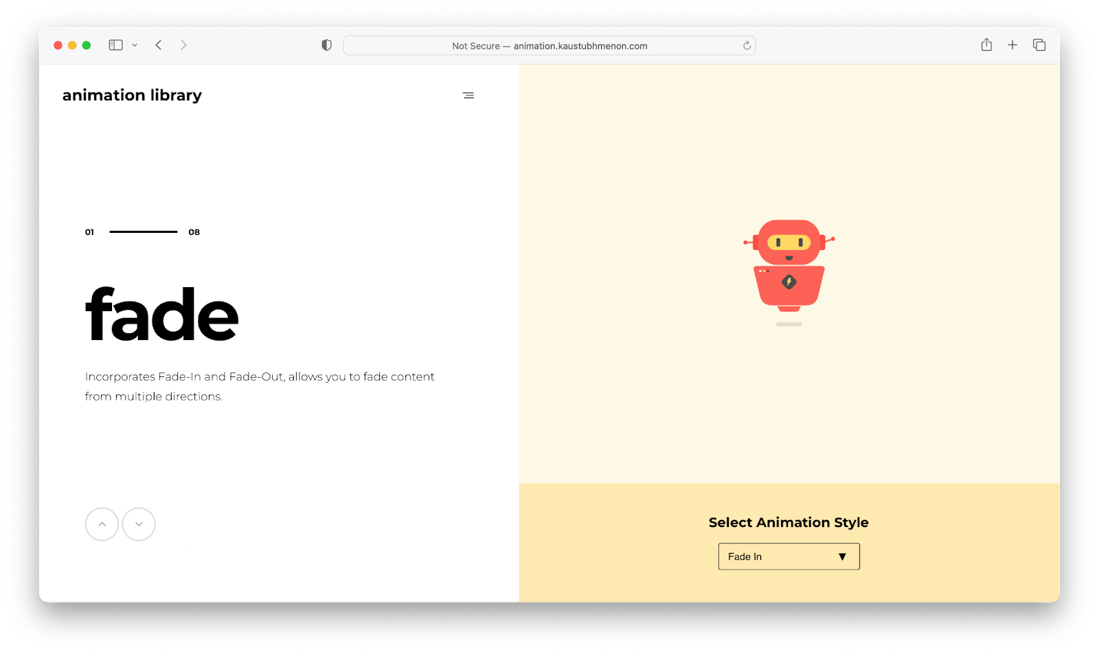
Animation library could be considered an Animate.css alternative, as they offer similar animation categories. However, unlike the former, animation library does not provide the additional customization options that allow you to set a preferred animation duration, speed, or timing.
Furthermore, animation library source files are divided into distinct classes — for example, all variants of the fade animation are in a single source file, as are other animation classes.
How to use
After downloading the ZIP file containing all available animation categories, you can choose to link to any of them and begin calling their associated class names in your markup. Here’s an example of linking rotate.css and using the rotateUpRight style:
<head>
  <link rel="stylesheet" href="path/to/rotate.css">
</head>

<body>
  <div class="rotateUpRight">
    This div will rotate up right.
  </div>
</body>Code language: HTML, XML (xml)Magic CSS
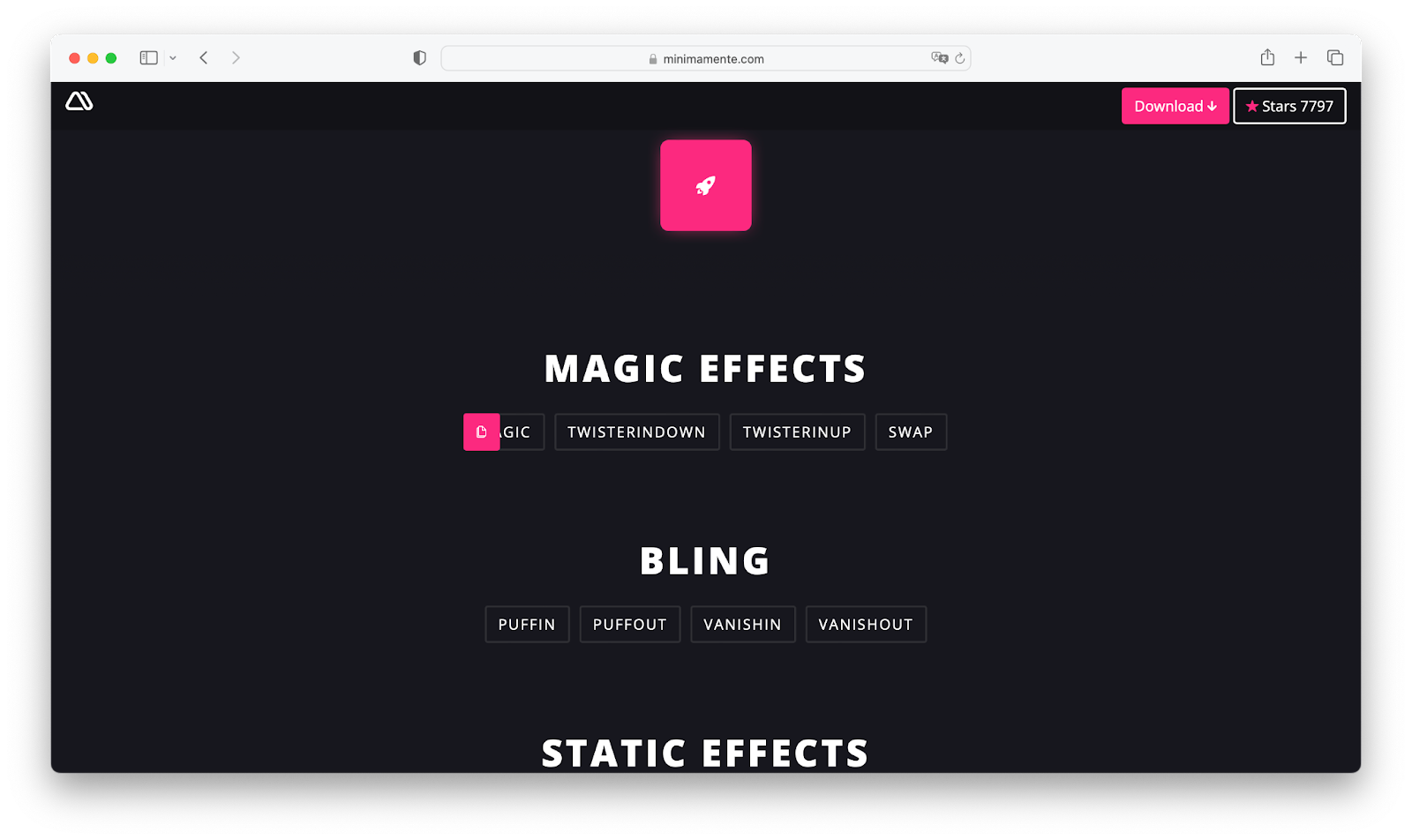
Magic CSS is another interesting animation library that offers even more engaging animations compared to the ones we’ve covered so far. The animations provided by this package are very handy for page transitions. However, one disadvantage of magic CSS is that it does not support the Opera mini-browser.
How to use
Magic CSS usage is also pretty straightforward. You can get started by downloading the library from npm or simply download its CSS source file, and include it in your webpage markup. You can then begin calling from its list of animations:
<head>
  <link rel="stylesheet" href="https://raw.githubusercontent.com/miniMAC/magic/master/dist/magic.min.css">
</head>

<body>
  <div class="magictime puffIn">
  </div>
</body>Code language: HTML, XML (xml)lightGallery
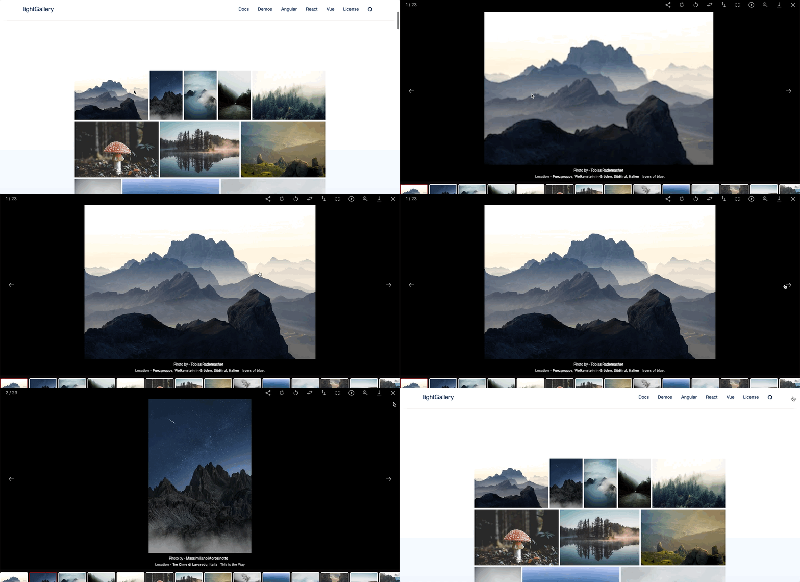
lightGallery is unique from the other animation libraries we’ve mentioned so far, in that it is specifically designed for making lightbox images. Lightbox images, such as the one seen above, are images that, when clicked, overlay the current website in a modal form.
lightGallery is a versatile library in that it supports video files, allows you to render media assets in a carousel format, and lets you create custom plugins to extend or modify its functionality. It’s also worth noting that lightGallery isn’t entirely a pure CSS animation library because it relies on JavaScript to function.
How to use
lightGallery is available via npm/yarn, bower, and also served via a CDN. To get started on a traditional web page, you’ll first include its CSS and JavaScript CDN link in your web page like below:
<head>
  <link rel="stylesheet" href="/path/to/lightgallery-bundle.css" />
</head>

<body>
  <!-- . . .  -->
  <script src="/path/to/lightgallery.min.js"></script>
</body>Code language: HTML, XML (xml)
Following that, you create an element that will act as a container for all of the images you want to convert to lightbox:
<div id="lightbox-container">
  <a data-lg-size="1600-2400">
    <img src="path/to/img" />
  </a>
  <a data-lg-size="1024-800">
    <img src="path/to/img" />
  </a>
</div>Code language: HTML, XML (xml)
Finally, you initialize lightGallery via the previously created container, with the script below:
lightGallery(document.getElementById("lightbox-container"), {
  speed: 500
  //   ...
});Code language: JavaScript (javascript)
lightGallery also integrates with other JavaScript frameworks such as React, Angular, and Vue, making it even easier to use the library via components and props.
Loading.io
Loading.io is a platform that allows you to customize from a collection of rich loading animations and export your creation as a CSS keyframe animation, GIF, SVG, or PNG file. These animations are especially handy for building preloaders or depicting asynchronous activities’ loading states.
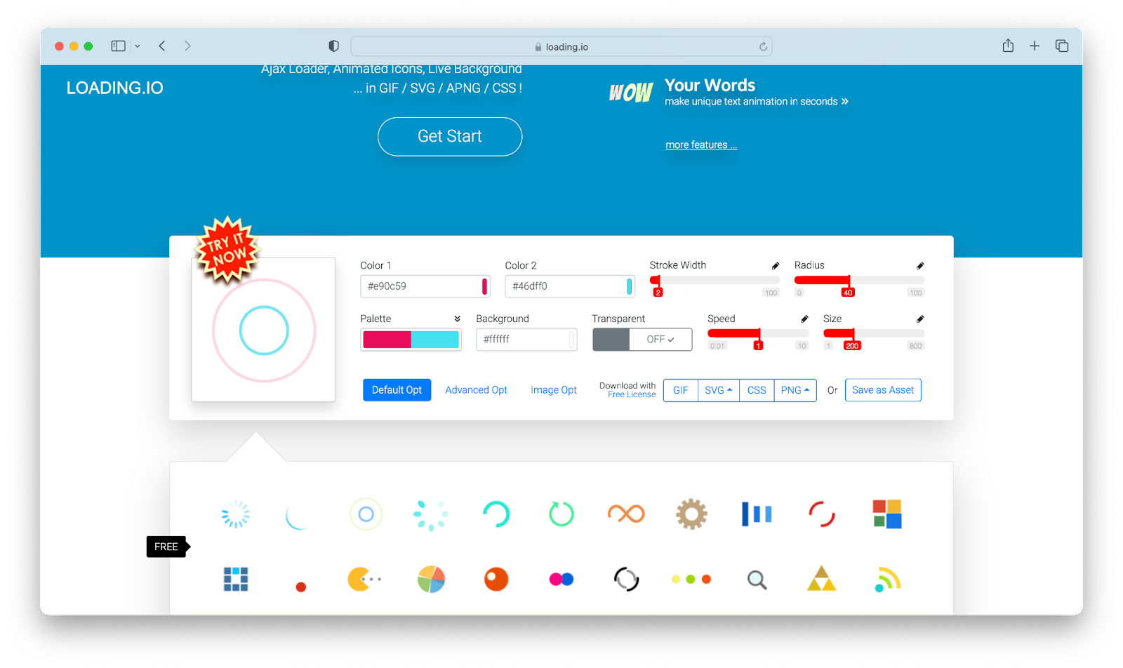
Loading.io offers more than just preloaders; the platform allows you to animate text and even background patterns. They also offer an additional loadingBar.js library for directly and interactively including its preloaders on a web page.
How to use
Loading.io usage is similar to Animista’s in that no additional package is required to get started. You’d simply go to their website, choose a preferred loader, customize as desired, and then export.
Skeleton Elements
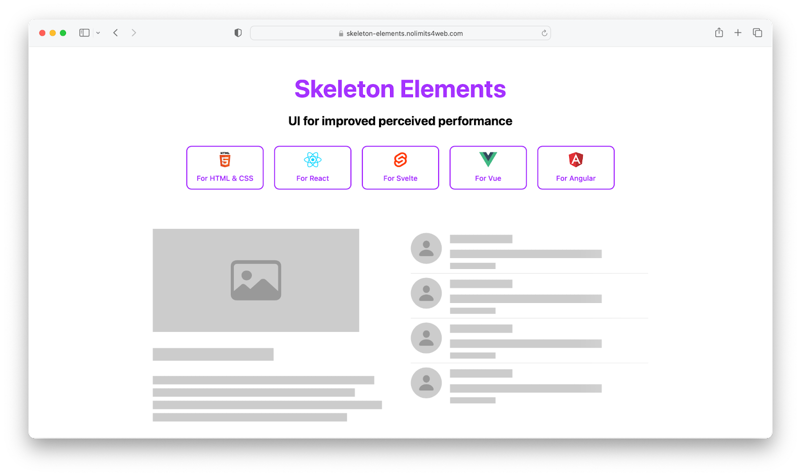
Skeleton loaders can also be categorized as preloaders. However, they differ from typical loaders in that skeleton loaders simulate the structure and appearance of loading content into gray blocks. It indicates what type of content is loading in each block, such as an image, text, and so on.
Skeleton elements is a popular library that provides this type of functionality, and it is also available as a component for several JavaScript frameworks.
How to use
The skeleton elements library is available via npm and is also served on a CDN. For a simple webpage, you can include its CDN in your markup head section like below:
<head>
  <link rel="stylesheet" href="https://cdn.jsdelivr.net/npm/[email protected]/skeleton-elements.css" />
</head>Code language: HTML, XML (xml)
You can then start creating skeleton loaders via the skeleton-text and skeleton-block class:
<body>
  <h3 class="skeleton-text">Placeholder Header</h3>
  <p class="skeleton-text">
    Lorem ipsum dolor sit amet consectetur adipiscing elit.
  </p>
  <div class="skeleton-block" style="width:30%; height:50px"></div>
</body>Code language: HTML, XML (xml)
You can also add loading effects via the skeleton-effect-EFFECT_NAME class. Here’s our previous example modified with a wave effect:
<body>
  <h3 class="skeleton-text skeleton-effect-wave">Placeholder Header</h3>
  <p class="skeleton-text skeleton-effect-wave">
    Lorem ipsum dolor sit amet consectetur adipiscing elit.
  </p>
  <div class="skeleton-block skeleton-effect-wave" style="width:30%; height:50px"></div>
</body>Code language: HTML, XML (xml)Micron
Micron is a JavaScript-controlled microinteraction library created with CSS animations. Simply put, micron allows you to easily attach multiple animations to elements when they are clicked. There are also other setup options to help you regulate the animation flow.
Furthermore, you can bind and simply trigger animation from other elements – for example, you might have a button element activate an animation you’d attach to another div.
How to use
You get started with micron by including its CSS and Javascript source file CDN in your markup, as shown below:
<link href="https://unpkg.com/[email protected]/dist/css/micron.min.css" type="text/css" rel="stylesheet">
<script src="https://unpkg.com/[email protected]/dist/script/micron.min.js" type="text/javascript"></script>Code language: HTML, XML (xml)
The library can then be used by adding a data-micron attribute to your elements. Here’s an example of how to include the bounce interaction:
<div data-micron="bounce">Click to bounce</div>Code language: HTML, XML (xml)Animxyz
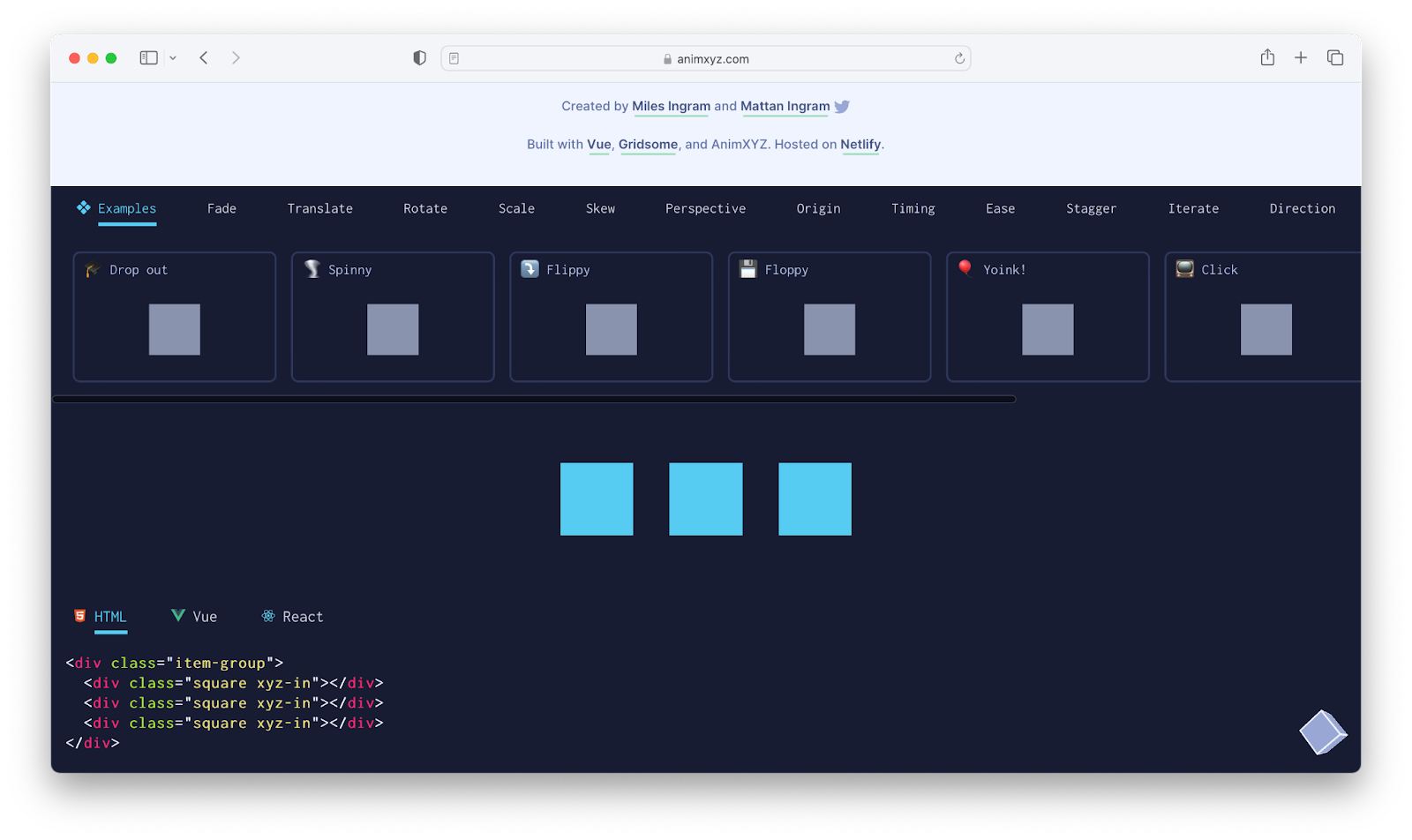
Animxyz is another easy to use CSS interaction animation library that allows for customization via attributes. You can choose from a variety of animation options and easily integrate with other JavaScript frameworks including React and Vue.
This library was also created with SCSS, which allows for variable usage, so that you can easily customize the library source to your liking.
How to use
You can install this library using npm, import its core SASS mixins, and customize as desired. Or you can simply include its CDN link in the head section of your HTML file:
<link rel="stylesheet" href="https://cdn.jsdelivr.net/npm/@animxyz/core">Code language: HTML, XML (xml)And you can start adding animations from its list by using the xyz attribute:
<div class="xyz-in" xyz="fade up big">I will animate in!</div>Code language: HTML, XML (xml)AOS
Animate on scroll (AOS) is another fascinating library that allows you to animate your markup elements while they are scrolling. The library offers predefined animations such as fade, flip, zoom, and so on, and allows you to attach them to custom elements while users scroll through them. It also includes additional configuration options that allow you to set a preferred animation duration, delay, and number of times it should run.
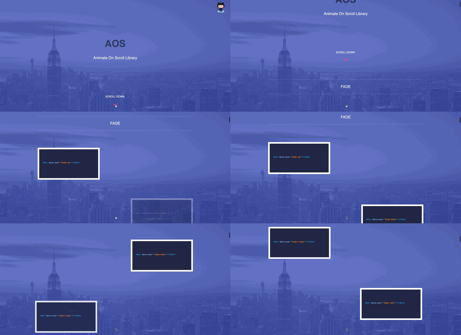
Furthermore, you are not limited to using only the animations provided by the library; you may also attach your own native animations created with the keyframe property.
How to use
To get started you first include the AOS CSS and JavaScript CDN link in your web page and then initialize the library as shown below:
<link rel="stylesheet" href="https://unpkg.com/aos@next/dist/aos.css" />

<script src="https://unpkg.com/aos@next/dist/aos.js"></script>
<script>
  AOS.init();
</script>Code language: HTML, XML (xml)
You can now start animating markup elements on scroll using the data-aos attribute:
<div data-aos="fade-up">
  This div will fade up when scrolled to
</div>Code language: HTML, XML (xml)Conclusion
While creating basic animations on the web is fairly simple, it becomes tiresome when working on complex ones. In this article, we’ve explored ten CSS libraries offering various ranges of animation to help save you the stress of reinventing the wheel.
Hi, I’m Elijah, a technical writer, and software developer, actively sharing all I’ve learned through writing. Follow me on Twitter if you enjoy programming tips and memes.