The Definitive Guide To Responsive Images On The Web
Using images on the web was made possible in 1995, by implementing the <img> tag into the HTML 2.0 specification.
A simple syntax to do a simple job.
But in the times of modern web and the multiplication of devices, HTML authors needed a way to serve different images, based on the screen size. Because images have a great impact on performance, we don’t want to load a large picture on a mobile phone.
We use responsive images to serve different images based on the device it’s being viewed on. We’ll load a smaller image for smaller screens, reducing the size of the network request.
To achieve responsive images, the World Wide Web Consortium (W3C) proposes two solutions:
- Using
srcseton animgtag: a straightforward solution, that will cover most of the cases - Using the
pictureelement with sources inside: a solution providing more control over your images, allowing us to give more precise instruction to the browser
Responsive images using srcset
Using an img with srcset is used for serving the same image in different sizes.
If we want to display a different image (like a zoomed in version for mobile, or a dark-mode version) we’ll want to use picture instead.
Indeed, when using srcset we’ll set guidelines for our browser, but we cannot predict which image the browser will actually prefer. The browser might display a larger version because it has it in its cache already.
Basic example: Targeting pixel density
<img src="goat.jpg" srcset="goat.jpg, goat-2x.jpg 2x, goat-4x.jpg 4x" alt="A goat climbing a mountain" />Code language: HTML, XML (xml)Here, we gave three different images to our browser, using a density descriptor (e.g. 2x) that will display the image corresponding to the device screen density.
Better: Using width descriptor
<img src="goat.jpg" srcset="goat.jpg 800w, goat-1200.jpg 1200w, goat-1800.jpg 1800w" alt="A goat climbing a mountain" />Code language: HTML, XML (xml)Here, the browser will take the viewport width, multiply it by the pixel density and choose the closest-sized image.
For example, on a device having a viewport width of 400px and a density of 3, the browser will look for the image with the closest width to 3 * 400px = 1200px – in this case, goat-1200.jpg.
You’ll use this syntax most of the time, as it handles the device width and its density at the same time.
While this syntax is helpful for many use cases, it is layout agnostic which means that it may not be optimized for images that don’t take up 100% of the device width.
Even better: Adding the sizes attribute
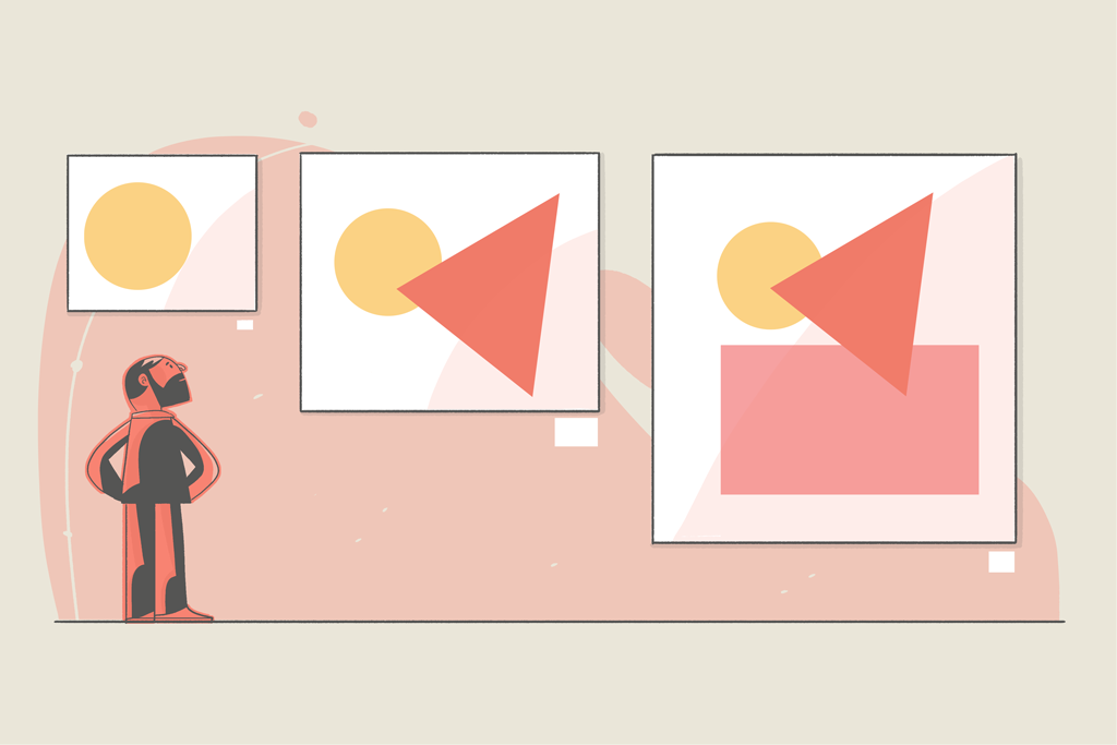
Usually, an image takes up only a portion of the page width, not its entirety. For this, we can use the sizes attribute to define the size of the image relative to the viewport.
An example of how an image width may vary based on the layout:
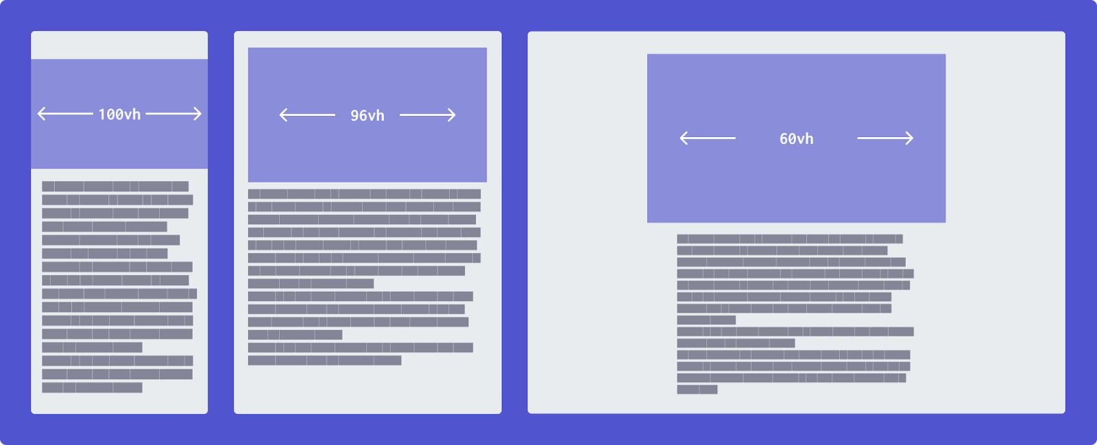
We can add multiple values and use media conditions like so:
<img src="goat.jpg" srcset="goat.jpg 800w, goat-1200.jpg 1200w, goat-1800.jpg 1800w" sizes="(max-width: 500px) 100vw, (max-width: 700px) 96vw, 60vw" alt="A goat climbing a mountain" />Code language: HTML, XML (xml)Here, we have three sizes defined into our sizes attribute:
(max-width: 500px) 100vw: If the viewport is less than 500px, the image will take up 100% of the viewport width(max-width: 700px) 96vw: If the viewport is less than 700px, the image will take up 96% of the viewport width60vw: Else, the image will use 60% of the viewport width
Fully control the image using picture
Using srcset and sizes is enough for most of the cases, but the browser still applies its “secret sauce” regarding which image it’ll load. In some cases, it might show you a bigger version of the picture because it was already in the cache.
That is fine in most cases, but sometimes we’ll have completely different images for different sizes (e.g. a cropped picture for mobile), and using picture ensures that the browser will load the expected image – exactly at the breakpoint we defined.
We also use picture for specifying a fallback image format, so we can use the brand-new image format without losing compatibility with legacy browsers.
Basic example: Different images
If we use not only different sizes of the same images but different images, we refer to this as art direction.
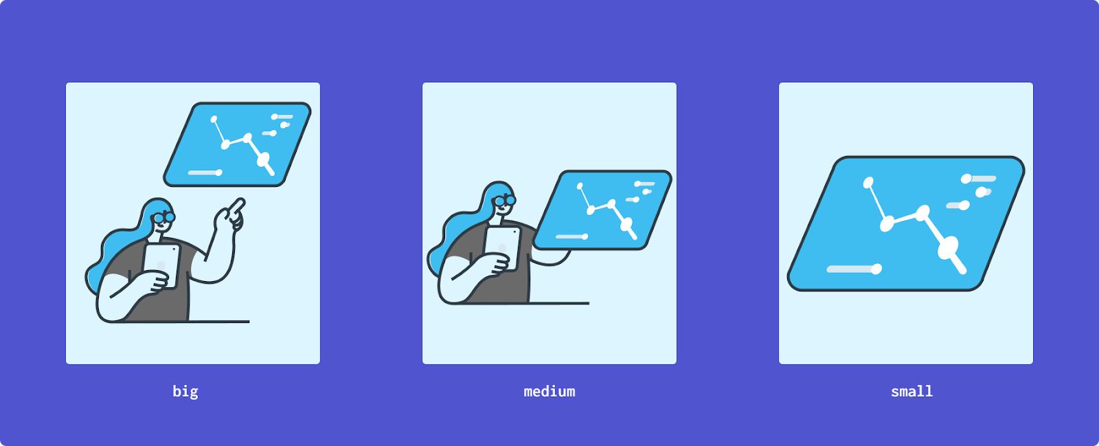
The picture element contains at least one img and can have multiple sources to choose from, based on the display.
That is how we declare these different images using picture:
<picture>
  <source
    srcset="illustration-big.png"
    media="(min-width: 1200px)"
  />
  <source
    srcset="illustration-medium.png"
    media="(min-width: 800px)"
  />
  <img
    src="illustration-small.png"
    alt="An admin panel"
  />
</picture> Code language: HTML, XML (xml)
We can specify media conditions using the media attribute, most of the time we’ll check the width.
Supporting modern image format
We can also use the picture syntax to elegantly support modern image formats. If the browser does not support it, it will fall back to the img element. It even works with old Internet Explorer (IE)!
We use the type attribute, inside which we’ll define the media type, using the Internet Assigned Numbers Authority (IANA) format:
<picture>
  <source srcset="illustration-small.webp" type="image/webp" />
  <img src="illustration-small.png" type="image/png" alt="An admin panel" />
</picture>Code language: HTML, XML (xml)
Using srcset with the picture syntax
We also can define srcset inside the picture syntax.
But remember that srcset are just guidelines, so we are certain of the source but not of the srcset. The browser will decide itself what to load.
<picture>
  <source
    srcset="
    landscape-800 800w,
    landscape-1600 1600w"
type="image/png"
    media="(min-width: 700px)"
  />
  <source
    srcset="
    portrait-200 200w,
    portrait-400 400w,
    portrait-600 600w"
type="image/png"
  />
  <img src="<https://via.placeholder.com/400x200.png?text=Fallback>"/>
</picture>Code language: HTML, XML (xml)
In this example, we have multiple sizes for the landscape version and for the portrait version.
We have full control over which version will be displayed, and we let the browser load the right size for it.
Automate responsive image generation
Loading different images based on the viewport is great, but we shouldn’t have to generate these variants by hand.
We shouldn’t have to export each image in five different sizes.
Let’s explore how we can generate them automatically.
On- the-fly responsive images using a Content Delivery Network (CDN)
A lot of CDNs/hosting services offer a way to resize your images by specifying a size in the URL, here are some that provide that feature:
This is super useful, and since we usually externalize our picture to CDNs for performance matters, it might be the solution for you.
Responsive images on wordpress
Since version 4.4, any image you upload to your media library will get generated into five different sizes.
When using an image in a post it will be responsive by default. A good example of a transparent yet powerful way of dealing with responsive images.
Generating them on your server
This is a solution I use on my personal blog, and it works perfectly.
I just upload my images and image-responsiver takes care of the rest.
Responsive images in CSS
Using media queries
Loading the right image in CSS is simply a matter of utilizing a media query (@media):
.hero {
  background-image: url(background-800.jpg);
}
@media
  (min-width: 800px){
  .hero{
    background-image: url(background-1400.jpg);
  }
}Code language: CSS (css)
The browser will now load only the right image. We are using min-width in our example, but we could’ve targeted the screen density too:
.hero {
  background-image: url(background-1x.jpg);
}
@media (min-resolution: 2dppx),
  (-webkit-min-device-pixel-ratio: 2){
  .hero{
    background-image: url(background-2x.jpg);
  }
}Code language: CSS (css)
Using image-set
There is also a new API, image-set that aims to handle responsive images in CSS like we do with srcset.
I would not recommend relying on this yet, since it’s still being implemented into modern browsers.
The syntax looks like this:
.hero {
background-image: url("background-1x.jpg"); /* fallback */
background-image: image-set(
    url("background-1x.jpg") 1x,
    url("background-2x.jpg") 2x);
}Code language: CSS (css)
It has the same structure as the srcset attribute.
We can use this syntax to serve different image formats as well:
.hero {
background-image: url("background.jpg"); /* fallback */
background-image: image-set(
    url("background.avif") type("image/avif"),
    url("background.jpg") type("image/jpeg"));
}Code language: CSS (css)
Responsive video
When dealing with video that does not intend to be the main content, but part of the design, loading an adapted version of the video is crucial for performances. It would be a huge waste of computing resources to load a 4k video for a mobile phone.
Ideally, we’d have a syntax similar to picture, like this:
<video class="responsive-video" preload autoplay loop preload="none" muted>
<source src="header-360p.webm" type="video/webm" media="(min-width: 641px)"></source>
<source src="header-480p.webm" type="video/webm" media="(min-width: 855px)"></source>
<source src="header-720p.webm" type="video/webm" media="(min-width: 1281px)"></source>
<source src="header-1080p.webm" type="video/webm" media="(min-width: 1921px)"></source>
<source src="header-4k.webm" type="video/webm"></source>
</video>Code language: HTML, XML (xml)
But unfortunately, this will likely never be implemented into browsers.
What we can do is use some JavaScript to load the right video, based on the screen size. The main drawback is that this solution works only with min-width and cannot, for example, target screen density.
Our syntax will now look like this:
<video class="responsive-video" preload autoplay loop preload="none" muted>
<source src="header-360p.webm" type="video/webm"></source>
<pseudo-source src="header-360p.webm" type="video/webm" max-size="641"></pseudo-source>
<pseudo-source src="header-480p.webm" type="video/webm" max-size="855"></pseudo-source>
<pseudo-source src="header-720p.webm" type="video/webm" max-size="1281"></pseudo-source>
<pseudo-source src="header-1080p.webm" type="video/webm" max-size="1921"></pseudo-source>
<pseudo-source src="header-4k.webm" type="video/webm"></pseudo-source>
</video>Code language: HTML, XML (xml)
Notice we’re using pseudo-source now, so it doesn’t mess with the browser. Also, we don’t use media anymore, but a max-size attribute.
The source defaults to the smaller version, and the JavaScript will replace its source with the matching one.
Let’s add this JavaScript snippet to our code:
const handleSourceChange = () => {
// get the video element
  const video = document.querySelector(".responsive-video");

  if (!video) return;

// get all the sources
  const sources = video.querySelectorAll("pseudo-source");

// the source that we'll replace with the matching video
  const actualSource = video.querySelector("source");

// getting the viewport width
  const width = video.clientWidth;

// sort the sources
  const sortedSources = elementsToArray(sources).sort(
    (a, b) => a.maxWidth - (b ? b.maxWidth : -1)
  );

// we try the max widths and keep the last that matched
  let lastSource;
  sortedSources.forEach((item, key) => {
    if (width > item.maxWidth) {
      lastSource = sortedSources[key + 1];
    }
  });

  // if none worked, we'll load the last one
  if (!lastSource) lastSource = sortedSources[0];

  // change the source of the actual element
  if (lastSource.src != actualSource.getAttribute("src")) {
    video.pause();
    let elapsed = video.currentTime;
    actualSource.setAttribute("src", lastSource.src);
    video.load();
    video.currentTime = elapsed;
    video.play();
  }
};

// utility function
const elementsToArray = (elements) => {
  const results = [];
  elements.forEach((item) => {
    results.push({
      src: item.getAttribute("src"),
      maxWidth: item.getAttribute("max-size"),
    });
  });
  return results;
};

// handling responsive videos on load
document.addEventListener("DOMContentLoaded", handleSourceChange);Code language: JavaScript (javascript)
And that’s it!
If you want a working example, I’ve attached a sandbox below. I used different videos for the breakpoints to be obvious.
And we are done with this guide! Hope it helps you understand why responsive images are important and which syntax to use for which cases.
I’m Tom Quinonero, I write about design systems and CSS, Follow me on Twitter for more tips and resources 🤙.
Links and sources:
- Responsive Images on MDN
- The Origin of the IMG Tag: The history of images in the browser
- ImageKit Website Analyzer : An amazing tool that’ll check if the images of a webpage are sized correctly
- Using Performant Next-Gen Images in CSS with image-set: A guide on image-set