Tailwind Grid CSS Classes: A How-to Guide

CSS grid layout is a great way to keep your web content organized using a system of rows and columns.
In this post, you’ll learn how to use Tailwind Grid CSS classes to build web components. We’ll also cover how you can easily resize the rows and columns, and how to make the grid responsive.
Tailwind CSS is a utility-first, low-level CSS framework that allows you to build web components directly into your HTML. It’s different from other CSS frameworks, like Bootstrap, that have predefined web components.
What Tailwind provides is utility classes that will let you build more custom components.
Tailwind grid CSS classes
There are several grid utility classes available in Tailwind, and you’ll find them all in the documentation.
In plain CSS, if you want an element to be in a grid, you’ll use the display property and set it to grid. The equivalent to this in Tailwind is simply using the grid utility class. You’ll find this in the layout section of the documentation.
Give this class to the components you want in a grid, and it adds the CSS display: grid; property to the components.
How to create rows and columns
In plain CSS, the grid-template-columns property lets you specify the number of columns you want in the grid. With Tailwind, you’ll use the grid-cols-{n} class, with “n” being the number of equal-sized columns.
In the same way, you can use the grid-rows-{n} utility class when you want to add rows to the grid. This is in place of the grid-template-rows CSS property.
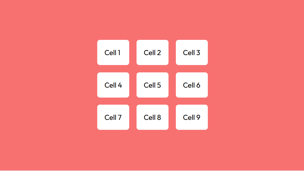
To illustrate, we’re going to build a simple container with a few elements inside it and display it in a grid layout.
Let’s get started!
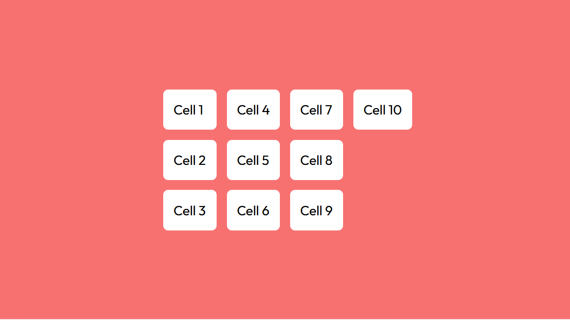
We’re going for a 3-by-3 grid with nine grid items and also adding a gap between each cell with the gap-{size} class.
<div class="min-h-screen flex items-center justify-center">
  <div class="grid grid-cols-3 grid-rows-3 gap-4">
    <div>Cell 1</div>
    <div>Cell 2</div>
    <div>Cell 3</div>
    <div>Cell 4</div>
    <div>Cell 5</div>
    <div>Cell 6</div>
    <div>Cell 7</div>
    <div>Cell 8</div>
    <div>Cell 9</div>
  </div>
</div>Code language: HTML, XML (xml)
Since this particular example is a 3-by-3 grid, you can actually leave out the grid-rows-3 class and the result will be the same.
In fact, with any number of grid items, you can specify a fixed number of rows or columns and the cells will automatically flow into the next grid line.
At this point, you can style the items as you wish by adding some utility classes. For this example, we’ve added a background color and some padding.
Here’s a screenshot of the grid:
You’ll notice the gap class adds equal spacing between every cell in the grid. You can change this and have a different gap size between the rows and columns.
The gap utility class for the columns is gap-x-{size}, and for the rows it’s gap-y-{size}.
<div class="grid grid-cols-3 gap-x-3 gap-y-1">

  <!-- cells -->

</div>Code language: HTML, XML (xml)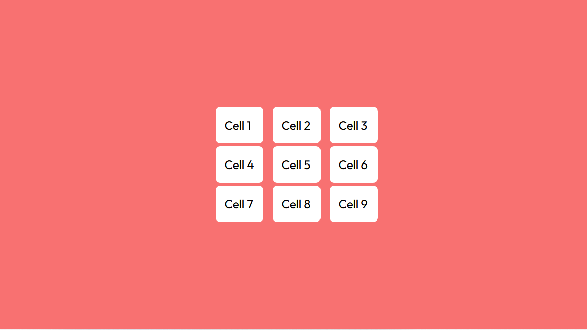
Grid column and row start/end
The size of the grid items can be increased so that they occupy multiple rows or columns.
Tailwind has the grid column start/end and grid row start/end utilities to make this possible. These utility classes will go directly into the individual grid items, and they control the grid-column and grid-row CSS properties.
Apart from resizing the cells, you can also choose where the rows and columns start.
Spanning rows and columns
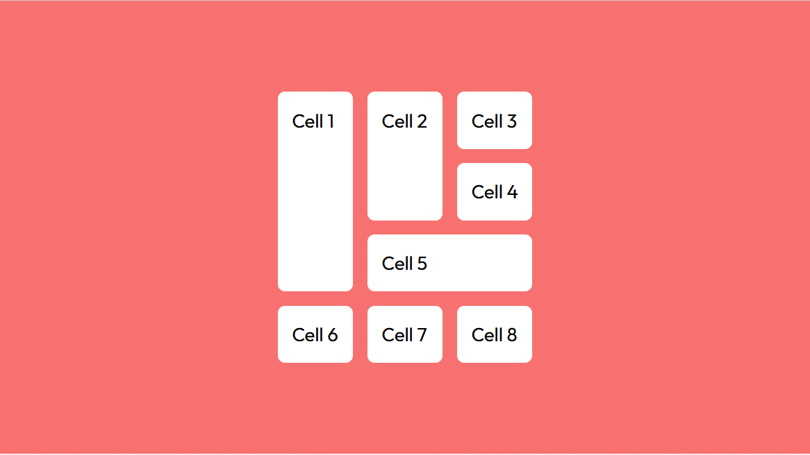
To increase the size of a grid item so that it expands across multiple columns, you’ll use the col-span-{n} class, with “n” being the number of columns you want that item to occupy. For the rows, the grid utility class is row-span-{n}.
Let’s see it in action. To illustrate, we’re going to create a masonry grid. A masonry grid is a grid where the cells don’t have a fixed height and length.
<div class="grid grid-cols-3 gap-3">
    <div class="row-span-3 bg-white p-3 rounded-md">Cell 1</div>
    <div class="row-span-2 bg-white p-3 rounded-md">Cell 2</div>
    <div class="bg-white p-3 rounded-md">Cell 3</div>
    <div class="bg-white p-3 rounded-md">Cell 4</div>
    <div class="col-span-2 bg-white p-3 rounded-md">Cell 5</div>
    <div class="bg-white p-3 rounded-md">Cell 6</div>
    <div class="bg-white p-3 rounded-md">Cell 7</div>
    <div class="bg-white p-3 rounded-md">Cell 8</div>
</div>Code language: HTML, XML (xml)
And here’s a screenshot of the grid layout:
Starting and ending lines
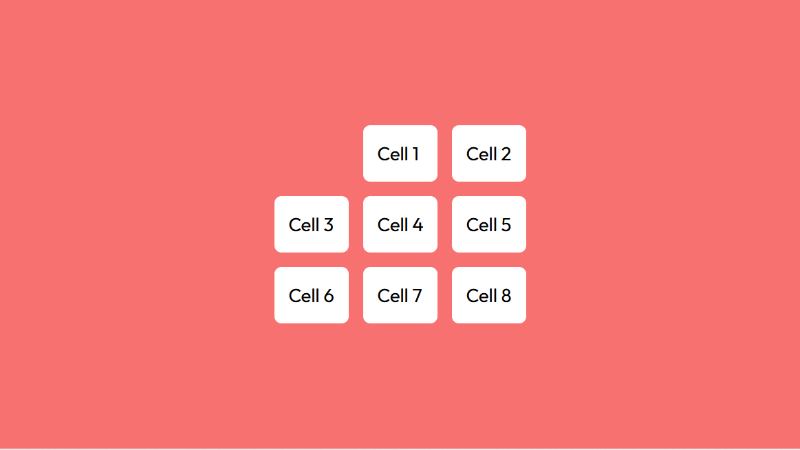
For the columns, the grid utility classes col-start-{n} and col-end-{n} are used to change the position of the columns. To change the start and end positions for the rows, you’ll use row-start-{n} and row-end-{n}.
<div class="grid grid-cols-3 grid-rows-3 gap-3">
    <div class="col-start-2 bg-white p-3 rounded-md">Cell 1</div>
    <div class="bg-white p-3 rounded-md">Cell 2</div>
    <div class="bg-white p-3 rounded-md">Cell 3</div>
    <div class="bg-white p-3 rounded-md">Cell 4</div>
    <div class="bg-white p-3 rounded-md">Cell 5</div
    <div class="bg-white p-3 rounded-md">Cell 6</div>
    <div class="bg-white p-3 rounded-md">Cell 7</div>
    <div class="bg-white p-3 rounded-md">Cell 8</div>
</div>Code language: HTML, XML (xml)
For this example, we want the first cell to start in the second column.
You can mix and match grid classes and get more interesting grid patterns.
Auto grid placement
Earlier, we mentioned how the grid items will auto-flow into the next line when you specify the number of columns or rows only. Defining both the number of columns and rows creates an explicit grid, and any overflow creates an implicit column or row. In Tailwind, there are grid auto-flow utilities, grid-auto-{keyword}, that control this placement of the grid items.
Using the grid-auto-row function makes any extra cell overflow into a new row outside the explicit grid lines. This is the default if no auto-flow class is added.
In the same way, using the grid-auto-col class adds the extra cells in a new column.
The grid-auto-dense class makes the grid items attempt to occupy every available space in the grid. Adding the “dense” keyword to the grid-auto-row and grid-auto-col classes performs the same function but in the implicit rows or columns. The default, if you don’t add an auto-flow utility, is grid-auto-row-dense.
There are also utilities for controlling the size of the implicit rows and columns. You’ll use the auto-cols-{size} class for the columns, and auto-rows-{size} for the rows.
Nesting grids
A nested grid is a grid within a grid. That is, one of the grid items will be a smaller grid.
It’s a pretty straightforward process to create a nested grid. First, you’ll build the bigger grid. Then, within one of the cells, build another grid.
<div class="grid grid-cols-3 grid-rows-3 gap-3">
    <div class="bg-white p-3 rounded-md">Cell 1</div>
    <div class="bg-white p-3 rounded-md">Cell 2</div>
    <div class="bg-white p-3 rounded-md">Cell 3</div>
    <div class="bg-white p-3 rounded-md">Cell 4</div>
    <div class="bg-white p-3 rounded-md">Cell 5</div>
    <div class="bg-white p-3 rounded-md">
        <div class="flex items-center justify-center">
            <div class="grid grid-cols-2 gap-2">
                <div class="bg-red-400 p-2 rounded-md">1</div>
                <div class="bg-red-400 p-2 rounded-md">2</div>
                <div class="bg-red-400 p-2 rounded-md">3</div>
                <div class="bg-red-400 p-2 rounded-md">4</div>
            </div>
        </div>
     </div>
    <div class="bg-white p-3 rounded-md">Cell 7</div>
    <div class="bg-white p-3 rounded-md">Cell 8</div>
    <div class="bg-white p-3 rounded-md">Cell 9</div>
</div>Code language: HTML, XML (xml)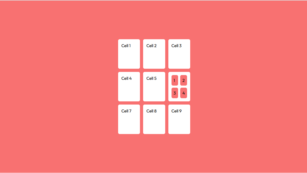
Since there’s no predefined dimensions for the grid items in this example, every cell expands to match the width and height of the biggest content, which in this case is the smaller grid.
Adding breakpoints
Sometimes a large grid will not look good on smaller screens, so there’s a need to collapse it so it fits. This is possible by adding breakpoints for small, medium, and large screens.
<div class="grid grid-cols-1 md:grid-cols-2 lg:grid-cols-4 gap-3">
    <div class="bg-white p-5 rounded-md">Cell 1</div>
    <div class="bg-white p-5 rounded-md">Cell 2</div>
    <div class="bg-white p-5 rounded-md">Cell 3</div>
    <div class="bg-white p-5 rounded-md">Cell 4</div>
    <div class="bg-white p-5 rounded-md">Cell 5</div>
    <div class="bg-white p-5 rounded-md">Cell 6</div>
    <div class="bg-white p-5 rounded-md">Cell 7</div>
    <div class="bg-white p-5 rounded-md">Cell 8</div>
</div>Code language: HTML, XML (xml)
For large screens, you’ll add the lg modifier, and for medium screens, it’s md.
Now, you can choose to add an sm modifier for small screens, but it’s not necessary, as the grid-cols-1 class will automatically be applied.
Check out the sandbox below to see how it works:
That’s a wrap
You can place different kinds of content into a grid—from text to videos to images, grids keep everything nice and tidy.
Tailwind makes it very easy to create grid layouts through the use of its utility classes. You can specify the number of rows and columns, the size of the grid items, how they behave, and much more.
Grids can also be made responsive by adding in breakpoints, which do the work of CSS media queries.
Now that you know how to use Tailwind CSS grid classes, let’s see what you can create.
This post was written by Oscar Jite-Orimiono. Oscar has a B.Eng in mechanical engineering, but now he’s a self-taught frontend web developer and technical writer. His skills include HTML, CSS, and JavaScript(Vanilla and jQuery). He builds websites with a focus on them being user-friendly, responsive, and having pleasing aesthetics. He’s also interested in data science, Python, and SQL.