Tailwind CSS Icons: A How-to Guide

Tailwind CSS is a low-level, utility-first CSS framework. It lets you build web components without leaving the comfort of the HTML markup. This is possible because, in place of predefined components, it has utility classes that make building custom components a lot easier.
Tailwind CSS has a lot of utilities but none for adding icons to your project. You’ll have to use an external icon library or image.
Icons are important in modern web development. In this post, you’ll learn how to use icons in Tailwind CSS. We’re going to look at how you can add icons using Font Awesome, as well as how you can add icons using Heroicons by the makers of Tailwind CSS.
Font Awesome
Font Awesome is the go-to icon library for many web developers. It has a vast array of icons and is easy to use.
First, set up an icon kit and link it to your project. An alternative is to link the Font Awesome stylesheet from the cdnjs open-source library.
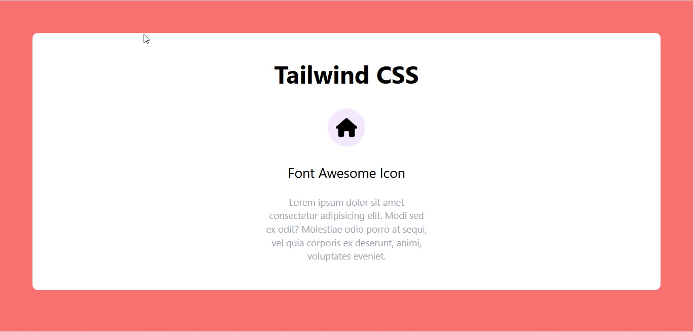
Next, create the webpage. Then, find the icon you want to use and copy its HTML code. To illustrate, we’re using a simple text card.
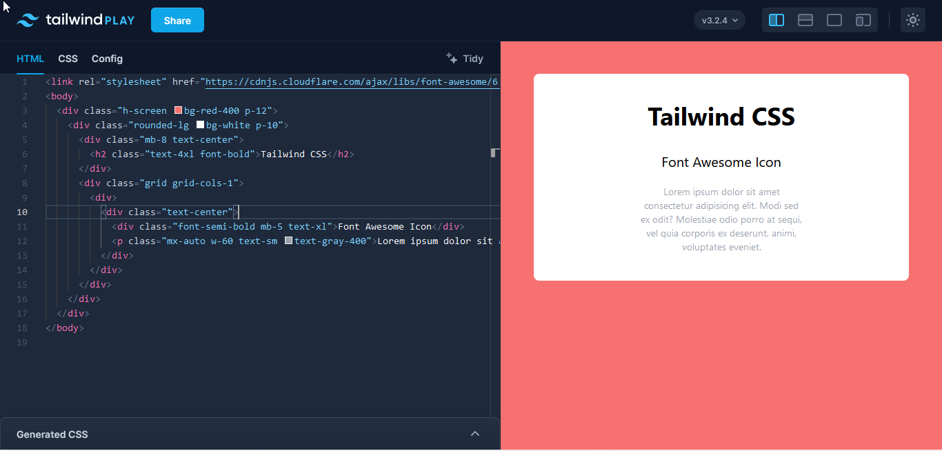
The icon will be just below the bold header.
<div class="text-center">
    <div>
        <i class="fa-solid fa-house"></i> <!--Icon-->
    </div>
    <div class="text-xl font-semi-bold mb-5">Font Awesome Icon</div>
        <p class="text-sm text-gray-400 w-60 mx-auto">
              Lorem ipsum dolor sit amet consectetur adipisicing elit. Modi sed ex odit?
              Molestiae odio porro at sequi, vel quia corporis ex deserunt, animi, voluptates eveniet.
        </p>
</div>Code language: HTML, XML (xml)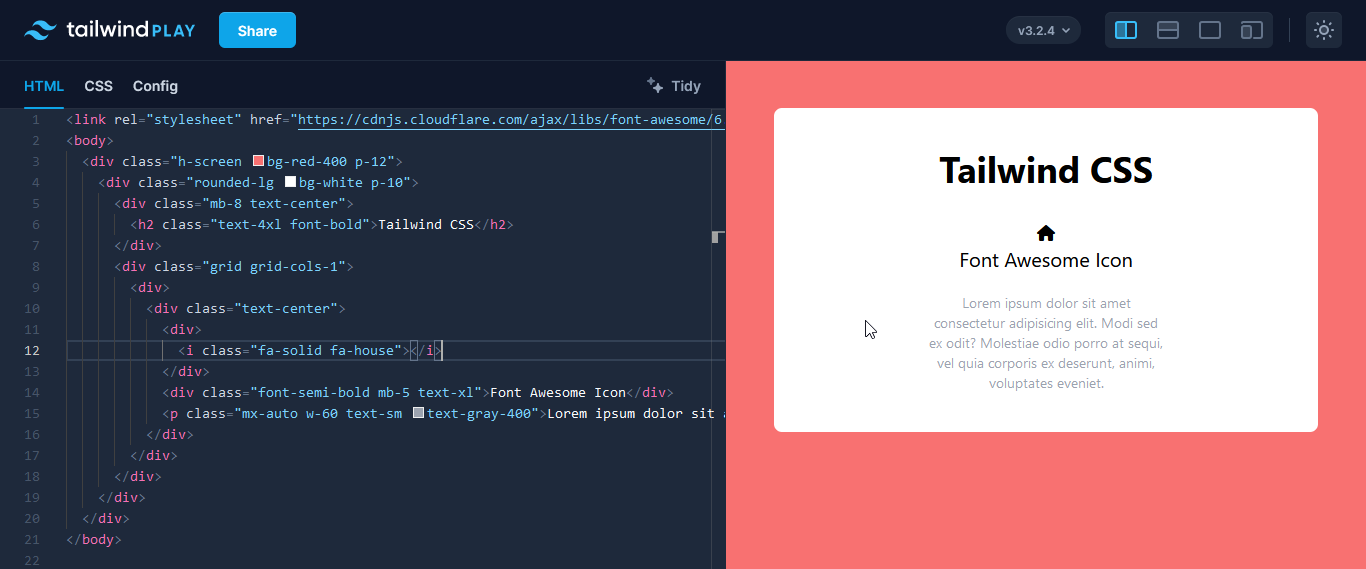
At this point, the icon has the default black color. You can style it by adding some of Tailwind’s utility classes to the icon’s div container.
<div class="text-xl bg-purple-100 text-red-900 w-14 h-14 flex justify-center items-center rounded-full mb-6 mx-auto">
    <i class="fa-solid fa-house"></i>
</div>Code language: HTML, XML (xml)
And that’s it!
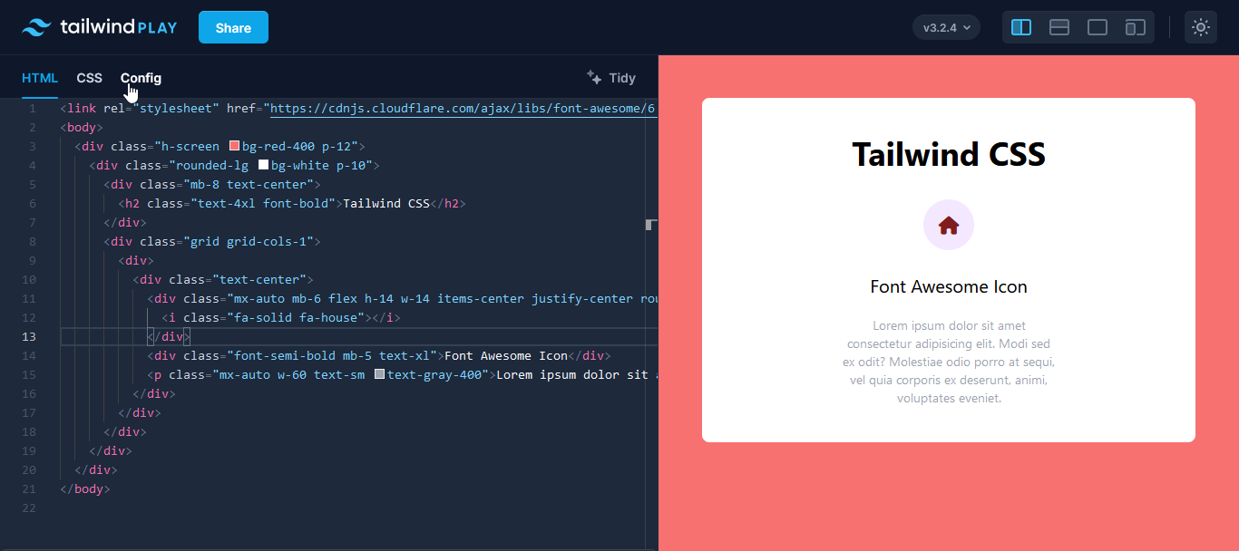
We now have a nice-looking icon on the text card.
Font Awesome also gives you the option of copying the icon’s SVG code. You can then add Tailwind’s utility classes to the SVG to style it to your taste.
<svg class="w-6 h-6 fill-red-900" xmlns="http://www.w3.org/2000/svg" viewBox="0 0 576 512">Code language: HTML, XML (xml)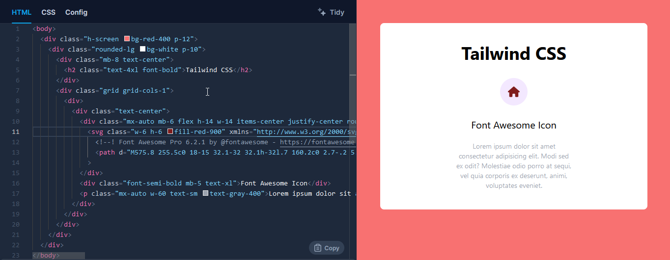
Here, the text-color utility won’t work, so you’ll have to add a fill color.
You can also download the icon as an SVG image and put it into your webpage with the HTML image tag. Then, add in some utilities to resize the icon.
<div class="mx-auto mb-6 flex h-14 w-14 items-center justify-center rounded-full bg-purple-100 text-red-900">
   <img class="h-8 w-8 fill-red-900" src="/house-solid.svg" alt="">
</div>Code language: HTML, XML (xml)
Here’s a screenshot of what you should see.
The problem with this method is that you can’t change the color of the icon because you’re loading the SVG as an image file. You have to load it as an SVG, in the SVG tag, before you can change the color. So, you’re stuck with a rather boring black (unless that’s what you want).
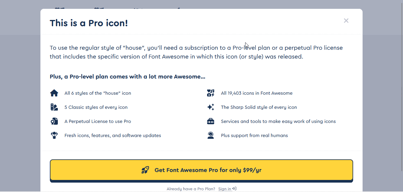
ℹ️ It’s important to note that a lot of the icons and some features available on Font Awesome are not free, and they’re only accessible when you have a pro account.
Heroicons
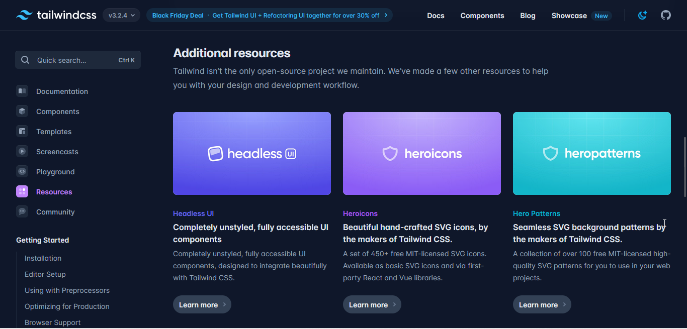
If you head over to the resources section of Tailwind’s website, you’ll find a link to Heroicons. It’s an open-source project, which almost certainly means it’s free.
Heroicons is an open-source library that contains “beautiful hand-crafted SVG icons by the makers of Tailwind CSS.” You don’t need to link a cdn to use Heroicons, you’ll just have to copy the SVG code of the icon and paste it in your project – and note that the icons are free to use.
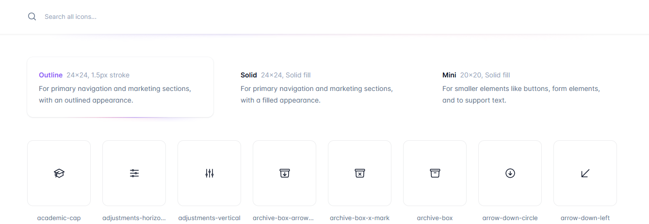
Heroicons also comes in three different styles corresponding to different icon use cases:
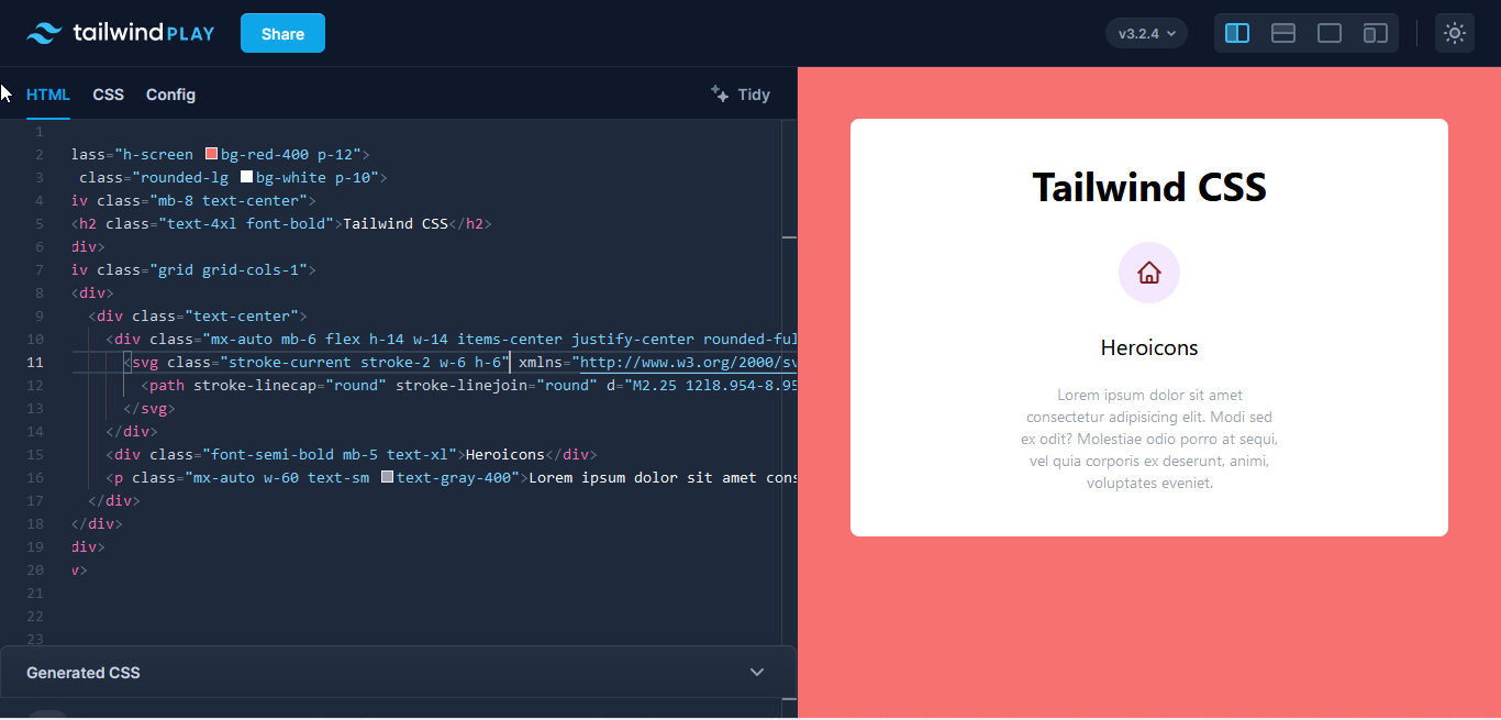
Here’s an example of how you’d implement an outline Heroicon. We’re using the same card as before, but this time copying and pasting the SVG code of the Heroicon into the HTML icon.
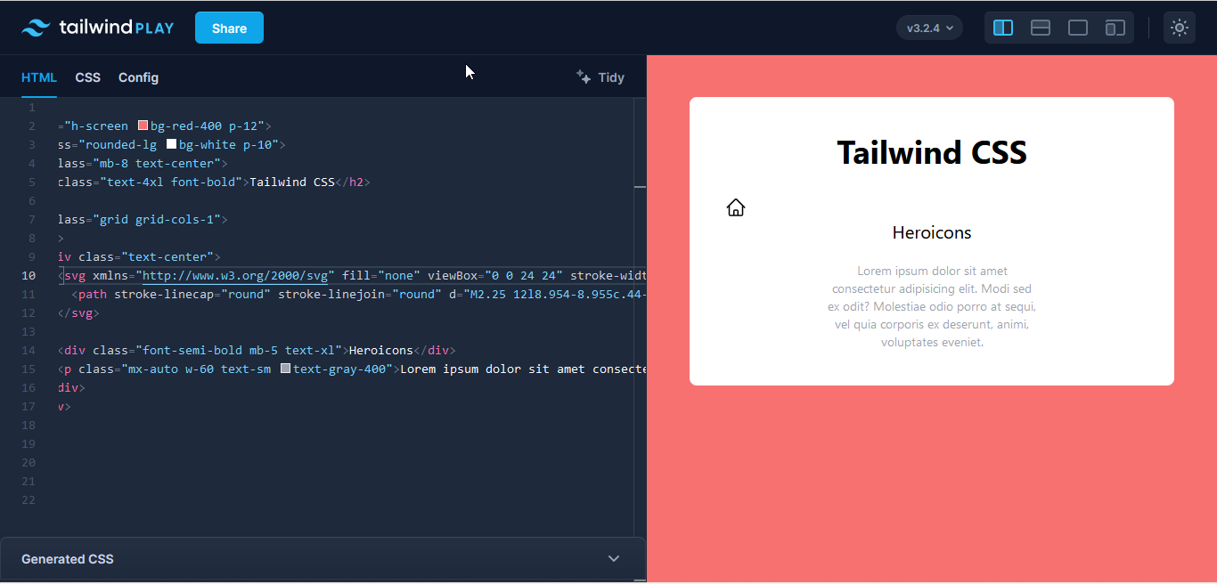
As with every element in Tailwind CSS, you can style them using the utility classes. The SVG icon comes with default height and width utilities, and you can overwrite these with your own styling.
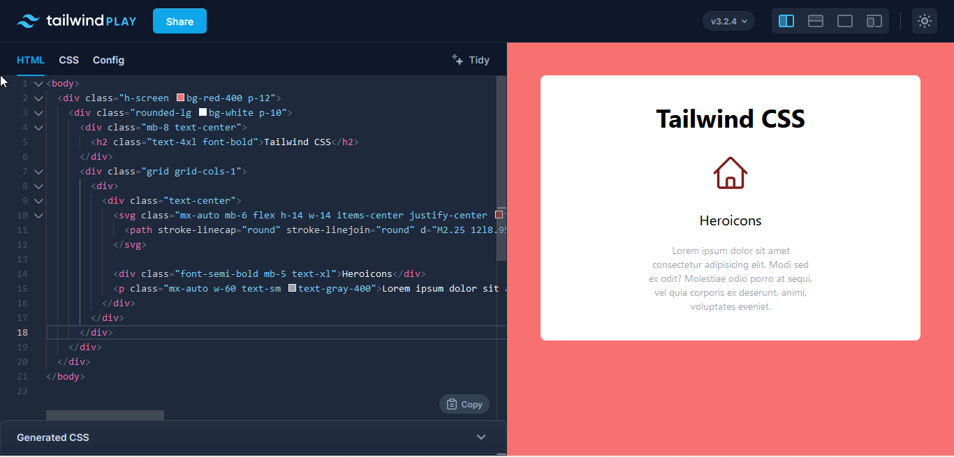
You can also wrap the SVG icon in a div container and add the utility classes there instead. This is great for adding a background color so the icon really stands out.
<div class="mx-auto mb-6 flex h-14 w-14 items-center justify-center rounded-full bg-purple-100 text-red-900">
    <svg xmlns="http://www.w3.org/2000/svg" fill="none" viewBox="0 0 24 24" stroke-width="1.5" stroke="currentColor" class="h-8 w-8">
   <!--path-->
    </svg>
</div>Code language: HTML, XML (xml)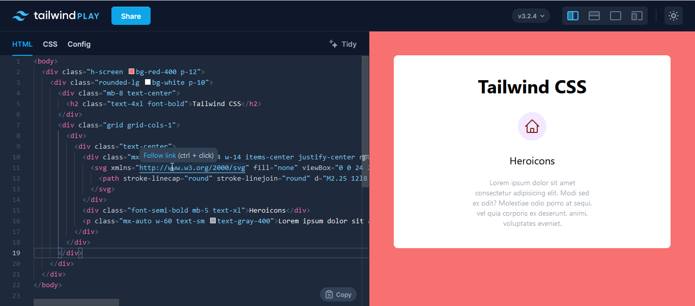
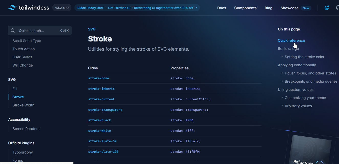
The icons with the outline style come with some default attributes that you can overwrite with Tailwind utility classes. These are stroke and stroke-width. You can replace them with the SVG utilities available in Tailwind CSS.
For this next example, we’re using stroke-current so it uses the text-color for both fill and stroke. Next, we’re making the icon a little bolder by using stroke-2, which increases the stroke-width of the SVG.
The next icon style on Heroicons is solid, which is the complete opposite of outline.
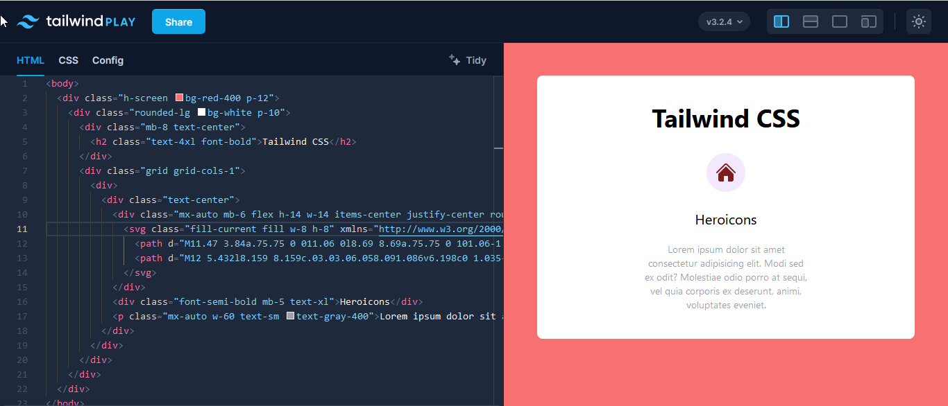
These icons come with a default height and width, just like the outline icons, and they also come with the fill attribute. This attribute comes with the currentColor keyword, meaning it’ll take the color defined by the text-color utility class.
Heroicons has a third style for its icon, and that’s mini, which is intended for smaller elements—buttons, for example. Adding it to your project follows the same process as the previous two icon styles. Copy, paste, and add in the utility classes.
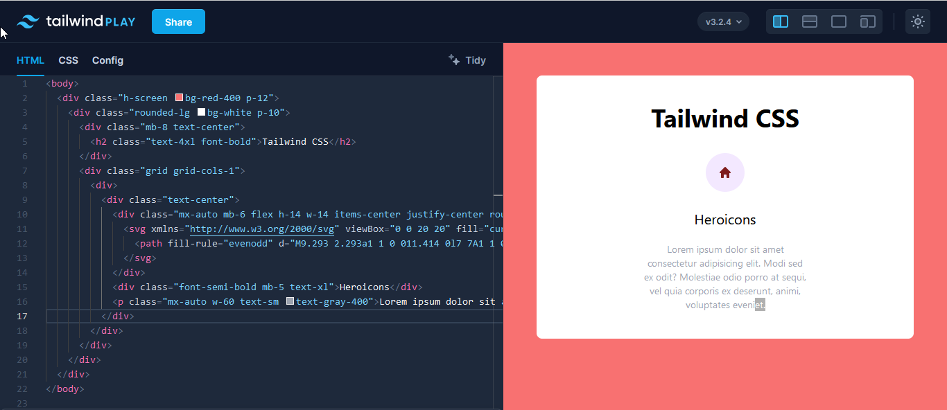
The outline and solid SVG icons have a 24-by-24 view box, while for the mini icons, it’s 20-by-20.
For any Heroicon style, you can also choose to remove the text-color class and add your own custom fill or stroke color. Keep in mind that if you’re adding a fill or stroke color, you can’t use either fill-current or stroke-current They’re conflicting attributes and will produce an error.
Conclusion
Icons have a big role on the web as well as the world at large. Everywhere you look, there’s a symbol with a much bigger meaning and purpose. When choosing icons for your next project, make sure that users can easily understand their function.
Tailwind CSS makes building websites easier with its utility classes. It’s simple to learn and understand, and it has a pretty straightforward installation process. Tailwind CSS has utilities for every web element or component, but it doesn’t for icons. That’s where external libraries come in.
Font Awesome is a well-known library containing hundreds of icons. All you have to do is link its cdn to your project and you’re in business. Once you find the icon you like, copy its HTML code and paste it where you want it. You can also copy its SVG code or download it as an image file. Font Awesome, however, is not entirely free to use.
Heroicons, by the makers of Tailwind CSS, is free. It They offers a library of SVG icons in three different styles. There’s the outline icons and solid icons, which use the stroke and fill properties, respectively. These icons are used for regular web elements.
Finally, we have the mini icons for smaller web elements. They all follow the same copy, paste, and add utilities format.
The choice is yours now that you know how to use these icon libraries in Tailwind CSS. Which one will it be, and what can you create?
This post was written by Oscar Jite-Orimiono. Oscar has a B.Eng in mechanical engineering, but now he’s a self-taught frontend web developer and technical writer. His skills include HTML, CSS, and JavaScript(Vanilla and jQuery). He builds websites with a focus on them being user-friendly, responsive, and having pleasing aesthetics. He’s also interested in data science, Python, and SQL.